Responsive Layout in ASP.NET WebForms Menu
27 Jan 20228 minutes to read
Responsive Layout is aimed at crafting sites to provide an optimal viewing experience—easy reading and navigation with a minimum of resizing, panning, and scrolling—across a wide range of devices (from mobile phones to desktop computer monitors). In order to get responsive layout, add ej.responsive.css file in your sample. CDN link for the responsive CSS file is as follows.
http://cdn.syncfusion.com/js/web/responsive-css/ej.responsive-latest.css
Add the above CSS link in the sample code example.
Add the following code example in your ASPX page.
<ej:Menu ID="MenuControl" Width="500" runat="server">

            <Items>

                <ej:MenuItem Id="Home" Text="Home">

                    <Items>

                        <ej:MenuItem Text="Foundation"></ej:MenuItem>

                    </Items>

                    <Items>

                        <ej:MenuItem Text="Launch"></ej:MenuItem>

                    </Items>

                    <Items>

                        <ej:MenuItem Text="About">

                            <Items>

                                <ej:MenuItem Text="Company"></ej:MenuItem>

                            </Items>

                            <Items>

                                <ej:MenuItem Text="Location"></ej:MenuItem>

                            </Items>

                        </ej:MenuItem>

                    </Items>

                </ej:MenuItem>

                <ej:MenuItem Id="Services" Text="Services">

                    <Items>

                        <ej:MenuItem Text="Consulting"></ej:MenuItem>

                    </Items>

                    <Items>

                        <ej:MenuItem Text="Outsourcing"></ej:MenuItem>

                    </Items>

                </ej:MenuItem>

                <ej:MenuItem Id="About" Text="About"></ej:MenuItem>

                <ej:MenuItem Id="Contact" Text="Contact us">

                    <Items>

                        <ej:MenuItem Text="Contact Number"></ej:MenuItem>

                    </Items>

                    <Items>

                        <ej:MenuItem Text="Email"></ej:MenuItem>

                    </Items>

                </ej:MenuItem>

                <ej:MenuItem Id="Careers" Text="Careers">

                    <Items>

                        <ej:MenuItem Text="Position">

                            <Items>

                                <ej:MenuItem Text="Developer"></ej:MenuItem>

                            </Items>

                            <Items>

                                <ej:MenuItem Text="Manager"></ej:MenuItem>

                            </Items>

                        </ej:MenuItem>

                    </Items>

                    <Items>

                        <ej:MenuItem Text="Apply online"></ej:MenuItem>

                    </Items>

                </ej:MenuItem>

            </Items>

        </ej:Menu>
The following screenshot displays the output for the above code example.
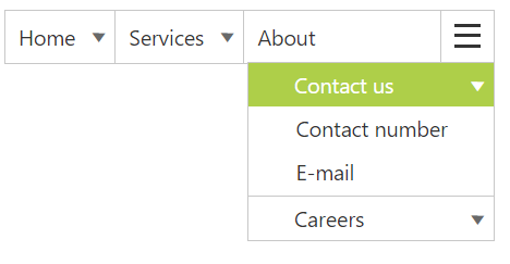
Responsive in Desktop:
When menu width is small and window width is normal as desktop ,only the overflown menu items will be moved inside menu popup.You can also set width and height for popup menu using overflowHeight and overflowWidth API
The following output shows the output of menu with Width of “300px” in Desktop mode
Download the sample here
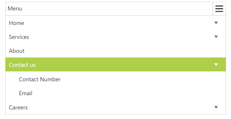
Responsive in Mobile or Tablet:
Menu will be displayed in mobile or Tablet as shown in the below image:
NOTE
Window width below 767px is considered as Mobile or Tablet mode in our menu.