How can I help you?
Overview
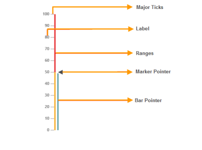
The Gauge control for Essential Studio displays numerical information in the form of a scale that can be customized and oriented either vertically or horizontally. It comprises the following basic elements:
- Scales
- Pointers: bars and markers
- Ticks
- Labels
- Ranges

Three basic scale designs available are : rectangle, rounded rectangle, and thermometer.
Key Features
- Interaction: Allows you to directly interact with pointers on a gauge.
- Indicators: Indicate the state of a gauge either active or inactive.
- Ranges: Highlight the range of values on a gauge.
- Pointers: Allows you to add multiple pointers like bar pointers and marker pointers to a gauge.
- Scale Direction: Allows you to set scales direction either horizontally or vertically.
- Animation: Supports animation effects for pointers.
- Custom Labels: Allows you to add custom label text on any part of a gauge.
- Scale Styles: Three basic styles of scales are supported: rectangle, rounded rectangle, and thermometer.