Appearance and Styling
12 Oct 20162 minutes to read
Theme
The CurrencyTextbox control’s style and appearance can be controlled based on CSS classes. In order to apply styles to the CurrencyTextbox control, refer to the files, ej.widgets.core.min.css and ej.theme.min.css. When the file ej.web.all.min.css is referred, then it is not necessary to include the files ej.widgets.core.min.css and ej.theme.min.css in your project, as ej.web.all.min.css is the combination of these two files.
By default, there are 17 themes available for the CurrencyTextbox control,
- bootstrap
- flat-azure
- flat-azure-dark
- fat-lime
- flat-lime-dark
- flat-saffron
- flat-saffron-dark
- gradient-azure
- gradient-azure-dark
- gradient-lime
- gradient-lime-dark
- gradient-saffron
- gradient-saffron-dark
- high-contrast-01
- high-contrast-02
- material
- office-365
CSS Class
The CSS properties can be customized by using the CssClass in the CurrencyTextbox. You can customize the CurrencyTextbox with various CSS properties to appear as you desire.
Configure CSS Class
Add the following code to your ASPX page to render the CurrencyTextbox control with customized style.
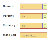
<ej:CurrencyTextBox ID="currency" cssClass="customCss" runat="server"> </ej:CurrencyTextBox>Customize the CSS properties in custom CSS class.
.customCss .e-box {

            border-color: #9d241b;

        }

        .customCss .e-input {

            background-color: #f6db8d;

        }

        .customCss .e-select {

            background-color: #ecf6ac;

            border-color: #3c36e7;

        }
The output after applying the CssClass.
Rounded Corner Support
The CurrencyTextbox provides rounded corner support that changes the appearance of the CurrencyTextbox control. The default value for ShowRoundedCorner property is false.
Configure Rounded Corner Support
Add the following code to your ASPX page to render the CurrencyTextbox control with rounded corners.
<ej:CurrencyTextBox ID="currency" Value="3" ShowRoundedCorner="true" runat="server"></ej:CurrencyTextBox>The output when the ShowRoundedCorner is set to true.