Easy Customization
3 Nov 20169 minutes to read
Button is used in all applications. Button size, content and content location is varied according to each application. Here, you can see some customizable option for button that can perform easily.
Button Size
You can render the button in different sizes. Here, you have some predefined size options for rendering a button with different sizes in easiest way. Each size option has different height and width. Mainly it avoids the complexity in rendering button with complex CSS class.
|
Normal |
Creates button with content size. |
|
Mini |
Creates button with Built-in mini size height, width specified. |
|
Small |
Creates button with Built-in small size height, width specified. |
|
Medium |
Creates button with Built-in medium size height, width specified. |
|
Large |
Creates button with Built-in large size height, width specified. |
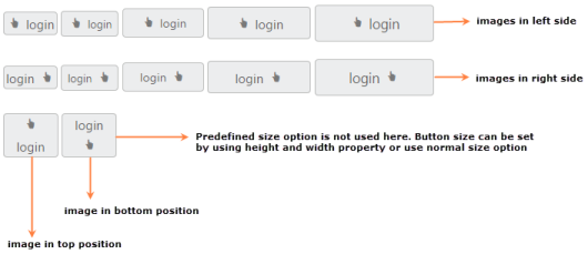
Apart from the above mentioned predefined size option, you can set your own width and height for button by using Height and Width property.
In the ASPX page, add the following button elements to configure button for configure the size
<%--Set the different size options and custom size for button control as follows--%>

<ej:Button ID="ButtonNormal" runat="server" Type="Button" Text="login" Size="Normal"

    ShowRoundedCorner="true" ContentType="ImageOnly" PrefixIcon="e-icon e-handup">

</ej:Button>

<ej:Button ID="ButtonMini" runat="server" Type="Button" Text="login" Size="Mini"

    ShowRoundedCorner="true">

</ej:Button>

<ej:Button ID="ButtonSmall" runat="server" Type="Button" Text="login" Size="Small"

    ShowRoundedCorner="true">

</ej:Button>

<ej:Button ID="ButtonMedium" runat="server" Type="Button" Text="login" Size="Medium"

    ShowRoundedCorner="true">

</ej:Button>

<ej:Button ID="ButtonLarge" runat="server" Type="Button" Text="login" Size="Large"

    ShowRoundedCorner="true" ContentType="TextAndImage" PrefixIcon="e-icon e-handup">

</ej:Button>

<ej:Button ID="ButtonCustomSize" runat="server" Type="Button" Text="login" ShowRoundedCorner="true" ContentType="TextAndImage" PrefixIcon="e-icon e-handup" Height="50" Width="150">

</ej:Button>
Content Type
The content of the Button is mainly text and images. Instead of using complex CSS classes to render Button with different content types, you can use some predefined content type options provided for Button control. By using these content types, you can easily add different types of content for button. Button supports the following content types.
|
TextOnly |
Supports only for text content only. |
|
ImageOnly |
Supports only for image content only |
|
ImageBoth |
Supports image for both ends of the button. |
|
TextAndImage |
Supports image with the text content. |
|
ImageTextImage |
Supports image with both ends and middle in text. |
Prefix and suffix icons
Icons inside the Button are added easily by using the PrefixIcon and SuffixIcon property. Location of the icon in button is necessary and you can easily customize it by using the following mentioned options.
Button control also supports the Built-in icon libraries. The ej.widgets.core.min CSS contains definitions for important icons that can be used in buttons. Simply you can use these Built-in icons by mentioning the icon class name as value in PrefixIcon and SuffixIcon property. You can use any font icons that are defined in ej.widgets.core.min CSS. It avoids the complexity in specifying icon by using the sprite image and CSS.
For example, the following mentioned Built-in CSS class are used to show the font icons that is used by media player.
- e-mediaback
- e-mediaforward
- e-medianext
- e-mediaprev
- e-mediaeject
- e-mediaclose
- e-mediapause
- e-mediaplay
Prefix Icon
It inserts the icon at the starting position of button. After this prefix icon, you can use text or suffix icon.
Suffix Icon
It inserts the icon at the ending position of button. Before this suffix icon, you can use text or prefix icon.
In the ASPX page, add the ContentType, Prefix and Suffix icon properties in button elements to configure Button widget.
<%--Set the different content types and use the necessary build-in icons for button control as follows.--%>

<ej:Button ID="button_imageOnly" runat="server" Type="Button" Text="login" ShowRoundedCorner="true" ContentType="ImageOnly" PrefixIcon="e-icon e-handup">

</ej:Button>

<ej:Button ID="button_textOnly" runat="server" Type="Button" Text="login" ShowRoundedCorner="true"

ContentType="TextOnly">

</ej:Button>

<ej:Button ID="button_imageBoth" runat="server" Type="Button" Text="login" ShowRoundedCorner="true" ContentType="ImageBoth" PrefixIcon="e-icon e-handup" SuffixIcon="e-icon e-palette">

</ej:Button>

<ej:Button ID="button_textAndImage" runat="server" Type="Button" Text="login" ShowRoundedCorner="true" ContentType="TextAndImage" PrefixIcon="e-icon e-handup">

</ej:Button>

<ej:Button ID="button_imageTextImage" runat="server" Type="Button" Text="login" ShowRoundedCorner="true" ContentType="ImageTextImage" PrefixIcon="e-icon e-handup" SuffixIcon="e-icon e-palette">

</ej:Button>

<br />

<br />

<ej:Button ID="button_small_imageOnly" runat="server" Type="Button" Text="login"

    Size="Small" ShowRoundedCorner="true" ContentType="ImageOnly" PrefixIcon="e-icon e-handup">

</ej:Button>

<ej:Button ID="button_small_textOnly" runat="server" Type="Button" Text="login" Size="Small"

    ShowRoundedCorner="true" ContentType="TextOnly">

</ej:Button>

<ej:Button ID="button_small_imageBoth" runat="server" Type="Button" Text="login"

    Size="Small" ShowRoundedCorner="true" ContentType="ImageBoth" PrefixIcon="e-icon e-handup"

SuffixIcon="e-icon e-palette">

</ej:Button>

<ej:Button ID="button_small_textAndImage" runat="server" Type="Button" Text="login"

    Size="Small" ShowRoundedCorner="true" ContentType="TextAndImage" PrefixIcon="e-icon e-handup">

</ej:Button>

<ej:Button ID="button_small_imageTextImage" runat="server" Type="Button" Text="login"

    Size="Small" ShowRoundedCorner="true" ContentType="ImageTextImage" PrefixIcon="e-icon e-handup" SuffixIcon="e-icon e-palette">

</ej:Button>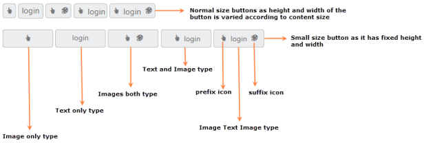
Image Position
To provide the best look and feel for Button, position of button images is an important customizable option. With ImagePosition property, you can easily customize the position of images inside the button without using any complex CSS. ImagePosition property is applicable only with the TextAndImage ContentType property. This property supports the following values.
|
ImageLeft |
Support for aligning text in right and image in left. |
|
ImageRight |
Support for aligning text in left and image in right. |
|
ImageTop |
Support for aligning text in bottom and image in top. |
|
ImageBottom |
Support for aligning text in top and image in bottom. |
In the ASPX page, add the following button elements to configure Button image position
<%--Set the different image position for button control as follows.--%>

<ej:Button ID="ButtonNormal_ImageLeft" runat="server" Type="Button" Text="login"

    Size="Normal" ShowRoundedCorner="true" ContentType="TextAndImage" PrefixIcon="e-icon e-handup" ImagePosition="ImageLeft">

</ej:Button>

<ej:Button ID="ButtonMini_ImageLeft" runat="server" Type="Button" Text="login" Size="Mini" ShowRoundedCorner="true" ContentType="TextAndImage" PrefixIcon="e-icon e-handup" ImagePosition="ImageLeft">

</ej:Button>

<ej:Button ID="ButtonSmall_ImageLeft" runat="server" Type="Button" Text="login" Size="Small" ShowRoundedCorner="true" ContentType="TextAndImage" PrefixIcon="e-icon e-handup" ImagePosition="ImageLeft">

</ej:Button>

<ej:Button ID="ButtonMedium_ImageLeft" runat="server" Type="Button" Text="login"

    Size="Medium" ShowRoundedCorner="true" ContentType="TextAndImage" PrefixIcon="e-icon e-handup" ImagePosition="ImageLeft">

</ej:Button>

<ej:Button ID="ButtonLarge_ImageLeft" runat="server" Type="Button" Text="login" Size="Large" ShowRoundedCorner="true" ContentType="TextAndImage" PrefixIcon="e-icon e-handup" ImagePosition="ImageLeft">

</ej:Button>

<br />

<br />

<ej:Button ID="ButtonNormal_ImageRight" runat="server" Type="Button" Text="login"

    Size="Normal" ShowRoundedCorner="true" ContentType="TextAndImage" PrefixIcon="e-icon e-handup" ImagePosition="ImageRight">

</ej:Button>

<ej:Button ID="ButtonMini_ImageRight" runat="server" Type="Button" Text="login" Size="Mini" ShowRoundedCorner="true" ContentType="TextAndImage" PrefixIcon="e-icon e-handup" ImagePosition="ImageRight">

</ej:Button>

<ej:Button ID="ButtonSmall_ImageRight" runat="server" Type="Button" Text="login"

    Size="Small" ShowRoundedCorner="true" ContentType="TextAndImage" PrefixIcon="e-icon e-handup" ImagePosition="ImageRight">

</ej:Button>

<ej:Button ID="ButtonMedium_ImageRight" runat="server" Type="Button" Text="login"

    Size="Medium" ShowRoundedCorner="true" ContentType="TextAndImage" PrefixIcon="e-icon e-handup" ImagePosition="ImageRight">

</ej:Button>

<ej:Button ID="ButtonLarge_ImageRight" runat="server" Type="Button" Text="login"

    Size="Large" ShowRoundedCorner="true" ContentType="TextAndImage" PrefixIcon="e-icon e-handup" ImagePosition="ImageRight">

</ej:Button>

<br />

<br />

<ej:Button ID="Button_ImageTop" runat="server" Type="Button" Text="login" ShowRoundedCorner="true" ContentType="TextAndImage" PrefixIcon="e-icon e-handup" ImagePosition="ImageTop"

    Width="60">

</ej:Button>

<ej:Button ID="Button_ImageBottom" runat="server" Type="Button" Text="login" ShowRoundedCorner="true" ContentType="TextAndImage" PrefixIcon="e-icon e-handup" ImagePosition="ImageBottom" Width="60">

</ej:Button>