How can I help you?
Getting Started with ASP.NET Webforms AutoComplete
This section helps you to configure the AutoComplete control in your application and also to learn how to pass the required data to it and to customize its various options according to your requirements.
In this ASP.NET section use the flat-lime as the default theme.
The following screenshot illustrates the AutoComplete control that searches the list of components available in the database.
Create an AutoComplete
You can create an ASP.NET Project and add necessary Dll’s and Scripts with the help of the given
WebForms-Getting Started documentation.
Initialize the corresponding AutoComplete control in the ASPX page.
<div>

    Select a component:

<ej:Autocomplete ID="ComponentList" runat="server"/>

</div>
Execute the above code to create the AutoComplete textbox as illustrated in the following screenshot.
Populate Data to AutoComplete
The data provided to the AutoComplete customizes the list of Data either locally or remotely.
Local Data Binding
AutoComplete provides data binding support to populate AutoComplete items, so that the values can be mapped to the AutoComplete fields, namely DataUniqueKeyField and DataTextField. DataBinding helps you bind a key value pair to AutoComplete textbox. DataUniqueKeyField takes the unique id of the dataSource elements. DataTextField gets the value to be displayed in the AutoComplete textbox.
Defining the Local data for AutoComplete
The following steps explain local data binding of a list data to an AutoComplete textbox.
Define local DataSource elements by using the Key and Text fields in code behind and map the list data to DataSource property
protected void Page_Load(object sender, EventArgs e)

            {

    this.AutoComplete.DataSource = new ComponentsList().GetComponentsList().ToList();

            }


    public class ComponentsList
        {

            public int ComponentId { get; set; }
            public string ComponentName { get; set; }
            public static List<ComponentsList> GetComponentsList()
            {
                List<ComponentsList> component = new List<ComponentsList>();
                component.Add(new ComponentsList { ComponentName = "Autocomplete" });
                component.Add(new ComponentsList { ComponentName = "Accordion" });
                component.Add(new ComponentsList { ComponentName = "BulletGraph" });
                component.Add(new ComponentsList { ComponentName = "Chart" });
                component.Add(new ComponentsList { ComponentName = "DatePicker" });
                component.Add(new ComponentsList { ComponentName = "Dialog" });
                component.Add(new ComponentsList { ComponentName = "Diagram" });
                component.Add(new ComponentsList { ComponentName = "DropDown" });
                component.Add(new ComponentsList { ComponentName = "Gauge" });
                component.Add(new ComponentsList { ComponentName = "Schedule" });
                component.Add(new ComponentsList { ComponentName = "Scrollbar" });
                component.Add(new ComponentsList { ComponentName = "Slider" });
                component.Add(new ComponentsList { ComponentName = "RangeNavigator" });
                component.Add(new ComponentsList { ComponentName = "Rating" });
                component.Add(new ComponentsList { ComponentName = "RichTextEditor" });
                component.Add(new ComponentsList { ComponentName = "Tab" });
                component.Add(new ComponentsList { ComponentName = "TagCloud" });
                component.Add(new ComponentsList { ComponentName = "Toolbar" });
                component.Add(new ComponentsList { ComponentName = "TreeView" });
                return component;
            }
        }
In the Design page, add an AutoComplete element from ToolBox and assign values for DataTextField and DataUniqueKeyField.
<%-- Map the data fields to the corresponding Field items--%>


<div>

Select a component/s:

<ej:Autocomplete ID="ComponentList" runat="server" DataTextField="ComponentName" DataUniqueKeyField="ComponentId" Width="500px"></ej:Autocomplete>

</div>
Run this code to render the AutoComplete with components list.
You can also set common customization changes to the AutoComplete textbox like enabling multiple-selection, highlight search and add dropdown icon in order to get the desired result.
Configure Visual Mode with filter option
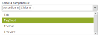
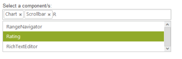
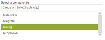
By default, the AutoComplete is rendered with single-value selection that is set to multiple-value selection by using the property MultiSelectMode as VisualMode that allows you to select multiple data. You can set the FilterType option as StartsWith to sort the suggestion list based on the starting character.
<div>

Select a component/s:

<ej:Autocomplete ID="ComponentList" runat="server" DataTextField="ComponentName" DataUniqueKeyField="ComponentId" FilterType="StartsWith" MultiSelectMode="VisualMode" Width="500px"> </ej:Autocomplete>

</div>
The following screenshot displays the AutoComplete textbox with selection visual mode.
Configure Highlight Search and Rounded corners
<div>
Select a component/s:
<ej:Autocomplete ID="ComponentList" runat="server"DataTextField="ComponentName" DataUniqueKeyField="ComponentId"
FilterType="StartsWith" MultiSelectMode="VisualMode" HighlightSearch="true" ShowRoundedCorner="true" Width="500px"></ej:Autocomplete>
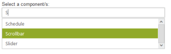
</div>When you set the HighlightSearch property to ‘true’, the characters typed in textbox gets highlighted in the suggestion list. To display the textbox with rounded ends, you can enable the ShowRoundedCorner property.
The following screenshot displays the AutoComplete textbox with highlight search enabled.
Configure Popup button
To enable the Popup button, you can set ShowPopupButton property to ‘true’ that displays the PopupButton icon at the end of textbox. By default, search icon replaces other icons and so you need to override the CSS classes and replace the content toDropDown arrow icon available in core CSS file as follows.
<style>

.e-icon.e-search:before {

               content:"\e63b";

        }

</style><div>
Select a component/s:
<ej:Autocomplete ID="ComponentList" runat="server" DataTextField="ComponentName" DataUniqueKeyField="ComponentId"
FilterType="StartsWith" MultiSelectMode="VisualMode" HighlightSearch="true" ShowRoundedCorner="true" ShowPopupButton="true"Width="500px"> </ej:Autocomplete>
</div>The following screenshot displays the AutoComplete textbox with dropdown icon.
