How can I help you?
Customization
Template Support
By default you can add any text or image to the Tooltip. To customize the tooltip layout or to create your own visualized elements you can use this template support.
<div class="ctrl" id="centerImg">
        <img class="ctrImg" src="http://aspnetcore.syncfusion.com/images/tooltip/template-04.png" />
        <div class="new">Roslyn Succinctly</div>
    </div>

    <ej-tooltip id="centerImg" content="<div class='main'> <div class='poster'> <img src='http://aspnetcore.syncfusion.com/images/tooltip/template-2.png' width='150px' height='120px'> </div> <div class='def'> <h4> Roslyn Succinctly </h4><div class='description'>Microsoft has only recently embraced the world of open source software, offering <a href='#'>More...</a> </div>" width="350px">
</ej-tooltip><style>
h4 {
margin-top: 0px;
margin-bottom: 2px;
}
.e-tooltip-wrap .e-tipContainer .e-tipcontent {
padding: 5px 0px;
}
.poster {
float: left;
padding: 4px 0px;
}
.new {
text-align: center;
}
.def {
float: right;
}
.ctrl {
border: 1px solid #ebebe0;
width: 150px;
padding: 5px;
height: 180px;
margin-top: 239px;
margin-left: 250px;
}
.ctrImg {
width: 150px;
height: 160px;
}
.category {
margin-left: 10px;
}
.description {
width: 200px;
height: 60px;
line-height: 22px;
margin-top: 10px;
}
</style>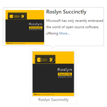
Tooltip’s title customization
Tooltip title can be customized with the image or any HTML element.
<div class="ctrl" id="centerImg">
        <img class="ctrImg" src="http://aspnetcore.syncfusion.com/images/tooltip/template-04.png" />
        <div class="new">Roslyn Succinctly</div>
    </div>

    <ej-tooltip id="centerImg" content="<div>Microsoft has only recently embraced the world of open source software, offering <a href='#'>More...</a> </div>").Title("<div><img class='titleImg' src='http://aspnetcore.syncfusion.com/images/tooltip/template-2.png' /> <div class='description'> Roslyn Succinctly </div> </div> ">
</ej-tooltip><style>
.titleImg {
width: 20px;
height: 20px;
float: left;
margin-right: 10px;
}
#centerImg{
margin-left : 300px;
margin-top : 250px;
position : absolute;
border: 1px solid grey;
}
.description {
height: 20px;
}
</style>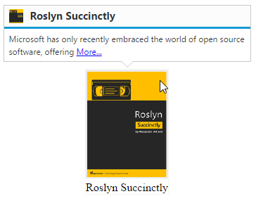
Animation Effects
Determines the type of effect that takes place when showing/hiding the tooltip.
We can specify the effect and the duration for the animation.
|
Effects |
Description |
|
Slide |
Sliding animation effect takes place with a duration of 200ms. |
|
Fade |
Fading animation effect takes place with a duration of 800ms. |
|
None (Default) |
No effect takes place |
Let’s create a Tooltip that slides down when shown using the animation property:
<div class="control">
        TypeScript lets you write <a id="tooltip1"><u> JavaScript</u> </a>the way you really want to.
    </div>

    <ej-tooltip id="tooltip1" content="JavaScript is the programming language of HTML and the Web.">
    <e-tooltip-animation effect="Slide" speed="1000" />
    </ej-tooltip>
Custom Animation
Custom animation effect for both Tooltip show/hide can also be done by show and hide method.
Show or Hide method may receive an optional ‘callback’ parameter, which represents a function you’d like to call which will animate the tooltip.
<div class="control">
        TypeScript lets you write <a id="tooltip2"><u> JavaScript</u> </a>the way you really want to.
    </div>

    <ej-button id="open" text="Open" show-rounded-corner="true" size="@ButtonSize.Large" click="onClick" />

    <ej-tooltip id="tooltip2" content="JavaScript is the programming language of HTML and the Web.">
    </ej-tooltip>

    <script>
        var tip;
        function onClick(args){
            tip = $("#tooltip2").data("ejTooltip");
            tip.show(null,"myFunc");
        }
        function myFunc(args) {
            tip = $("#tooltip2").data("ejTooltip");
            $(tip.tooltip).slideDown(200, "easeOutElastic");
        }

    </script>
NOTE
Show or Hide method can also receive an optional parameter “effect name”, (e.g any easing effect name) which specifies the type of effect taken place when showing/hiding of the tooltip, please refer to the following link for online demo - link.
Modernize the tooltip’s content
It’s easy to update a tooltip’s content – whether it’s open or closed.
<div class="control">
        TypeScript lets you write <a id="tooltip3"><u> JavaScript</u> </a>the way you really want to.
        <ej-button id="open" text="Update Content" show-rounded-corner="true" size="@ButtonSize.Large" click="onClick" />
    </div>

    <ej-tooltip id="tooltip3" content="JavaScript is the programming language of HTML and the Web.">
    </ej-tooltip>

    <script type="text/javascript">
        function onClick(args){
            tip = $("#tooltip3").data("ejTooltip");
            tip.setModel({ content: "JavaScript" });
            tip.show();
        }
    </script>
Closing Mode
By default, the Tooltip will be hidden when mouse leaves the target element. Different types of close mode as follows
|
Types |
Description |
|
Auto |
Tooltip will be hidden after a particular period of time. |
|
Sticky |
Tooltip rendered with the button, it will close the tooltip. |
|
None (Default) |
Tooltip will be hidden when mouse leaves the target element. |
Auto
The tooltip will be visible only for the period of time specified in the autoCloseTimeout.
Let see an example, this Tooltip will only hide after hovering the target for 2000ms
<div class="control">
        TypeScript lets you write <a id="tooltip4"><u> JavaScript</u> </a>the way you really want to.
    </div>

    <ej-tooltip id="tooltip4" content="JavaScript is the programming language of HTML and the Web." close-mode="Auto" auto-close-timeout="2000">
    </ej-tooltip>
NOTE
Time specified in the autoCloseTimeout will be in milliseconds and the default value is 4000ms
Sticky
A close button will be shown with the Tooltip. The button element (i.e. close button) located by default at the top right of the Tooltip or title bar (if title is enabled). The tooltip gets closed when the button is clicked.
<div class="control">
        TypeScript lets you write <a id="tooltip5"><u> JavaScript</u> </a>the way you really want to.
    </div>

    <ej-tooltip id="tooltip5" content="JavaScript is the programming language of HTML and the Web." close-mode="Sticky" width="200px">
    </ej-tooltip>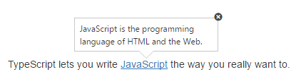
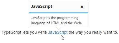
You can also have Tooltip with a title, in which case the button will lye within it:
<div class="control">
        TypeScript lets you write <a id="tooltip6"><u> JavaScript</u> </a>the way you really want to.
    </div>

    <ej-tooltip id="tooltip6" content="JavaScript is the programming language of HTML and the Web." close-mode="Sticky" width="200px" title="JavaScript">
    </ej-tooltip>