How can I help you?
Appearance
The appearance of the Sunburst Chart can be customized as shown below
Palette
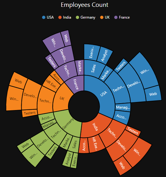
The Sunburst Chart displays different segments in different colors by default. You can customize the color of each segment by providing a custom color palette of your choice by using the palette property.
<ej-sunburstchart id="SunburstChart" palette=@ViewBag.ColorList>
</ej-sunburstchart>
public ActionResult Default()
{
List<string> ColorList=new List<string> { "#002e4d", "#005c99", "#008ae6", "#33adff", "#80ccff" };
ViewBag.ColorList= ColorList;
return View();
}The Sunburst Chart rendered with palette colors
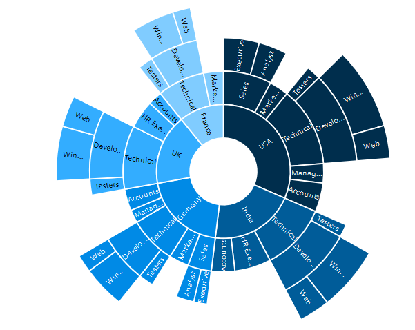
Built- in Themes
The Sunburst Chart supports different themes.
- flat-light
- flat-dark
- gradient-light
- gradient-dark
- azure
- azure-dark
- lime
- lime-dark
- saffron
- saffron-dark
- gradient-azure
- gradient-azure-dark
- gradient-lime
- gradient-lime-dark
- gradient-saffron
- gradient-saffron-dark
You can set your desired theme by using the theme property. Flat light is the default theme used in the Sunburst Chart.
<ej-sunburstchart id="SunburstChart" theme="@SunburstTheme.FlatDark">
</ej-sunburstchart>