Sparkline Customization
29 Nov 20173 minutes to read
This section explains you the customization options available to make changes in the Sparkline for getting better appearance.
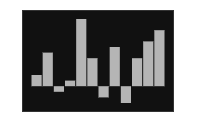
Sparkline background
You can specify the background color for the Sparkline using background property. When you don’t specify the background, it takes “transparent” as background color.
<ej-spark-line id="spark" background="blue">

</ej-spark-line>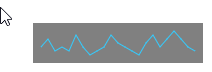
Stroke color and width
You can customize the series border color and width using stroke and width. This is applicable for Sparkline types line and area.
<ej-spark-line id="spark" stroke="blue" width="3">

</ej-spark-line>
Sparkline border
You can customize the border width and height of the Sparkline using border width and border height properties. This is applicable for column, win-loss and pie series.
<ej-spark-line id="spark">

<e-border width="50" height="10"> </e-border>

</ej-spark-line>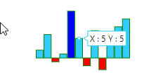
Opacity
By default opacity of the Sparkline is 1. You can specify the opacity value from 0 to 1. This is applicable for all types of series.
<ej-spark-line id="spark" opacity="0.5">

</ej-spark-line>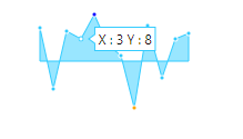
Localization
Sparkline is having support for localization as well. Default culture is “en-US”. You can modify the culture using the property locale.
<ej-spark-line id="spark" opacity="0.5">

</ej-spark-line>
Padding for Sparkline
Padding is used to specify the padding value between the container and Sparkline. By default padding value of the Sparkline is 5.
<ej-spark-line id="spark" padding="2">

</ej-spark-line>
Canvas support
You can control whether Sparkline has to be rendered as SVG or Canvas. Canvas rendering supports all the functionalities supported in SVG rendering.
<ej-spark-line id="spark" enable-canvas-rendering="true">

</ej-spark-line>
Themes
You can specify different themes for Sparkline control.
<ej-spark-line id="spark" theme="saffaron">

</ej-spark-line>