Resize
17 May 201824 minutes to read
Ribbon control dynamically resizes to display possible number of controls in the optimal layout as the application window size changes.
As the window is narrowed, controls in the Ribbon will be combined as group button with dropdown arrow, in which controls can be expanded with dropdown arrow.
Tablet Layout
Set IsResponsive as true to enable resizing in Ribbon. If client width is above 420px or control content exceeds the page then, the ribbon will render in Tablet mode.
<ej-ribbon id="defaultRibbon" width="30%" is-responsive="true">
        <e-application-tab type=Menu menu-item-id="ribbonmenu">
        </e-application-tab>
        <e-tabs>
            <e-tab id="home" text="HOME">
                <e-groups>
                    <e-group text="Clipboard">
                        <e-content>
                            <e-contents>
                                <e-content-groups>
                                    <e-content-group id="cut" text="Cut">
                                    </e-content-group>
                                    <e-content-group id="copy" text="Copy">
                                    </e-content-group>
                                </e-content-groups>
                                <e-defaults width="40" height="70"></e-defaults>
                            </e-contents>
                        </e-content>
                    </e-group>
                    <e-group text="Font">
                        <e-content>
                            <e-contents>
                                <e-content-groups>
                                    <e-content-group id="bold" text="Bold">
                                    </e-content-group>
                                    <e-content-group id="italic" text="Italic">
                                    </e-content-group>
                                </e-content-groups>
                                <e-defaults width="40" height="70"></e-defaults>
                            </e-contents>
                        </e-content>
                    </e-group>
                    <e-group text="Align">
                        <e-content>
                            <e-contents>
                                <e-content-groups>
                                    <e-content-group id="left" text="Left">
                                    </e-content-group>
                                    <e-content-group id="right" text="Right">
                                    </e-content-group>
                                </e-content-groups>
                                <e-defaults width="40" height="70"></e-defaults>
                            </e-contents>
                        </e-content>
                    </e-group>
                </e-groups>
            </e-tab>
        </e-tabs>
   </ej-ribbon>

      <ul id="ribbonmenu">
        <li>
            <a>FILE</a>
            <ul>
                <li><a>New</a></li>
                <li><a>Open</a></li>
            </ul>
        </li>
     </ul>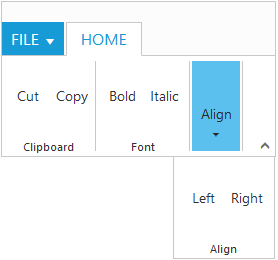
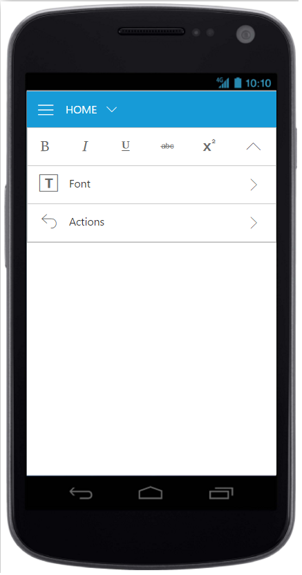
Mobile Layout
If client width is less than 420px, the ribbon will render in mobile mode. In which, you can see that ribbon user interface is customized and redesigned for best view in small screens.
The customized features includes responsive tab & group rendering, backstage, gallery and button controls.
Responsive Tab and group
Set IsResponsive as true to enable responsive mode in Ribbon.
<ej-ribbon id="defaultRibbon" is-responsive="true" width="100%">
        <e-application-tab type=Backstage text="FILE">
            <e-backstage-settings text="FILE" height="360" width="600" headerWidth="125">
                <e-pages>
                    <e-page-collection id="new" text="New" content-id="newCon"></e-page-collection>
                    <e-page-collection id="close" text="Close" enable-separator="true" item-type=Button></e-page-collection>
                    <e-page-collection id="account" text="Office Account" content-id="accountCon"></e-page-collection>
                </e-pages>
            </e-backstage-settings>
        </e-application-tab>
        <e-tabs>
            <e-tab id="home" text="HOME">
                <e-groups>
                    <e-group text="Font" align-type=Rows>
                        <e-content>
                            <e-contents>
                                <e-content-groups>
                                    <e-content-group id="bold" type="ToggleButton" is-mobile-only="true">
                                        <e-toggle-button-settings content-type=ImageOnly default-text="Bold" active-text="Bold" default-prefix-icon="e-icon e-ribbon e-resbold" active-prefix-icon="e-icon e-ribbon e-resbold">
                                        </e-toggle-button-settings>
                                    </e-content-group>
                                    <e-content-group id="italic" type="ToggleButton" is-mobile-only="true">
                                        <e-toggle-button-settings content-type=ImageOnly default-text="Italic" active-text="Italic" default-prefix-icon="e-icon e-ribbon e-resitalic" active-prefix-icon="e-icon e-ribbon e-resitalic">
                                        </e-toggle-button-settings>
                                    </e-content-group>
                                    <e-content-group id="underline" text="Underline" type="ToggleButton" is-mobile-only="true">
                                        <e-toggle-button-settings content-type=ImageOnly default-text="Underline" active-text="Underline" default-prefix-icon="e-icon e-ribbon e-resunderline" active-prefix-icon="e-icon e-ribbon e-resunderline">
                                        </e-toggle-button-settings>
                                    </e-content-group>
                                    <e-content-group id="strikethrough" text="strikethrough" type="ToggleButton" is-mobile-only="true">
                                        <e-toggle-button-settings content-type=ImageOnly default-text="Strickthrough" active-text="Strickthrough" default-prefix-icon="e-icon e-ribbon e-strikethrough" active-prefix-icon="e-icon e-ribbon e-strikethrough">
                                        </e-toggle-button-settings>
                                    </e-content-group>
                                    <e-content-group id="superscript" text="superscript" is-mobile-only="true">
                                        <e-button-settings content-type=ImageOnly prefix-icon="e-icon e-ribbon e-superscripticon">
                                        </e-button-settings>
                                    </e-content-group>
                                </e-content-groups>
                               <e-defaults is-big="false"></e-defaults>
                            </e-contents>
                        </e-content>
                    </e-group>
                    <e-group text="Actions" align-type=Rows>
                        <e-content>
                            <e-contents>
                                <e-content-groups>
                                    <e-content-group id="undo" text="Undo" tool-tip="undo">
                                        <e-button-settings content-type=TextAndImage image-position=ImageTop prefix-icon="e-icon e-ribbon e-undo">
                                        </e-button-settings>
                                    </e-content-group>
                                    <e-content-group id="redo" text="Redo" tool-tip="redo">
                                        <e-button-settings content-type=TextAndImage image-position=ImageTop prefix-icon="e-icon e-ribbon e-redo">
                                        </e-button-settings>
                                    </e-content-group>
                                </e-content-groups>
                                <e-defaults type=Button width="40px" height="70px" is-big="false"></e-defaults>
                            </e-contents>
                        </e-content>
                    </e-group>
                </e-groups>
            </e-tab>
        </e-tabs>
   </ej-ribbon>

     <div id="newCon">
        <table>
            <tr>
                <td>
                    <button id="btn1" class="e-bsnewbtnstyle">Blank WorkBook</button>
                </td>
            </tr>
        </table>
     </div>
     <div id="accountCon">
        <div class="e-userDiv">
            <span>User Information</span>
            <div>
                <div class="e-accuser e-newpageicon"></div>
                <div class="e-userCon">
                    <div>user</div>
                    <div>[email protected]</div>
                </div>
            </div>
        </div>
        <a href="#">Sign out</a>
     </div>
    @section ScriptSection{
     <script>
        $("#btn1").ejButton({
           size: "large",
           height: 200,
           width: 205,
           contentType: "textandimage",
           imagePosition: "imagetop",
           prefixIcon: "e-icon e-blank e-infopageicon"
         });
     </script>
     }
    @section StyleSection{
         <link href="@Url.Content("~/css/ejthemes/ribbon-css/ej.icons.css")" rel="stylesheet" />
           <style type="text/css">
                 .e-accuser {
                      background-image: url('../css/ejthemes/common-images/ribbon/user.jpg');
                  }
                 .e-blank {
                      background-image: url('../css/ejthemes/common-images/ribbon/blank.png');
                  }
                 .e-infopageicon {
                      background-repeat: no-repeat;
                      height: 150px;
                      width: 198px;
                 }
                .e-newpageicon {
                     background-repeat: no-repeat;
                     height: 42px;
                     width: 42px;
                 }
                .e-bspagestyle {
                     line-height: 0;
                     font-size: 30px;
                 }
                .e-ribbon .e-ribbonbackstagepage .e-bsnewbtnstyle {
                     color: #212121;
                     background: #fdfdfd;
                     margin: 20px;
                 }
            </style>
      }
NOTE
To make the Ribbon control to react as responsive in mobile devices, it is necessary to refer the additional
ej.responsive.cssfile in the application.
Mobile Toolbar Customization
Set IsMobileOnly as true to group control to show the controls
in the Mobile Toolbar of the ribbon. For each tab , first row of mobile ribbon will pick and display the controls which is set as IsMobileOnly with look adapt to mobile mode.If IsMobileOnly property is not defined to any of the control within tab, then by default fist group content will be displayed in first row toolbar.
To adapt to proper display of controls , following layout will be customized with constants display.
- First ribbon toolbar and Button controls with min-height.
- Drop down control will adapt to full screen width.
- All button controls icon will be displayed commonly as Top position.
<ej-ribbon id="defaultRibbon" is-responsive="true">
        <e-application-tab type=Backstage text="FILE">
            <e-backstage-settings text="FILE" height="360" width="600" headerWidth="125">
                <e-pages>
                    <e-page-collection id="new" text="New" content-id="newCon"></e-page-collection>
                    <e-page-collection id="close" text="Close" enable-separator="true" item-type=Button></e-page-collection>
                    <e-page-collection id="account" text="Office Account" content-id="accountCon"></e-page-collection>
                </e-pages>
            </e-backstage-settings>
        </e-application-tab>
        <e-tabs>
            <e-tab id="home" text="HOME">
                <e-groups>
                    <e-group text="Font" align-type=Rows>
                        <e-content>
                            <e-contents>
                                <e-content-groups>
                                    <e-content-group id="bold" type="ToggleButton" is-mobile-only="true">
                                        <e-toggle-button-settings content-type=ImageOnly default-text="Bold" active-text="Bold" default-prefix-icon="e-icon e-ribbon e-resbold" active-prefix-icon="e-icon e-ribbon e-resbold">
                                        </e-toggle-button-settings>
                                    </e-content-group>
                                    <e-content-group id="italic" type="ToggleButton" is-mobile-only="true">
                                        <e-toggle-button-settings content-type=ImageOnly default-text="Italic" active-text="Italic" default-prefix-icon="e-icon e-ribbon e-resitalic" active-prefix-icon="e-icon e-ribbon e-resitalic">
                                        </e-toggle-button-settings>
                                    </e-content-group>
                                    <e-content-group id="underline" text="Underline" type="ToggleButton" is-mobile-only="true">
                                        <e-toggle-button-settings content-type=ImageOnly default-text="Underline" active-text="Underline" default-prefix-icon="e-icon e-ribbon e-resunderline" active-prefix-icon="e-icon e-ribbon e-resunderline">
                                        </e-toggle-button-settings>
                                    </e-content-group>
                                    <e-content-group id="strikethrough" text="strikethrough" type="ToggleButton">
                                        <e-toggle-button-settings content-type=ImageOnly default-text="Strickthrough" active-text="Strickthrough" default-prefix-icon="e-icon e-ribbon e-strikethrough" active-prefix-icon="e-icon e-ribbon e-strikethrough">
                                        </e-toggle-button-settings>
                                    </e-content-group>
                                    <e-content-group id="superscript" text="superscript">
                                        <e-button-settings content-type=ImageOnly prefix-icon="e-icon e-ribbon e-superscripticon">
                                        </e-button-settings>
                                    </e-content-group>
                                </e-content-groups>

                                <e-defaults is-big="false"></e-defaults>
                            </e-contents>
                        </e-content>
                    </e-group>
                </e-groups>
            </e-tab>
        </e-tabs>
   </ej-ribbon>

     <div id="newCon">
        <table>
            <tr>
                <td>
                    <button id="btn1" class="e-bsnewbtnstyle">Blank WorkBook</button>
                </td>
            </tr>
        </table>
     </div>
     <div id="accountCon">
        <div class="e-userDiv">
            <span>User Information</span>
            <div>
                <div class="e-accuser e-newpageicon"></div>
                <div class="e-userCon">
                    <div>user</div>
                    <div>[email protected]</div>
                </div>
            </div>
        </div>
        <a href="#">Sign out</a>
     </div>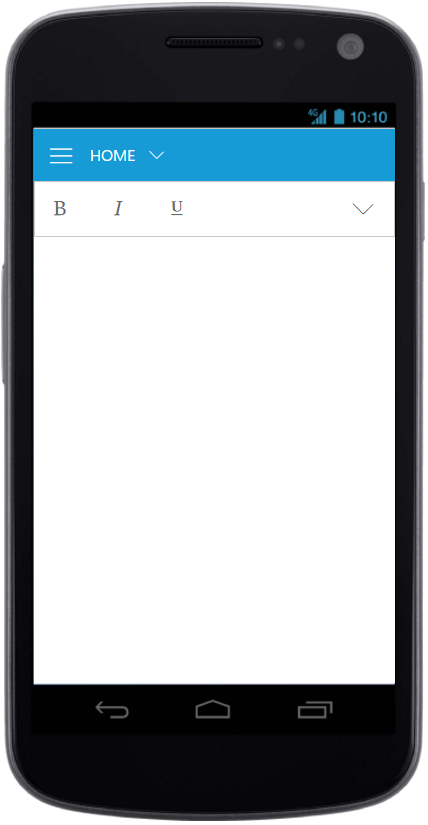
Ribbon Responsive with MobileToolbar
Customized Features
The customized layout for Quick Access Toolbar, backstage, gallery can be seen following screen shots.
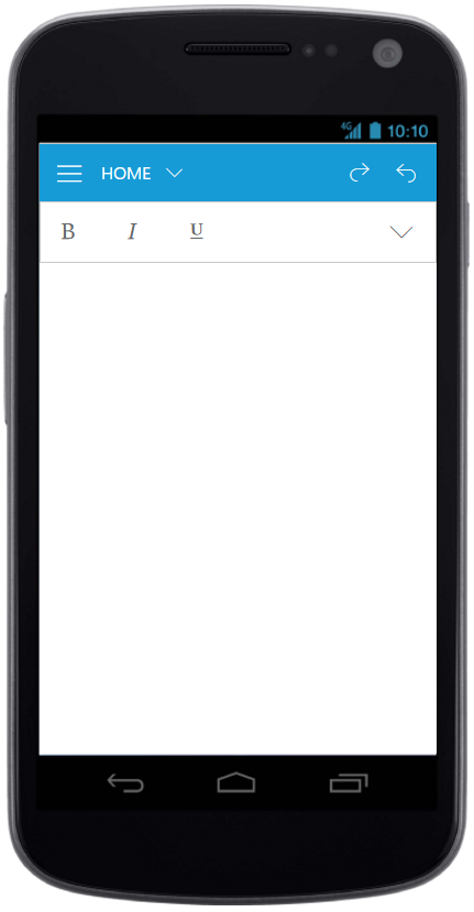
Ribbon Responsive with Quick Access Toolbar
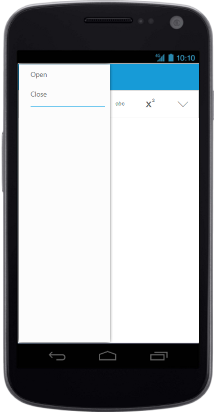
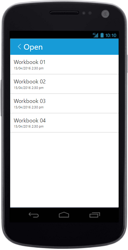
Ribbon Responsive with backstage
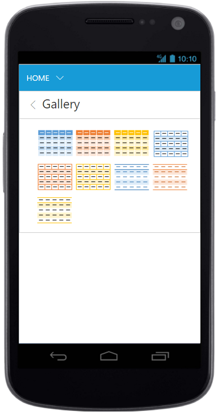
Ribbon Responsive with gallery
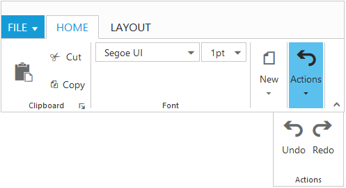
Group Button Customization
Based on window size, detailed group is shrined into single button and you can expand group items with group button click.
For each group shirked for resizing, Custom Class will be added based on group text.For example, e-Action whereas Action is group text. Using this custom class, group button can be customized such as to set icons etc.
<ej-ribbon id="defaultRibbon" width="36%" allow-resizing="true">
        <e-application-tab type=Menu menu-item-id="ribbonmenu">
        </e-application-tab>
        <e-tabs>
            <e-tab id="home" text="HOME">
                <e-groups>
                    <e-group text="Clipboard" align-type=Columns enable-group-expander="true">
                        <e-content>
                            <e-contents>
                                <e-defaults is-big="true" width="50" height="70"></e-defaults>
                                <e-content-groups>
                                    <e-content-group id="paste" text="paste" tool-tip="Paste">
                                        <e-button-settings content-type=ImageOnly prefix-icon="e-icon e-ribbon e-ribbonpaste">
                                        </e-button-settings>
                                    </e-content-group>
                                </e-content-groups>
                            </e-contents>
                            <e-contents>
                                <e-defaults is-big="false" width="60" height="40"></e-defaults>
                                <e-content-groups>
                                    <e-content-group id="cut" text="Cut" tool-tip="Cut">
                                        <e-button-settings content-type=TextAndImage prefix-icon="e-icon e-ribbon e-ribboncut">
                                        </e-button-settings>
                                    </e-content-group>
                                    <e-content-group id="copy" text="Copy" tool-tip="Copy">
                                        <e-button-settings content-type=TextAndImage prefix-icon="e-icon e-ribbon e-ribboncopy">
                                        </e-button-settings>
                                    </e-content-group>
                                </e-content-groups>
                            </e-contents>
                        </e-content>
                    </e-group>
                    <e-group text="Font" align-type=Rows>
                        <e-content>
                            <e-contents>
                                <e-defaults is-big="false" type=DropDownList height="28"></e-defaults>
                                <e-content-groups>
                                    <e-content-group id="fontfamily" tool-tip="Font">
                                        <e-dropdown-settings datasource="ViewBag.datasource" text="Segoe UI" width="150">
                                        </e-dropdown-settings>
                                    </e-content-group>
                                    <e-content-group id="fontsize" tool-tip="FontSize">
                                        <e-dropdown-settings datasource="ViewBag.datasource1" text="1pt" width="65">
                                        </e-dropdown-settings>
                                    </e-content-group>
                                </e-content-groups>
                            </e-contents>
                        </e-content>
                    </e-group>
                    <e-group text="New" align-type=Rows>
                        <e-content>
                            <e-contents>
                                <e-defaults height="40" width="60"></e-defaults>
                                <e-content-groups>
                                    <e-content-group id="new" text="New" tool-tip="New">
                                        <e-button-settings content-type="ImageOnly" image-position="ImageTop" prefix-icon="e-icon e-ribbon e-new">
                                        </e-button-settings>
                                    </e-content-group>
                                </e-content-groups>
                            </e-contents>
                        </e-content>
                    </e-group>
                    <e-group text="Actions" align-type=Rows>
                        <e-content>
                            <e-contents>
                                <e-defaults height="70" width="40"></e-defaults>
                                <e-content-groups>
                                    <e-content-group id="undo" text="Undo" tool-tip="Undo">
                                        <e-button-settings content-type="TextAndImage" image-position="ImageTop" prefix-icon="e-icon e-ribbon e-undo">
                                        </e-button-settings>
                                    </e-content-group>
                                    <e-content-group id="redo" text="Redo" tool-tip="Redo">
                                        <e-button-settings content-type="TextAndImage" image-position="ImageTop" prefix-icon="e-icon e-ribbon e-redo">
                                        </e-button-settings>
                                    </e-content-group>
                                </e-content-groups>
                            </e-contents>
                        </e-content>
                    </e-group>
                </e-groups>
            </e-tab>
            <e-tab id="layout" text="LAYOUT">
                <e-groups>
                    <e-group text="Print Layout" align-type=Rows>
                        <e-content>
                            <e-contents>
                                <e-defaults width="80" height="70"></e-defaults>
                                <e-content-groups>
                                    <e-content-group id="printlayout" text="Print Layout" tool-tip="Print Layout">
                                        <e-button-settings content-type=TextAndImage image-position=ImageTop prefix-icon="e-icon e-ribbon e-printlayout">
                                        </e-button-settings>
                                    </e-content-group>
                                </e-content-groups>
                            </e-contents>
                        </e-content>
                    </e-group>
                </e-groups>
            </e-tab>
        </e-tabs>
   </ej-ribbon>

   <ul id="ribbonmenu">
        <li>
            <a>FILE</a>
            <ul>
                <li><a>New</a></li>
                <li><a>Open</a></li>
            </ul>
        </li>
   </ul>


   @section StyleSection{
     <link href="~/lib/syncfusion-javascript/Content/ej/web/ribbon-css/ej.icons.css" rel="stylesheet" />
     <style type="text/css">
        .e-ribbon .e-New:before, .e-ribbon .e-Actions:before {
            font-family: "ej-ribbonfont";
            font-size: 28px;
            line-height: 35px;
        }
        .e-ribbon .e-New:before {
            content: "\e167";
            text-indent: -1.5px;
        }
        .e-ribbon .e-Actions:before {
            content: "\e184";
            text-indent: 7px;
        }
    </style>
     }
public partial class RibbonController: Controller
{
List<FontFamily> fontFamily1 = new List<FontFamily>();
List<FontPoint> fontPoint1 = new List<FontPoint>();
public ActionResult RibbonFeatures()
{
fontFamily1.Add(new FontFamily { text = "Segoe UI" });
fontFamily1.Add(new FontFamily { text = "Arial" });
fontFamily1.Add(new FontFamily { text = "Times New Roman" });
fontFamily1.Add(new FontFamily { text = "Tahoma" });
fontFamily1.Add(new FontFamily { text = "Helvetica" });
ViewBag.datasource = fontFamily1;
fontPoint1.Add(new FontPoint { text = "1pt" });
fontPoint1.Add(new FontPoint { text = "2pt" });
fontPoint1.Add(new FontPoint { text = "3pt" });
fontPoint1.Add(new FontPoint { text = "4pt" });
fontPoint1.Add(new FontPoint { text = "5pt" });
ViewBag.datasource1 = fontPoint1;
return View();
}
}
public class FontFamily
{
public string text { get; set; }
}
public class FontPoint
{
public string text { get; set; }
}