Controls Support
17 May 201821 minutes to read
Button, SplitButton, DropDownList, ToggleButton, Gallery and Custom controls can be added to each groups. You can set Type property in group to define the controls. Default Type is Button.
Built in Controls
The following table describes about the built in controls Type and their corresponding control settings.
| Type | Control Settings | Example |
|---|---|---|
| Button | Button - button-settings | button-settings width="70" content-type= "ImageOnly" prefix-icon="e-icon e-ribbon e-new" |
| SplitButton | SplitButton - split-button-settings | split-button-settings content-type="ImageOnly" target-id="pasteSplit" button-mode="dropdown" arrow-position=Bottom |
| ToggleButton | ToggleButton - toggle-button-settings | toggle-button-settings content-type="ImageOnly" default-text="Italic" active-text="Italic" |
| DropDownList | DropDownList - dropdown-settings | dropdown-settings datasource="ViewBag.datasource" text="1pt" width="65" |
NOTE
- You can specify type either to group’s collection or to each group.
- For
Typeproperty you can assign either string value (“SplitButton”) or enum value (RibbonButtonType.SplitButton).
<ej-ribbon id="defaultRibbon" width="100%">
<e-application-tab type=Menu menu-item-id="ribbonmenu">
<e-menu-settings open-on-click="false">
</e-menu-settings>
</e-application-tab>
<e-tabs>
<e-tab id="home" text="HOME">
<e-groups>
<e-group text="New" align-type=Rows>
<e-content>
<e-contents>
<e-defaults width="60" height="70" type=Button></e-defaults>
<e-content-groups>
<e-content-group id="new" text="New" tool-tip="New">
<e-button-settings image-position="ImageTop" content-type="ImageOnly" prefix-icon="e-icon e-ribbon e-new">
</e-button-settings>
</e-content-group>
</e-content-groups>
</e-contents>
</e-content>
</e-group>
<e-group text="Clipboard" align-type=Columns>
<e-content>
<e-contents>
<e-defaults width="50" height="70" type=SplitButton></e-defaults>
<e-content-groups>
<e-content-group id="paste" text="Paste" tool-tip="Paste">
<e-split-button-settings button-mode=Dropdown arrow-position="Bottom" target-id="pasteSplit" content-type="ImageOnly" prefix-icon="e-icon e-ribbon e-ribbonpaste">
</e-split-button-settings>
</e-content-group>
</e-content-groups>
</e-contents>
</e-content>
</e-group>
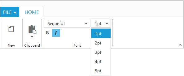
<e-group text="Font" align-type=Rows>
<e-content>
<e-contents>
<e-defaults height="28" type=DropDownList></e-defaults>
<e-content-groups>
<e-content-group id="fontfamily" tool-tip="Font">
<e-dropdown-settings datasource="ViewBag.datasource" text="Segoe UI" width="150">
</e-dropdown-settings>
</e-content-group>
<e-content-group id="fontsize" tool-tip="FontSize">
<e-dropdown-settings datasource="ViewBag.datasource1" text="1pt" width="65">
</e-dropdown-settings>
</e-content-group>
</e-content-groups>
</e-contents>
<e-contents>
<e-defaults is-big="false"></e-defaults>
<e-content-groups>
<e-content-group id="bold" tool-tip="Bold" type="ToggleButton">
<e-toggle-button-settings default-text="Bold" content-type="ImageOnly" active-text="Bold" default-prefix-icon="e-icon e-ribbon bold" active-prefix-icon="e-icon e-ribbon bold">
</e-toggle-button-settings>
</e-content-group>
<e-content-group id="italic" tool-tip="Italic" type="ToggleButton">
<e-toggle-button-settings default-text="Italic" content-type="ImageOnly" active-text="Italic" default-prefix-icon="e-icon e-ribbonitalic" active-prefix-icon="e-icon e-ribbonitalic">
</e-toggle-button-settings>
</e-content-group>
</e-content-groups>
</e-contents>
</e-content>
</e-group>
</e-groups>
</e-tab>
</e-tabs>
</ej-ribbon>
<ul id="ribbonmenu">
<li>
<a>FILE</a>
<ul>
<li>
<a>New</a>
</li>
</ul>
</li>
</ul>
<ul id="pasteSplit">
<li><a>Paste</a></li>
</ul>public partial class RibbonController: Controller
{
List<FontFamily> fontFamily1 = new List<FontFamily>();
List<FontPoint> fontPoint1 = new List<FontPoint>();
public ActionResult RibbonFeatures()
{
fontFamily1.Add(new FontFamily { text = "Segoe UI" });
fontFamily1.Add(new FontFamily { text = "Arial" });
fontFamily1.Add(new FontFamily { text = "Times New Roman" });
fontFamily1.Add(new FontFamily { text = "Tahoma" });
fontFamily1.Add(new FontFamily { text = "Helvetica" });
ViewBag.datasource = fontFamily1;
fontPoint1.Add(new FontPoint { text = "1pt" });
fontPoint1.Add(new FontPoint { text = "2pt" });
fontPoint1.Add(new FontPoint { text = "3pt" });
fontPoint1.Add(new FontPoint { text = "4pt" });
fontPoint1.Add(new FontPoint { text = "5pt" });
ViewBag.datasource1 = fontPoint1;
return View();
}
}
public class FontFamily
{
public string text { get; set; }
}
public class FontPoint
{
public string text { get; set; }
}
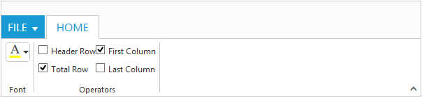
Custom
You can set Type as custom to render custom controls and Custom element id has to be specified as ContentID.You can change the element defined in the custom template to appropriate Syncfusion control in the event of Ribbon Create.
<ej-ribbon id="defaultRibbon" width="600" create="createControl">
        <e-application-tab type=Menu menu-item-id="ribbonmenu">
        </e-application-tab>
        <e-tabs>
            <e-tab id="home" text="HOME">
                <e-groups>
                    <e-group text="Font">
                        <e-content>
                            <e-contents>
                                <e-defaults height="30" type=Custom></e-defaults>
                                <e-content-groups>
                                    <e-content-group id="fontColor" tool-tip="Font Color" content-id="fontColor">
                                    </e-content-group>
                                </e-content-groups>
                            </e-contents>
                        </e-content>
                    </e-group>
                    <e-group text="Operators">
                        <e-content>
                            <e-contents>
                                <e-content-groups>
                                    <e-content-group id="design" type="Custom" content-id="design">
                                    </e-content-group>
                                </e-content-groups>
                            </e-contents>
                        </e-content>
                    </e-group>
                </e-groups>
            </e-tab>
        </e-tabs>
   </ej-ribbon>

   <ul id="ribbonmenu">
        <li>
            <a>FILE</a>
            <ul>
                <li><a>New</a></li>
                <li><a>Print</a></li>
            </ul>
        </li>
   </ul>
   <input id="fontColor" />
   <table id="design" class="e-designtablestyle">
        <tr>
            <td><input type="checkbox" id="check1" /><label for="check1">Header Row</label></td>
            <td><input type="checkbox" id="Check2" checked="checked" /><label for="Check2">First Column</label></td>
        </tr>
        <tr><td><input type="checkbox" id="check4" checked="checked" /><label for="check4">Total Row</label></td>
            <td><input type="checkbox" id="Check5" /><label for="Check5">Last Column</label></td>
        </tr>
   </table>
   <script>
        function createControl(args) {
            $("#fontColor").ejColorPicker({ value: "#FFFF00", modelType: "palette", cssClass: "e-ribbon", toolIcon: "e-fontcoloricon" });
        }
    </script>