Customizations in Essential ASP.NET Core Gantt
19 Dec 202213 minutes to read
Gantt provides support for the following UI customizations,
- Taskbar template
- Task label template
- Tooltip template
Taskbar template
You can design your own taskbars to view the tasks in Gantt by using taskbar-template property. And it is possible to map the JsRender script or script element’s ID to this property. It is also possible to customize the parent taskbars and milestones with custom templates by using parent-taskbar-template and milestone-template properties.
The following code example shows how to define template for taskbars in Gantt.
<script type="text/x-jsrender" id="taskbarTemplate">

    <div class="e-gantt-template-taskbar bg-color">

        <div>

            //…

        </div>

        <div class="e-gantt-template-progressbar">

        </div>

    </div>

</script>

<script type="text/x-jsrender" id="parentTaskbarTemplate">

    <div class="e-gantt-template-taskbar">

        //…

        <div class="e-gantt-template-progressbar">

        </div>

    </div>

</script>

<script type="text/x-jsrender" id="milestoneTemplate">

    <div class="e-gantt-template-milestone" style="background-color:transparent;">

        <div class="e-gantt-milestone milestone-top"></div>

        <div class="e-gantt-milestone milestone-bottom"></div>

    </div>

</script>

<ej-gantt id="GanttContainer" datasource="ViewBag.datasource"
        //...
        taskbar-template="#taskbarTemplate"
        parent-taskbar-template="#parentTaskbarTemplate"
        milestone-template="#milestoneTemplate">
</ejGantt>
The DOM structure and class names mentioned in the above code snippet is mandatory for providing the editing support in custom templates.
The following screenshot shows the template for taskbars in Gantt.
Task label template
By default, task name will be displayed to the left and resource names will be displayed to the right of the taskbars as task labels. We can enable/disable this default task labels by using show-task-names and show-resource-names properties. But these task labels are customizable.
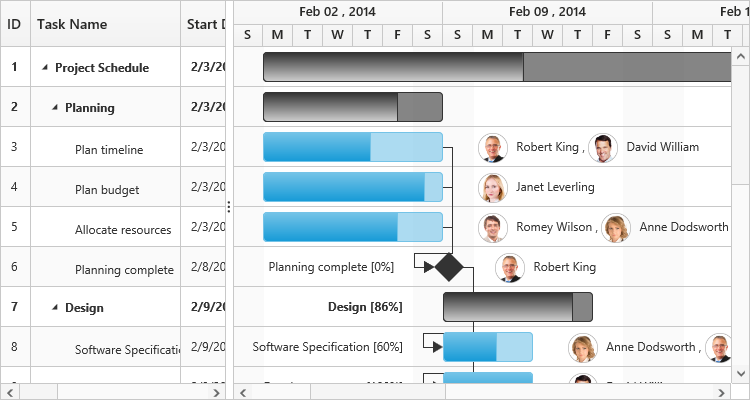
Mapping data source fields as task labels
It is also possible to set any data source fields as task labels using right-task-label-mapping and left-task-label-mapping properties.
The following code example explains how to set task name field as right label and task ID field as left label,
<ej-gantt id="GanttContainer" datasource="ViewBag.datasource"
        //...
        right-task-label-mapping="taskName"
        left-task-label-mapping="taskID">
  </ejGantt>
The following screenshot shows Gantt with task labels mapped with different data source fields
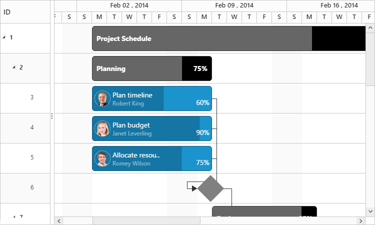
Task label templates
It is possible to customize the task labels with templates, by using right-task-label-template and left-task-label-template properties. The following code example explains how to map custom templates to task labels.
<script id="rightLabelTemplate" type="text/x-jsrender">

    {{if #data['resourceNames']}}

    <div>

        {{for resourceInfo}}

        <img src="14.2.0.26/themes/web/content/images/gantt/{{:resourceName}}.png" height="30px" />

        <span style="margin-left:5px;">{{:resourceName}}</span> {{:~_getSeparator(#get("array").data.length,#index)}} {{/for}}

    </div>


</script>

<script id="leftLabelTemplate" type="text/x-jsrender">

    <div style="padding-top:5px;">

        <span>{{:#data['taskName']}}  [{{:status}}%]</span>

    </div>

</script>

<ej-gantt id="GanttContainer" datasource="ViewBag.datasource"
        //...
        right-task-label-template="#rightLabelTemplate"
        left-task-label-template="#leftLabelTemplate">
</ejGantt>
The following screenshot shows Gantt with task label templates.
Tooltip template
Taskbar tooltip
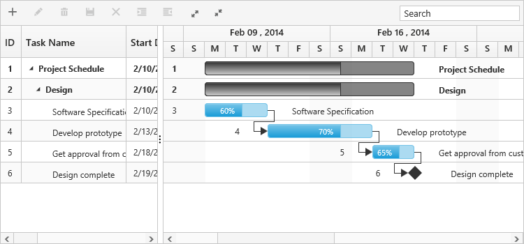
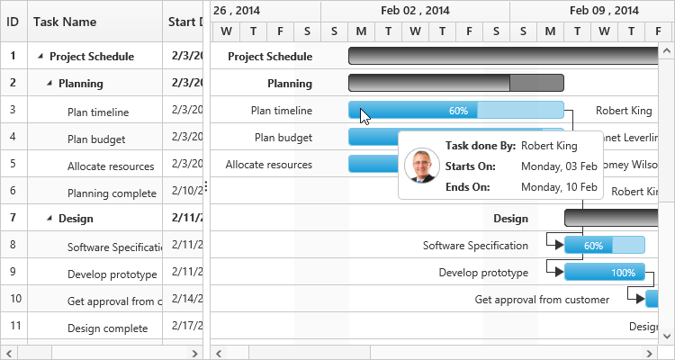
The default tooltip in Gantt can be customized by using the taskbar-tooltip-template-id property. We need to map the JsRender script element’s ID value to this property.
The following code example shows how to customize the tooltip.
<script type="text/x-jsrender" id="tooltipTemplate">

    <table>

       {{if #data['resourceNames']}}

        <tr>

            <td rowspan="3" style="padding:3px"><img src="14.2.0.26/themes/web/content/images/gantt/{{:#data['resourceNames']}}.png" height="40px" /></td>

            <td style="padding:3px"><b>Task done By:</b></td>

            <td style="padding:3px">{{:#data['resourceNames']}}</td>

        </tr>

        }}

        <tr>

            <td style="padding:3px"><b>Starts On:</b></td>

            <td style="padding:3px">{{:~_ganttDateFormatter("startDate")}}</td>

        </tr>

        <tr>

            <td style="padding:3px"><b>Ends On:</b></td>

            <td style="padding:3px">{{:~_ganttDateFormatter("endDate")}}</td>

        </tr>

    </table>

</script>

<ej-gantt id="GanttContainer" datasource="ViewBag.datasource"
    //...
    taskbar-tooltip-template-id="tooltipTemplate">
</ejGantt>
The following screenshot shows Gantt with task tooltip customization.
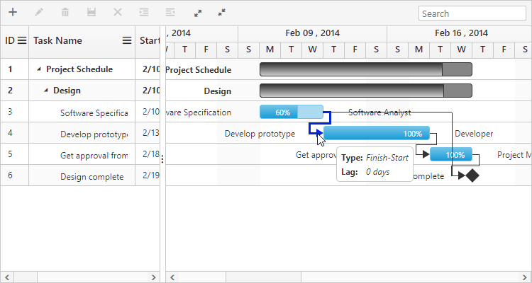
Dependency tooltip
The default dependency tooltip in Gantt can be customized by using predecessor-tooltip-template property. We can map value to this property as JsRender template script id with prefix of ‘#’ or HTML elements in string format. The following code example shows how to use the predecessor-tooltip-template property.
<script type="text/javascript">

    $.views.helpers({
        _Type: getType,
        _Lag: getLag
    });

    function getType() {
        return this.data.linkText;
    }

    function getLag() {
        return this.data.offset + " " + this.data.offsetUnit;
    }
</script>

<script id="ToolTipTemplate" type="text/x-jsrender">

    <table>
            <tr>
                <td><b>Type:</b></td>
                <td><i></i></td>
            </tr>
            <tr>
                <td><b>Lag:</b></td>
                <td><i></i></td>
            </tr>
    </table>

</script>

<ej-gantt id="GanttContainer" datasource="ViewBag.datasource"
    //...
    predecessor-tooltip-template="ToolTipTemplate">
</ejGantt>
The following screenshot show the output of above code example.
Cell tooltip
TreeGrid part tooltip can also be customized using cell-tooltip-template property. We need to map the script element or element id to this property. The following code explains how to customize the cell tooltip in Gantt.
<script type="text/javascript">

    $.views.helpers({
        _TaskID: getTaskID,
        _TaskName: getTaskName
    });

    function getTaskID() {
        return this.data.record["taskId"];
    }

    function getTaskName() {
        return this.data.record["taskName"];
    }
</script>

<script id="CustomToolTip" type="text/x-jsrender">
    <table>
        <tr>
            <td>Id:</td>
            <td>{{:~_TaskID()}}</td>
        </tr>
        <tr>
            <td>Name:</td>
            <td>{{:~_TaskName()}}</td>
        </tr>
    </table>
</script>

<ej-gantt id="GanttContainer" datasource="ViewBag.datasource"
    //...
    show-grid-cell-tooltip="true"
    cell-tooltip-template="#CustomToolTip">
</ejGantt>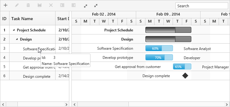
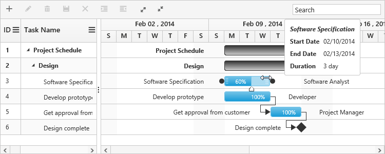
Taskbar Editing Tooltip
Editing tooltip is used to show the updated start date, end date, duration and progress values of a task while resizing, dragging and progress bar resizing actions. Currently two editing tooltips are available in Gantt.
- Taskbar editing tooltip
- Progress bar editing tooltip
We can customize the default taskbar editing tooltip and progress bar editing tooltip in Gantt.
Customize taskbar editing tooltip
Taskbar editing tooltip can be customized by using taskbar-editing-tooltip-template and taskbar-editing-tooltip-template-id properties. The below code example shows how to customize the taskbar editing tooltip in Gantt.
<script type="text/javascript">
    $.views.helpers({
        getStartDate: function () {
            return ej.format(this.data.startDate, "MM/dd/yyyy", "en-US");
        },
        getEndDate: function () {
            return ej.format(this.data.endDate, "MM/dd/yyyy", "en-US");
        }
    });
</script>

<script id="taskbar_editing_tooltip_template" type="text/x-jsrender">
    <table>
        <tr>
            <td colspan="2" style="padding:3px;font-weight:bold;font-style:italic"></td>
        </tr>
        <tr>
            <td style="padding:3px;font-weight:bold">Start Date</td>
            <td style="padding:3px"></td>
        </tr>
        <tr>
            <td style="padding:3px;font-weight:bold">End Date</td>
            <td style="padding:3px"></td>
        </tr>
        <tr>
            <td style="padding:3px;font-weight:bold">Duration</td>
            <td style="padding:3px"> </td>
        </tr>
    </table>
</script>

<ej-gantt id="GanttContainer" datasource="ViewBag.datasource"
    //...
    TaskbarEditingTooltipTemplateId="taskbar_editing_tooltip_template">
</ejGantt>
The below screenshot shows the output of above code example.
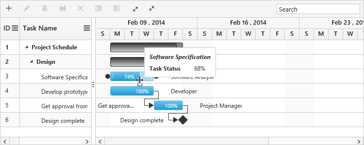
Customize progress bar editing tooltip
Progress bar editing tooltip can be customized by using progressbar-tooltip-template and progressbar-tooltip-template-id properties. The below code example shows how to customize the progress bar editing tooltip in Gantt.
<script id="progressbar_editing_tooltip_template" type="text/x-jsrender">
    <table>
        <tr>
            <td colspan="2" style="padding:3px;font-weight:bold;font-style:italic"></td>
        </tr>
        <tr>
            <td style="padding:3px;font-weight:bold">Task Status</td>
            <td style="padding:3px">%</td>
        </tr>
    </table>
</script>

<ej-gantt id="GanttContainer" datasource="ViewBag.datasource"
    //...
    progressbar-tooltip-template-id="progressbar_editing_tooltip_template">
</ejGantt>
The below screenshot shows the output of above code example.