How can I help you?
Templates
The ComboBox has been provided with several options to customize each list item, group title, selected value, header, and footer elements.
Item template
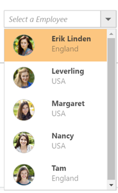
The content of each list item within the ComboBox can be customized with the help of itemTemplate property.
In the following sample, each list item is split into two columns to display the relevant data.
<div class="frame">
        <div class="control">
                 <ej-combo-box id="selectCountry" datasource="(IEnumerable<empList>)ViewBag.datasource" placeholder="Select a country" width="100%" item-template="<div><img class='eimg' src='../images/combobox/${eimg}.png' alt='employee'/><div class='ename'> ${text} </div><div class='temp'> ${country} </div></div>">
                <e-combo-box-fields text="text" />
            </ej-combo-box>
        </div>
</div><style>
.ename {
font-weight: bold;
display: block !important;
opacity: .87;
}
.tempName {
padding: 5px 42px;
opacity: .87;
}
.temp {
margin-top: -15px;
opacity: .54;
}
.eimg {
border-radius: 50%;
padding: 10px 16px;
width: 40px;
height: 40px;
float: left;
}
.tempImg {
padding-bottom: 3px;
border-radius: 50%;
float: left;
}
.e-dropdownbase .e-list-item * {
display: block;
}
</style>Output for item template combobox control is as follows.
Group template
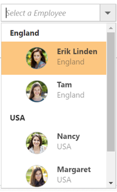
The group header title with appropriate sub-items are categorized that is customized with the help of the groupTemplate property. This template is common for both inline and floating group header template.
In the following sample, employees are grouped according to their city.
<div class="frame">
        <div class="control">
             <ej-combo-box id="selectCountry" datasource="(IEnumerable<empList>)ViewBag.datasource" placeholder="Select a country" width="100%" item-template="<div><img class='eimg' src='../images/combobox/${eimg}.png' alt='employee'/><div class='ename'> ${text} </div><div class='temp'> ${country} </div></div>" group-template="<strong>${country}</strong>">
                <e-combo-box-fields text="text" group-by="country"/>
            </ej-combo-box>
        </div>
</div><style>
.ename {
font-weight: bold;
display: block !important;
opacity: .87;
}
.tempName {
padding: 5px 42px;
opacity: .87;
}
.temp {
margin-top: -15px;
opacity: .54;
}
.eimg {
border-radius: 50%;
padding: 10px 16px;
width: 40px;
height: 40px;
float: left;
}
.tempImg {
padding-bottom: 3px;
border-radius: 50%;
float: left;
}
.e-dropdownbase .e-list-item * {
display: block;
}
</style>Output for group template combobox control is as follows.
Header template
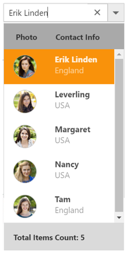
The header element is shown statically at the top of the popup list items within the ComboBox, and any custom element can be placed as a header element using the headerTemplate property.
In the following sample, the list items and its headers are designed, and displayed as two columns similar to the multiple columns of the grid.
<div class="frame">
        <div class="control">
            <ej-combo-box id="selectCountry" datasource="(IEnumerable<empList>)ViewBag.datasource" placeholder="Select a country" width="100%" header-template="<div class='head'>  Photo  <span style='padding-left:42px'> Contact Info </span></div>" item-template="<div><img class='eimg' src='../images/combobox/${eimg}.png' alt='employee'/><div class='ename'> ${text} </div><div class='temp'> ${country} </div></div>" footer-template="<div class='Foot'> Total Items Count: 5 </div>">
                <e-combo-box-fields text="text" />
            </ej-combo-box>
        </div>
</div><style>
.head {
background-color: #a9a9a9;
height: 30px;
font-weight: bold;
padding: 14px 0 0 20px;
}
.ename {
font-weight: bold;
display: block !important;
opacity: .87;
}
.tempName {
padding: 5px 42px;
opacity: .87;
}
.temp {
margin-top: -15px;
opacity: .54;
}
.eimg {
border-radius: 50%;
padding: 10px 16px;
width: 40px;
height: 40px;
float: left;
}
.tempImg {
padding-bottom: 3px;
border-radius: 50%;
float: left;
}
.e-dropdownbase .e-list-item * {
display: block;
}
</style>Output for item template combobox control is as follows.
Footer template
The ComboBox has an option to show a footer element at the bottom of the list items in the popup list. Here, you can place any custom element as a footer element by using the footerTemplate property.
In the following sample, footer element displays the total number of list items present in the ComboBox.
<div class="frame">
        <div class="control">
             <ej-combo-box id="selectCountry" datasource="(IEnumerable<empList>)ViewBag.datasource" placeholder="Select a country" width="100%" item-template="<div><img class='eimg' src='../images/combobox/${eimg}.png' alt='employee'/><div class='ename'> ${text} </div><div class='temp'> ${country} </div></div>" footer-template="<div class='Foot'> Total Items Count: 5 </div>">
                <e-combo-box-fields text="text" />
            </ej-combo-box>
        </div>
</div><style>
.Foot {
background-color: #dadada;
vertical-align: middle;
padding: 16px;
font-weight: bold;
}
.ename {
font-weight: bold;
display: block !important;
opacity: .87;
}
.tempName {
padding: 5px 42px;
opacity: .87;
}
.temp {
margin-top: -15px;
opacity: .54;
}
.eimg {
border-radius: 50%;
padding: 10px 16px;
width: 40px;
height: 40px;
float: left;
}
.tempImg {
padding-bottom: 3px;
border-radius: 50%;
float: left;
}
.e-dropdownbase .e-list-item * {
display: block;
}
</style>Output for footer template combobox control is as follows.

No records template
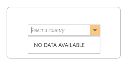
The ComboBox is provided with support to custom design the popup list content when no data is found and no matches found on search with the help of the noRecordsTemplate property.
In the following sample, popup list content displays the notification of no data available.
<div class="frame">
        <div class="control">
            <ej-combo-box id="searchCustomer" query="ej.Query().from('Suppliers').select('SupplierID', 'ContactName').take(0)" no-records-template="<span class='norecord'> NO DATA AVAILABLE</span>" placeholder="Select a customer" width="100%">
                <e-datamanager url="//js.syncfusion.com/ejServices/wcf/NorthWind.svc/" offline="false" cross-domain="true"></e-datamanager>
                <e-combo-box-fields text="ContactName" value="SupplierID" />
            </ej-combo-box>
        </div>
</div>public ActionResult Data()
{
return View();
}Output for no records template combobox control is as follows.
Action failure template
There is also an option to custom design the popup list content when the data fetch request fails at the remote server. This can be achieved by using the actionFailureTemplate property.
In the following sample, when the data fetch request fails, the ComboBox displays the notification as Data fetch get fails.
<div class="frame">
        <div class="control">
             <ej-combo-box id="searchCustomer" query="ej.Query().from('Suppliers').select('SupplierID', 'ContactName')" .action-failure-template="<span class='action-failure'>Data fetch get fails</span>" placeholder="Select a customer" width="100%">
                <e-datamanager url="//js.syncfusion.com/ej/ej/ejServices/wcf/NorthWind.svc/" offline="false" cross-domain="true"></e-datamanager>
                <e-combo-box-fields text="ContactName" value="SupplierID" />
            </ej-combo-box>
            </ej-combo-box>
        </div>
</div>public ActionResult Data()
{
return View();
}