How can I help you?
Accessibility
The ComboBox component has been designed, keeping in mind the WAI-ARIA specifications and applies
the WAI-ARIA roles, states, and properties along with the keyboard support. This component is characterized
by complete keyboard interaction support and ARIA accessibility support that makes it easy for people who
uses assistive technologies (AT) or those who completely rely on keyboard navigation.
ARIA attributes
The ComboBox component uses the combobox role, and each list item has an option role. The following
ARIA attributes denote the ComboBox state.
| Properties | Functionalities |
|---|---|
| aria-haspopup | Indicates whether the ComboBox input element has a popup list or not. |
| aria-expanded | Indicates whether the popup list is expanded or not. |
| aria-selected | Indicates the selected option. |
| aria-readonly | Indicates the readonly state of the ComboBox element. |
| aria-disabled | Indicates whether the ComboBox component is in a disabled state or not. |
| aria-activedescendent | This attribute holds the ID of the active list item to focus its descendant child element. |
| aria-owns | This attribute contains the ID of the popup list to indicate popup as a child element. |
| aria-autocomplete | This attribute contains the ‘both’ to a list of options shows and the currently selected suggestion also shows inline. |
Keyboard interaction
You can use the following key shortcuts to access the ComboBox without interruptions.
| Keyboard shortcuts | Actions |
|---|---|
| Arrow Down | Selects the first item in the ComboBox when no item selected. Otherwise, selects the item next to the currently selected item. |
| Arrow Up | Selects the item previous to the currently selected one. |
| Page Down | Scrolls down to the next page and selects the first item when popup list opens. |
| Page Up | Scrolls up to the previous page and selects the first item when popup list opens. |
| Enter | Selects the focused item and popup list closes when it is in open state. |
| Tab | Focuses on the next TabIndex element on the page when the popup is closed. Otherwise, closes the popup list and remains the focus of the component. |
| Shift + tab | Focuses on the previous TabIndex element on the page when the popup is closed. Otherwise, closes the popup list and remains the focus of the component. |
| Alt + Down | Opens the popup list. |
| Alt + Up | Closes the popup list. |
| Esc(Escape) | Closes the popup list when it is in an open state and the currently selected item remains the same. |
| Home | Selects the first item when popup is in open state. If it is in closed state, the cursor moves before to the first character in the input. |
| End | Selects the last item when popup is in open state. If it is in closed state, the cursor moves next to the last character in the input. |
In the following sample, focus the ComboBox component using alt+t keys.
<div class="frame">
        <div class="control">
            <ej-combo-box id="select" datasource="(IEnumerable<Countries>)ViewBag.datasource" placeholder="Select">
            <e-combo-box-fields text="text" />
        </ej-combo-box>
        </div>
    </div>
<script type="text/javascript">

    $(function () {
        $(document).on("keydown", function (e) {
            if (e.altKey && e.keyCode === 84 /* t */) {
                // press alt+t to focus the control.
                $("#select").focus();
            }
        });

    });
</script>public string text { get; set; }
public string category { get; set; }
public static List<Countries> GetCountries()
{
List<Countries> country = new List<Countries>();
country.Add(new Countries { text = "Austria", category = "A" });
country.Add(new Countries { text = "Australia", category = "A" });
country.Add(new Countries { text = "Antarctica", category = "A" });
country.Add(new Countries { text = "Bangladesh", category = "B" });
country.Add(new Countries { text = "Brazil", category = "B" });
country.Add(new Countries { text = "Canada", category = "C" });
country.Add(new Countries { text = "Cuba", category = "C" });
country.Add(new Countries { text = "Denmark", category = "D" });
country.Add(new Countries { text = "Dominica", category = "D" });
return country;
}
}
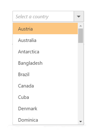
}Output for the accessibility combobox control is as follows.
