Getting Started
28 Jun 201723 minutes to read
This section explains briefly about how to create a Toolbar in your application with JavaScript.
Create Toolbar for PDF Reader
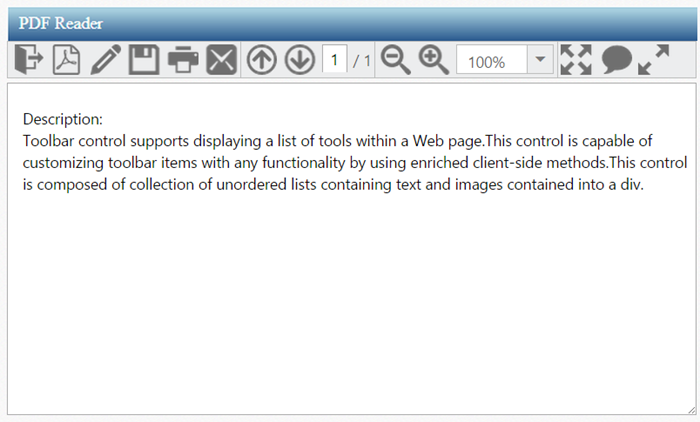
Toolbar control supports displaying a list of tools in a Web page. This control is capable of customizing toolbar items with any functionality by using enriched client-side methods. This control consists of a collection of unordered lists contains text and images into a <div>. From the following section, you can learn how to customize toolbar control for a PDF reader scenario. The following screen shot shows the appearance of toolbar in PDF reader simulator application.
Create Toolbar control in AngularJS
The Essential JavaScript Toolbar control can be easily configured with HTML <DIV> and <UL><LI> elements. The basic rendering of Essential JS Toolbar is achieved by the default functionality.
Essential JS includes angular directives for all controls in the ej.widget.angular.min.js script file. All the Essential JS directives have been encapsulated into a single module called angular.min.js. To render our ej controls in angular, you need to refer the “angular.min.js” and “ej.widget.angular.min.js” in your application.
Create an HTML file and add the following template into the HTML file for Toolbar creation.
<!doctype html>
<html lang="en" ng-app="toolbarApp">
<head>
    <title>Essential Studio for JavaScript : Angular JS Support for Toolbar </title>
    <!-- Style sheet for default theme (flat azure) -->
    <link href="http://cdn.syncfusion.com/28.1.33/js/web/flat-azure/ej.web.all.min.css" rel="stylesheet" />
    <!--Scripts-->
    <script src="http://cdn.syncfusion.com/js/assets/external/jquery-1.11.3.min.js" type="text/javascript"> </script>
    <script src="http://cdn.syncfusion.com/js/assets/external/angular.min.js"></script>
    <script type="text/javascript" src="http://cdn.syncfusion.com/28.1.33/js/web/ej.web.all.min.js "></script>
    <script src="http://cdn.syncfusion.com/28.1.33/js/common/ej.widget.angular.min.js"></script>
    <!--Add custom scripts here -->
</head>
<body ng-controller="ToolbarCtrl">

<!--Add necessary HTML elements-->

</body>
</html>
The ng-app directive explains the root element (<html> or <body> tags) of the application. You will assign a name to the ng-app directive, then you must create a module with that name. In this module, you will have to define your directives, services, filters and configurations.
A controller is defined using ng-controller directive. Each controller accepts an object $scope which we pass as a parameter. This object is used to bind the controller with view.
Properties can be bind to ejToolbar control using the prefix e- and particular property name.
Add div or span element for Toolbar rendering.
<div id="ToolbarItem" ej-toolbar></div>Initialize the Toolbar in script
To render the ejToolbar using angular directive, we need to inject the ej angular directive with modules shown as below,
<script>
        angular.module('toolbarApp', ['ejangular'])
         .controller('ToolbarCtrl', function ($scope) {
         });
    </script>
Output of the above steps

Initialize Toolbar Items
Toolbar consists of a list of items. From the following section, you can learn how to initialize the toolbar items with UL LI template.
Initialize the Toolbar items with UL LI template as follows.
<div class="control">
   <div id="ToolbarItem" ej-toolbar e-width="auto" e-height="33px">
      <!--list of toolbar items-->
      <ul>
         <li id="OtherFormat" title="Convert PDF files to Word or Excel Online..">
            <div class="PdfDocument e-icon convertToOthers "></div>
         </li>
         <li id="PDFOnline" title="Convert files to PDF Online">
            <div class="PdfDocument e-icon convertToPdf "></div>
         </li>
         <li id="Signature" title="Sign, add text or send a document for signature">
            <div class=" PdfDocument e-icon signature "></div>
         </li>
         <li id="Save" title="Save file ( Ctrl+S )">
            <div class=" PdfDocument e-icon save "></div>
         </li>
         <li id="Print" title="Print file ( Ctrl+P ) ">
            <div class=" PdfDocument e-icon print "></div>
         </li>
         <li id="Message" title="Message">
            <div class=" PdfDocument e-icon msg "></div>
         </li>
      </ul>
   </div>
</div>
Apply the given styles in the code table to show the toolbar items as follows. You can refer images from any location. In the following code sample, the images are referred from the given location.
http://js.syncfusion.com/UG/Web/Content/
<style type="text/css" class="cssStyles">

        .e-tooltxt .PdfDocument.e-icon {
             background-image: url('http://js.syncfusion.com/UG/Web/Content/pdf-icon.png');
            background-repeat: no-repeat;
            display: block;
            height: 30px;
            width: 30px;
        }
        .e-tooltxt .PdfDocument.e-icon:hover {
            background-image: url('http://js.syncfusion.com/UG/Web/Content/pdf-icon-white.png');        }
        .PdfDocument.e-icon.convertToOthers {
            background-position: -349px 0px;
        }
        .PdfDocument.e-icon.convertToPdf {
            background-position: -527px 0px;
        }
        .PdfDocument.e-icon.signature {
            background-position: 2px 0px;
        }
        .PdfDocument.e-icon.save {
            background-position: -87px 0px;
        }
        .PdfDocument.e-icon.msg {
            background-position: -483px 0px;
        }

</style>
After updating the Toolbar items with their CSS styles, you can render the toolbar inside <script> tag.
<script>
        angular.module('toolbarApp', ['ejangular'])
        .controller('ToolbarCtrl', function ($scope) {
         });
    </script>
Execute the code to render a toolbar with a list of toolbar items.
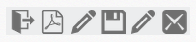
Toolbar with list of toolbar items
Render remaining Toolbar items
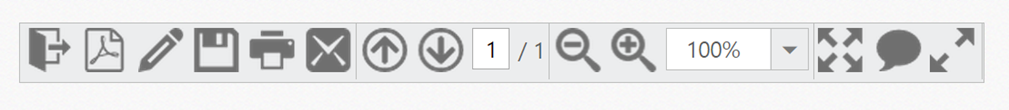
In the above output only few toolbar items are rendered, but you need to render all the toolbar items to achieve the requirements. You can separate or group the toolbar items. The separation or grouping of toolbar items is achieved when you give toolbar items as a list of UL LI values inside the toolbar <div> or span element. From the following section, you can learn how to initialize the remaining toolbar items with UL LI template and how to group the toolbar items.
Initialize the Toolbar items with UL LI template as follows.
<div id="ToolbarItem" ej-toolbar e-width="auto" e-height="33px" e-enableseparator="true">
   <!--Initializes toolbar items from above code example -->
   <!-- Separator is added at the end of each ul inside the toolbar element-->
   <!-- list of Remaining toolbar items with item separator -->
   <ul>
      <li id="Previous" title="Show previous page ( Left Arrow )">
         <div class=" PdfDocument e-icon previous "></div>
      </li>
      <li id="Next" title="Show next page ( Right Arrow )">
         <div class="PdfDocument e-icon next "></div>
      </li>
      <li id="page">
         <div class="PdfDocument">
            <input type="text" value="1" />
         </div>
      </li>
      <li id="count">
         <span>/ 1</span>
      </li>
   </ul>
   <ul>
      <li id="ZoomOut" title="Zoom Out">
         <div class=" PdfDocument e-icon zoomOut "></div>
      </li>
      <li id="ZoomIn" title="Zoom In">
         <div class=" PdfDocument e-icon zoomIn "></div>
      </li>
      <li id="ZoomValue">
         <div class=" PdfDocument">
            <!-- input element for rendering Zoom value dropdown  -->
            <input type="text" id="selectPercent" ej-dropdownlist e-datasource="dataList" e-value="value" e-width="width" e-height="height"/>
         </div>
      </li>
   </ul>
   <ul>
      <li id="FitFull" title="Fit one full page to window">
         <div class=" PdfDocument e-icon fitOne "></div>
      </li>
      <li id="StickyNote" title="Add stick note ( Ctrl+6 ) ">
         <div class=" PdfDocument e-icon sticky "></div>
      </li>
      <li id="ReadMode" title="View File in Read Mode">
         <div class=" PdfDocument e-icon readMode "></div>
      </li>
   </ul>
</div>
Add the following styles in the code table to display the toolbar items as follows.
<style>

       .PdfDocument.e-icon.previous {
            background-position: -395px 0px;
        }
        .PdfDocument.e-icon.next {
            background-position: -439px 0px;
        }
        .PdfDocument.e-icon.zoomIn {
            background-position: -175px 0px;
        }
        .PdfDocument.e-icon.zoomOut {
            background-position: -219px 0px;
        }
        .PdfDocument.e-icon.fitOne {
            background-position: -264px 0px;
        }
        .PdfDocument.e-icon.sticky {
            background-position: -131px -1px;
        }
        .PdfDocument.e-icon.readMode {
            background-position: -308px 0px;
        }
        .PdfDocument.e-icon.print {
            background-position: -43px 0px;
        }
        #ZoomValue .PdfDocument {
            width: 90px;
        }
        #page .PdfDocument input {
            text-align: center;
            width: 20px;
            height: 21px;
        }
        #count span {
            width: 30px;
            height: 30px;
            position: relative;
            top: 2px;
            text-align: center;
            vertical-align: middle;
        }

 </style>
After updating the Toolbar items with their CSS styles, you can render the toolbar inside the <script> tag and also need to render the drop down list control for select zoom value. Basically, dropdown list control is rendered with input element. Set Zoom value is one of the items in the toolbar. The following code example shows how to render and initialize drop down control with list of zoom values.
<script>
var percentList = ["10%", "25%", "50%", "100%", "400%", "800%", "1600%", "3200%", "6400%"];
 angular.module('toolbarApp', ['ejangular'])
        .controller('ToolbarCtrl', function ($scope) {
            $scope.dataList= percentList;
            $scope.value = "100%";
            $scope.width = "90px";
            $scope.height = "27px";
         });
</script>
Execute the code to render a toolbar items with separator.
Add Actions to Toolbar Items
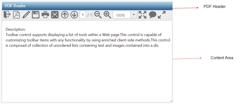
Now the toolbar is rendered so you need to render the header and content area to create a PDF reader. From the following section, you can learn how to render the header (Toolbar), contentsection (PDF viewer area) and how to set the action to toolbar items.
You are not going to deal with PDF reading or rendering task here. You will only simulate the PDF Reader app to demonstrate the Toolbar control usage and will completely ignore the PDF rendering area.
Initialize the content area and header as specified in the code table.
<!-- control class used for aligns the pdf reader in center of a page. -->
<div class="control">
 <div class="ctrllabel"></div>
   <!-- Here Initialize the Toolbar items as like above code sample -->
   <div id="contentSection">
      <textarea id="content" rows="10" cols="30">
      Description:
      Toolbar control supports displaying a list of tools within a Web page.This control is capable of
      customizing toolbar items with any functionality by using enriched client-side methods.This control
      is composed of collection of unordered lists containing text and images contained into a div.
      </textarea>
   </div>
</div>
You can apply the following styles with the above styles to design the PDF header and content area. The desired output is shown as follows.
<style type="text/css" class="cssStyles">

        #content {
            float: left;
            height: 300px;
            width: 628px;
            position: absolute;
        }

        .control {
            margin: 110px 320px 0;
            position: relative;
        }

        .ctrllabel {
            background-image: url("http://js.syncfusion.com/UG/Web/Content/pdf-header.png");
            background-repeat: no-repeat;
            width: 634px;
            height: 32px;
        }

</style>
Execute the given code to render a PDF reader as follows.
So far, you have added the required toolbar items and configured its appearance. When you click on toolbar items, the operation is performed through client slide click event. The following code example explains how to perform operations when you click on the toolbar items.
<script>
        angular.module('toolbarApp', ['ejangular'])
        .controller('ToolbarCtrl', function ($scope) {
             $scope.width ="auto",
             $scope.height = "33px",
             $scope.enableseparator = "true",
             $scope.click= function (args) {
        switch (option) {
            case "OtherFormat":
                //writes a code for Convert pdf files to Other format.
            case "PDFOnline":
                //writes a code for Convert files to Pdf online.
            case "Signature":
                //writes a code for Send a document for signature.
            case "Save":
                //writes a code for Save content.
            case "Print":
                //writes a code for Print content.
            case "Message":
                //writes a code for Send a Message.
            case "Previous":
                //writes a code for Show previous page.
            case "Next":
                //writes a code for Show Next page.
            case "ZoomOut":
                //writes a code for Zoom out the page.
            case "ZoomIn":
                //writes a code for Zoom In the page.
            case "FitFull":
                //writes a code for Fit one full page to window.
            case "StickyNote":
                //writes a code for Add Sticky Note.
            case "ReadMode":
                //writes a code for view file in read mode.
        }
    }
         });

    </script>