How To
17 Dec 20185 minutes to read
Modify SplitBar size?
SplitBar can be customized by using e-cssClass in the Splitter component. The following steps explain the implementation of changing splitbar size in the Splitter component.
In the HTML page set the corresponding <div> element for rendering Splitter component.
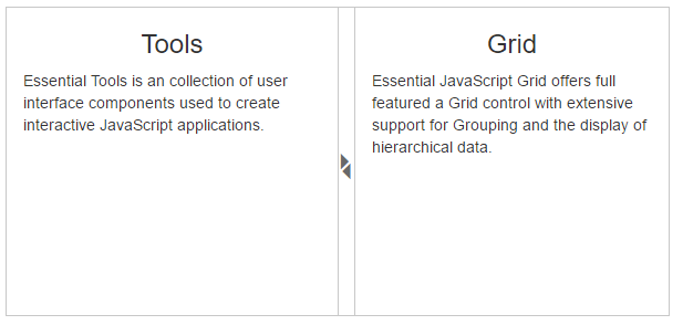
<div id="splitter" ej-splitter e-properties="proper" e-height="280" e-width="600" e-cssClass="cssClass">
        <div>
            <div style="padding: 0px 15px;">
                <h3 class="h3">Tools </h3>
                Essential Tools is an collection of user interface components used to create interactive JavaScript applications.
            </div>
        </div>
        <div>
            <div style="padding: 0px 15px;">
                <h3 class="h3">Grid </h3>
                Essential JavaScript Grid offers full featured a Grid control with extensive support for Grouping and the display of hierarchical data.
            </div>
        </div>
    </div>
Define “e-cssClass” in angular module in script section.
angular.module('syncApp', ['ejangular'])
       .controller('SplitterCtrl', function ($scope) {
                  $scope.proper = [{ paneSize: "50%" }, {}];
                  $scope.cssClass = "customClass";
Customize the Splitbar by setting CSS properties using cssClass.
.customClass.e-splitter .e-splitbar.e-h-bar {
        width: 16px;
    }
    .customClass.e-splitter .e-splitbar > .e-icon:before {
        font-size: 18px;
    }
The output for Splitter after customizing the CSS class.
Make Splitter with other components Responsive?
In General, any components within the splitter is not responsive while you have set responsive property of that component. But You can make splitter with inner components Responsive by using “e-resize” event of Splitter. For example, if you have Splitter inside the Splitter, innerSplitter is not responsive. If you resize the outerSplitter, innerSplitter is not responsive when you have set “e-isResponsive” is true. Because isResponsive will word whenever the window resize event occurs. On resizing the splitter will not trigger any event related to window resizing and so you need to manually resize the elements inside the splitter.
To achieve responsiveness of innerSplitter, you have set “e-resize” event for outerSplitter. While resizing the outerSplitter, the resize event is triggered. You can call “windowResized” method to make responsiveness of innerSplitter within the resize event.
In the HTML page set the corresponding <div> element for rendering Splitter component.
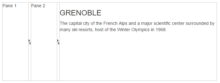
<div id="outterSpliter" ej-splitter e-properties="proper" e-height="250" e-width="50%" e-isresponsive="true" e-resize="resize">
        <div id="innerSpliter" ej-splitter e-isresponsive="true">
            <div>
                <div class="cont">Pane 1 </div>
            </div>
            <div>
                <div class="cont">Pane 2 </div>
            </div>
        </div>
        <div>
            <div class="cont">
                <h3>GRENOBLE</h3>
                The capital city of the French Alps and a major scientific center surrounded by many ski resorts, host of the Winter Olympics in 1968.
            </div>
        </div>
    </div>
Define “e-isresponsive” and “e-properties” in angular module in script section.
angular.module('syncApp', ['ejangular'])
               .controller('SplitterCtrl', function ($scope) {
                   $scope.proper = [{}, {}];
    })
The output for Splitter with innerSplitter at initial rendering as given below:
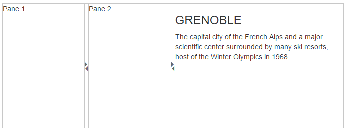
After resizing the splitter, output of innerSplitter as follows.