Slider Types
28 Jun 20171 minute to read
This feature allows you to specify the type of Slider. There are three different types of Slider, Default Slider, Min-Range Slider and Range Slider. By default, Default Slider renders. You can use the sliderType property to choose the type of Slider. Data type of this property is “Enum”
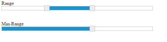
Both Default Slider and Min-Range Slider have same behavior that is used to select a single value. In Min-Range Slider, a shadow is considered from the start value to current handle position. But Range Slider contains two handles that is used to select a range of values and a shadow is considered in between the two handles.
Possible Slider types are as follows,
Property Table for JavaScript
| Property | Allowed values | Description |
|---|---|---|
| sliderType | ej.SliderType.Default (default value) | It is the default Slider type. It helps to select a single value. |
| ej.SliderType.MinRange | Use this Slider to select a single value; Displays shadow from the start value to the current value. | |
| ej.SliderType.Range | Use this Slider to select a range of values; Displays shadow in-between the selection range. |
The following steps explains you on how to configure the sliderType property to display Range Slider and MinRange Slider.
In an HTML page, specify the div elements to render the RangeSlider and MinRange Slider.
<div class="txt">Range</div>
<div id="rangeSlider" ej-slider e-slidertype="Range" e-width="500" e-values="value"></div>
<br />
<br />
<div class="txt">Min-Range</div>
<div id="minSlider" ej-slider e-slidertype="MinRange" e-value="60" e-width="500"></div>angular.module('sliderApp', ['ejangular'])
.controller('SliderCtrl', function ($scope) {
$scope.value = [30, 60]
});Execute the above code example to render the following output.