How can I help you?
Getting Started
Before we start with the Ribbon, please refer this page page for general information regarding integrating Syncfusion widget’s.
Adding JavaScript and CSS references
To render the Ribbon control, the following list of external dependencies are needed,
The required angular script as angular.min.js and ej.widget.angular.min.js which can be available in below CDN links:
-
angular.min.js- http://cdn.syncfusion.com/js/assets/external/angular.min.js -
ej.widget.angular.min.js- http://cdn.syncfusion.com/32.2.3/js/common/ej.widget.angular.min.js
The other required internal dependencies are tabulated below,
| Files | Description/Usage |
|---|---|
| ej.core.min.js | Must always be referred to before using all the JS controls. |
| ej.data.min.js | Used to handle data manger operation and should be used while binding data to JS controls. |
| ej.globalize.min.js | Must be referred to localize any of the JS control's text and content. |
| ej.ribbon.min.js | Should be referred when using Ribbon control. |
| ej.menu.min.js | This file is used to render menu in the application tab. |
| ej.scroller.min.js | This file is used to render scroller in the Ribbon control. |
| ej.checkbox.min.js | This file is used to render checkboxes in the Ribbon control. |
| ej.tab.min.js | This file is used to render tabs into the Ribbon control. |
| ej.dropdownlist.min.js | These files are used to render button,split button,toggle button, and dropdown list controls in the ribbon groups. |
| ej.splitbutton.min.js | |
| ej.button.min.js | |
| ej.togglebutton.min.js |
NOTE
Ribbon uses one or more sub-controls, therefore refer the
ej.web.all.min.js(which encapsulates all theejcontrols and frameworks in a single file) in the application instead of referring all the above specified internal dependencies.
To get the real appearance of the Ribbon, the dependent CSS file ej.web.all.min.css (which includes styles of all the widgets) should also needs to be referred.
So the complete boilerplate code is
<!DOCTYPE html>
    <html xmlns="http://www.w3.org/1999/xhtml" lang="en" ng-app="RibbonApp">
    <head>
    <meta name="viewport" content="width=device-width, initial-scale=1.0">
    <meta name="description" content="Essential Studio for JavaScript">
    <meta name="author" content="Syncfusion">
    <title>Essential Studio for AngularJS: Ribbon</title>
    <!-- Essential Studio for JavaScript  theme reference -->
    <link href="http://cdn.syncfusion.com/32.2.3/js/web/flat-azure/ej.web.all.min.css" rel="stylesheet" />
    <!-- To load ribbon sample level icons -->
    <link href="http://cdn.syncfusion.com/32.2.3/js/web/ribbon-css/ej.icons.css" rel="stylesheet" />
    <!-- Essential Studio for JavaScript  script references -->
    <script src="http://cdn.syncfusion.com/js/assets/external/jquery-3.0.0.min.js"></script>
    <script src="http://cdn.syncfusion.com/js/assets/external/jsrender.min.js"></script>
    <script src="http://cdn.syncfusion.com/js/assets/external/angular.min.js"></script>
    <script src="http://cdn.syncfusion.com/32.2.3/js/web/ej.web.all.min.js"></script>
    <script src="http://cdn.syncfusion.com/32.2.3/js/common/ej.widget.angular.min.js" type="text/javascript"></script>
    <!-- Add your custom scripts here -->
    </head>
    <body>
    </body>
    </html>
NOTE
- In production, we highly recommend you to use our
custom script generatorto create custom script file with required controls and its dependencies only. Also to reduce the file size further please useGZip compressionin your server.- For themes, you can use the
ej.web.all.min.cssCDN link from the code snippet given. To add the themes in your application, please refer tothis link.- Ribbon’s sample level icons can be loaded using
ej.icons.CSSfrom this CDN or from the location (installed location)\ Syncfusion\Essential Studio\32.2.3\JavaScript\assets\css\web\ribbon-css”.
Control Initialization
All the Essential JavaScript directives have been encapsulated into a single module called ejangular so the first step would be to declare dependency for this module within your AngularJS application.
The Ribbon can be created using ej-ribbon AngularJS directive and its properties can be defined using e- prefix followed by the property name.(For example, e-width)
Ribbon can be initialized with Application Tab and UL list is needed for binding menu to application menu which can be specified through e-applicationtab-menuItemID which denotes id of UL.
Define the Application Tab with e-applicationtab-type as menu to render simple Ribbon control.
The code example for defining controls in AngularJS is as follows,
<html xmlns="http://www.w3.org/1999/xhtml" lang="en" ng-app="RibbonApp">
    <head>
        <title>Essential Studio for AngularJS: Ribbon</title>
    </head>
    <body ng-controller="RibbonCtrl">
    <ul id="ribbonmenu">
        <li><a>FILE</a>
            <ul>
                <li><a>New</a></li>
                <li><a>Open</a></li>
                <li><a>Save</a></li>
                <li><a>Print</a></li>
            </ul>
        </li>
    </ul>
    <div id="Ribbon" ej-ribbon e-width="500px" e-applicationtab-type="menu" e-applicationtab-menuitemid="ribbonmenu">
    </div>
    <script>
        angular.module('RibbonApp', ['ejangular'])
            .controller('RibbonCtrl', function ($scope) {
            });
    </script>
    </body>
    </html>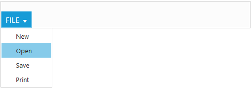
NOTE
Set the required
e-widthto Ribbon, else default parent container or window width will be considered.
Adding Tabs
Tab is a set of related groups which are combined into single item. For creating Tab, e-id and e-text properties should be specified.
<html xmlns="http://www.w3.org/1999/xhtml" lang="en" ng-app="RibbonApp">
    <head>
        <title>Essential Studio for AngularJS: Ribbon</title>
    </head>
    <body ng-controller="RibbonCtrl">
    <ul id="ribbonmenu">
        <li><a>FILE</a>
            <ul>
                <li><a>New</a></li>
                <li><a>Open</a></li>
                <li><a>Save</a></li>
                <li><a>Print</a></li>
            </ul>
        </li>
    </ul>
    <div id="Ribbon" ej-ribbon e-width="500px" e-applicationtab-type="menu" e-applicationtab-menuitemid="ribbonmenu">
        <e-tabs>
            <e-tab e-id="home" e-text="Home"></e-tab>
        </e-tabs>
    </div>
    <script>
        angular.module('RibbonApp', ['ejangular'])
            .controller('RibbonCtrl', function ($scope) {
            });
    </script>
    </body>
    </html>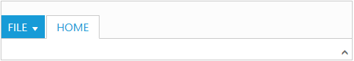
Configuring Groups
List of controls are combined as logical e-groups into Tab. Group alignment type as row/column, Default is row.
Create group item with e-text specified and add content group to Groups collection with ejButton control settings.
<html xmlns="http://www.w3.org/1999/xhtml" lang="en" ng-app="RibbonApp">
    <head>
        <title>Essential Studio for AngularJS: Ribbon</title>
    </head>
    <body ng-controller="RibbonCtrl">
    <ul id="ribbonmenu">
        <li><a>FILE</a>
            <ul>
                <li><a>New</a></li>
                <li><a>Open</a></li>
                <li><a>Save</a></li>
                <li><a>Print</a></li>
            </ul>
        </li>
    </ul>
    <div id="Ribbon" ej-ribbon e-width="500px" e-applicationtab-type="menu" e-applicationtab-menuitemid="ribbonmenu">
        <div e-tabs>
            <div e-tab e-id="home" e-text="Home">
                <div e-groups>
                    <div e-group e-text="New" e-aligntype="rows">
                        <div e-content>
                            <div e-content>
                                <div e-groups>
                                    <div  e-group e-id="new" e-text="New" e-buttonsettings-contenttype="imageonly" e-buttonsettings-prefixicon="e-icon e-ribbon e-new">
                                    </div>
                                </div>
                            </div>
                        </div>
                    </div>
                </div>
            </div>
        </div>
    </div>
    <script>
        angular.module('RibbonApp', ['ejangular'])
            .controller('RibbonCtrl', function ($scope) {
            });
    </script>
    </body>
    </html>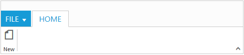
Adding Controls to Group
Syncfusion JavaScript Controls can be added to group’s content with corresponding type specified like button, split button, toggle button, dropdown list, gallery, custom, etc. Default type is button.
<html xmlns="http://www.w3.org/1999/xhtml" lang="en" ng-app="RibbonApp">
    <head>
        <title>Essential Studio for AngularJS: Ribbon</title>
    </head>
    <body ng-controller="RibbonCtrl">
    <ul id="ribbonmenu">
        <li><a>FILE</a>
            <ul>
                <li><a>New</a></li>
                <li><a>Open</a></li>
                <li><a>Save</a></li>
                <li><a>Print</a></li>
            </ul>
        </li>
    </ul>
    <ul id="split">
        <li><span>Paste</span></li>
    </ul>
    <div id="Ribbon" ej-ribbon e-width="500px" e-applicationtab-type="menu" e-applicationtab-menuitemid="ribbonmenu">
            <div e-tabs>
                <div e-tab e-id="home" e-text="Home">
                    <div e-groups>
                        <div e-group e-text="New" e-aligntype="rows">
                            <div e-content>
                                <div e-content>
                                    <div e-groups>
                                        <div  e-group e-id="new" e-text="New" e-buttonsettings-contenttype="imageonly" e-buttonsettings-prefixicon="e-icon e-ribbon e-new">
                                        </div>
                                    </div>
                                </div>
                            </div>
                        </div>
                        <div e-group e-text="SplitButton & Dropdown" e-aligntype="columns">
                            <div e-content>
                                <div e-content e-defaults-type="splitbutton" e-defaults-width="50" e-defaults-height="70">
                                    <div e-groups>
                                        <div e-group e-id="paste" e-text="Paste" e-splitbuttonsettings-contenttype="imageonly" e-splitbuttonsettings-targetid="split" e-splitbuttonsettings-prefixicon="e-icon e-ribbon e-ribbonpaste" e-splitbuttonsettings-buttonmode="dropdown" e-splitbuttonsettings-arrowposition="bottom"></div>
                                    </div>
                                </div>
                                <div e-content>
                                    <div e-groups>
                                        <div e-group e-id="fontfamily" e-type="dropdownlist" e-dropdownsettings-datasource="list" e-dropdownsettings-value="1" e-dropdownsettings-width="100"></div>
                                    </div>
                                </div>
                            </div>
                        </div>
                    </div>
                </div>
            </div>
        </div>
        <script>
               var fontfamily = [{
                     value: 1,
                     text: "Segoe UI"
                    }, {
                    value: 2,
                    text: "Arial"
                  }];
               angular.module('RibbonApp', ['ejangular'])
                .controller('RibbonCtrl', function ($scope) {
                    $scope.list = fontfamily;
                });
        </script>
        </body>
        </html>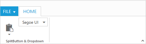
NOTE
The control can be render using
ej.web.all.min.jsand angular related references are referred fromej.widget.angular.min.jsto render the control.
User Interface
Ribbon component able to integrate any custom components and customized their functionality in application end. Our Ribbon component is similar to Microsoft products(Word). The Ribbon UI consists of several sections like Application Tab, Quick Access Toolbar, Tab, Contextual Tab, Gallery and etc.The following screenshot shows the diagrammatic detail of Ribbon UI:
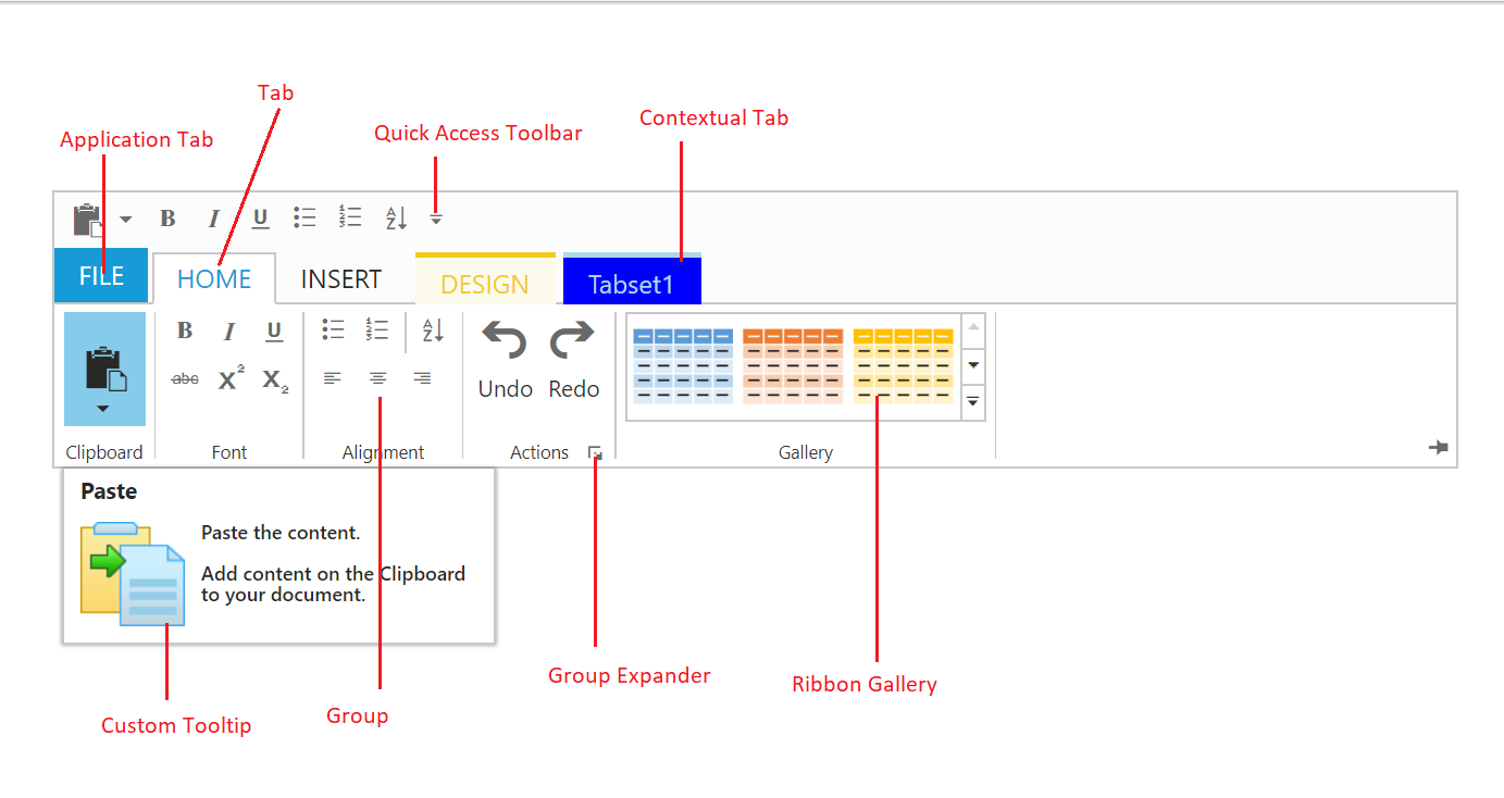
From above screenshot, you can see Ribbon has several subcomponents for different functionalities. The upcoming sections explains the brief details of each functionalities and their customizations.