Styling
29 Aug 20173 minutes to read
By default, PivotGrid supports 17 different themes.
- default-theme
- flat-azure-dark
- fat-lime
- flat-lime-dark
- flat-saffron
- flat-saffron-dark
- gradient-azure
- gradient-azure-dark
- gradient-lime
- gradient-lime-dark
- gradient-saffron
- gradient-saffron-dark
- bootstrap-theme
- high-contrast-01
- high-contrast-02
- material
- office-365
You can also customize the appearance of the following component manually.
- PivotGrid
- Grouping Bar
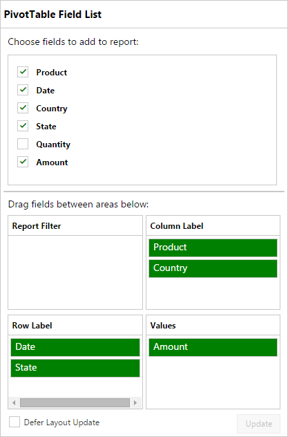
- PivotTable Field List
To change the appearance of PivotGrid, apply the below customized CSS.
.e-pivotgrid table {
   color: #565656;
   background-color: White;
}
.e-pivotgrid th,
.e-pivotgrid td {
   border: solid 1px;
   border-color: #c4c4c4;
}
.e-pivotgrid .value {
   background-color: White;
}
.e-pivotgrid .summary {
   background-color: aqua !important;
   color: #565656;
}
.e-pivotgrid .colheader, .e-pivotgrid .rowheader {
   color: #5c5c5c;
   background: white;
   background-repeat: repeat;
}
.e-pivotgrid .colheader:hover, .e-pivotgrid .rowheader:hover {
   color: white;
   background: #91aa29;
   background-repeat: repeat;
}
To change the appearance of Grouping Bar, apply the below customized CSS.
.e-pivotgrid .summary {
   background-color: aqua !important;
   color: #565656;
}
.e-pivotgrid .e-grpRow, .e-pivotgrid .values, .e-pivotgrid .columns, .e-pivotgrid .e-drag {
   background: green;
}
.e-pivotgrid .e-pivotButton .e-btn.e-select, .e-pivotgrid .e-rows .e-pivotButton, .e-pivotgrid .values .e-pivotButton, .e-pivotgrid .columns .e-pivotButton, .e-pivotgrid .e-drag .e-pivotButton {
   background: blanchedalmond;
}
.e-pivotgrid .colheader, .e-pivotgrid .rowheader {
   color: #5c5c5c;
   background: white;
   background-repeat: repeat;
}
.e-pivotgrid .colheader:hover, .e-pivotgrid .rowheader:hover {
   color: white;
   background: #91aa29;
   background-repeat: repeat;
}
To change the appearance of PivotTable Field List, apply the below customized CSS.
.e-pivotschemadesigner, .e-pivotschemadesigner .e-fieldTable {
     background-color: white;
     color: black;
}
.e-pivotschemadesigner .e-treeview .e-active {
     background: white;
}
.e-pivotschemadesigner .e-chkbox-wrap .e-chk-image.e-stop, .e-chkbox-wrap .e-chk-image.e-checkmark {
     color:green
}
.e-pivotschemadesigner .subheadText, .e-pivotschemadesigner .centerHead, .e-pivotschemadesigner .e-schemaFieldTree.e-treeview .e-text{
     color: black;
}
.e-pivotschemadesigner .e-pivotButton .e-pvtBtn {
     background: green;
     color: white;
}
You can also customize the appearance of the Pivot component using our Theme Studio utility. To know more about Theme Studio click here.