Appearance
28 Jun 20173 minutes to read
Theme
The MaskEdit control’s style and appearance can be controlled based on CSS classes. In order to apply styles to the MaskEdit control, you need to refer 2 files namely, ej.widgets.core.min.css and ej.theme.min.css. If the file ej.web.all.min.css is referred, then it is not necessary to include the files ej.widgets.core.min.css and ej.theme.min.css in your project, as ej.web.all.min.css is the combination of these two.
By default, there are 17 themes support available for MaskEdit control namely:
- bootstrap
- flat-azure
- flat-azure-dark
- flat-lime
- flat-lime-dark
- flat-saffron
- flat-saffron-dark
- gradient-azure
- gradient-azure-dark
- gradient-lime
- gradient-lime-dark
- gradient-saffron
- gradient-saffron-dark
- high-contrast-01
- high-contrast-02
- material
- office-365
CSS Class
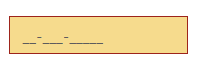
The CSS can be customized by using the cssClass in the MaskEdit. You can customize the MaskEdit with cssClass property to appear like your desired control.
The following steps explain the implementation of MaskEdit with cssClass property.
In the HTML page, add a <input> element to render the MaskEdit widget.
<input id="maskedit" type="text" ej-maskedit e-inputmode="ej.InputMode.Text" e-maskformat='99-999-99999' e-cssclass="customCss" />Customize the CSS properties in custom CSS class.
<style>
    .customCss .e-box {
        border-color: #9d241b;
    }
    .customCss .e-input {
        background-color: #f6db8d;
    }
    .customCss .e-select {
        background-color: #ecf6ac;
        border-color: #3c36e7;
    }
</style>
The output for MaskEdit after applying cssClass is as follows.
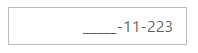
Rounded Corner Support
MaskEdit provides you with rounded corner support whose appearance is different from normal textbox controls.
The following steps explain the implementation of MaskEdit with showRoundedCorner property.
In the HTML page, add a <input> element to render the MaskEdit widget.
<input id="maskedit" type="text" ej-maskedit e-inputmode="ej.InputMode.Text" e-maskformat='99-999-99999' e-value="123456" e-showroundedcorner="true"/>Output of MaskEdit when showRoundedCorner is “true”.
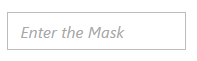
WatermarkText Support
The MaskEdit control provide water mark text support. You can display the initial value in the control by water mark.
The following steps explain the implementation of MaskEdit with watermarkText property.
In the HTML page, add a <input> element to render the MaskEdit widget.
<input id="maskedit" type="text" ej-maskedit e-inputmode="ej.InputMode.Text" e-maskformat='99-999-99999' e-watermarktext="Enter the Mask" />Output of MaskEdit when waterMarkText is “Enter the Mask”.
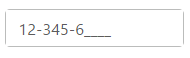
Text Alignment Support
The MaskEdit provides text alignment support that allows you to set the alignment of text in the control by using the textAlign property.
The following steps explain the implementation of MaskEdit with textAlign property.
In the HTML page, add a <input> element to render the MaskEdit widget
<input id="maskedit" type="text" ej-maskedit e-inputmode="ej.InputMode.Text" e-maskformat='99-999-99999' e-textalign="ej.TextAlign.Right" />The output for Textboxes when textAlign is set to “right”.