Appearance and styling in Angular Dialog control
18 Sep 20242 minutes to read
Showing header
In order to display any title for our dialog, we can use the e-showheader property to display the header of the Dialog. By default, rounded corner property is true in Dialog.
<div id="dialog" ej-dialog e-title="Dialog" e-showheader="false"  e-actionbuttons="Icons">
          <p>This is a simple dialog</p>
    </div>
Display dialog on initialization
Using [e-showoninit] property to true or false, we can either display our dialog on the page load or on any actions. By default, [showoninit] property is true in Dialog.
<div id="dialog" ej-dialog e-title="Dialog" e-showoninit="false">  e-actionbuttons="Icons">
          <p>This is a simple dialog</p>
    </div>
Applying Rounded Corner
You can use e-showroundedcorner property to add rounded borders to the dialog popup elements. By default, rounded corner property is disabled in Dialog.
<div id="dialog" ej-dialog e-title="Dialog" e-showroundedcorneroninit="trufalse"  e-actionbuttons="Icons">
          <p>This is a simple dialog</p>
    </div>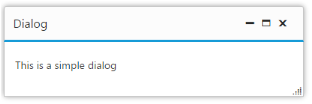
Responsive Dialog:
To set the Dialog the dialog to be responsive set the e-isresponsive property as true. By default, isresponsive property is disabled in Dialog. This will override the height and width set for Dialog on resizing the widow and in device view.
Using Adding HTML attributes
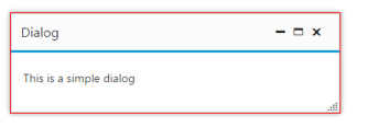
Using the e-htmlattributes property we can directly set our own html attributes to the wrapper of the Dialog component.
<div id="dialog" ej-dialog e-title="Dialog" e-htmlattributes="attributes">
        <p>This is a simple dialog</p>
    </div>
    <script>
        angular.module('dialogApp', ['ejangular'])
         .controller('DialogCtrl', function ($scope) {
             $scope.attributes = {
                 class: "my-class", style: "border:1px solid red"
             }
         });
    </script>