How can I help you?
Action Buttons in AngularJS Dialog
The Dialog component provides the following action buttons.
-
Close
-
Maximize
-
Minimize
-
Pin/Unpin
-
Collapse/Expand
You can display only the necessary buttons in the Dialog component by configuring the e-actionbuttons property
<div id="dialog" ej-dialog e-title="Dialog"  e-actionbuttons="Icons">
          <p>This is a simple dialog</p>
    </div>
    <script>
        angular.module('dialogApp', ['ejangular'])
         .controller('DialogCtrl', function ($scope) {
             $scope.Icons = ["close", "maximize", "minimize"]
         });
    </script>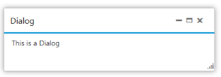
Customizing Action Buttons
We can customize the action buttons in dialog component.
You can add new action button in the dialog component by configuring the e-actionbuttonclick event.
<div id="dialog" ej-dialog e-title="Dialog" e-showoninit="false" e-actionbuttons="Icons" e-actionbuttonclick="playMedia">
        <p>This is a simple dialog</p>
    </div>
    <script>
        angular.module('dialogApp', ['ejangular'])
         .controller('DialogCtrl', function ($scope) {
             $scope.Icons = ["close", "maximize", "minimize", "pin", "mediaplay", "search"];
             $scope.playMedia = function (args) {
                 console.log(args.buttonID);
             }

         });
    </script>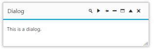
Giving Modal dialog
The Dialog component’s modal dialog acts like a child window that is displayed on top of the main window/screen and disables the main window interaction until it is closed. We can enable or disable this modal dialog in our dialog component by using the property [e-enablemodal]. You can refer the following code example to set this property.
<div id="lognForm" ej-dialog title="Modal dialog" e-enablemodal="true" enableresize="true"  isresponsive="true">
                    <p>This is a simple model dialog</p>
                </div>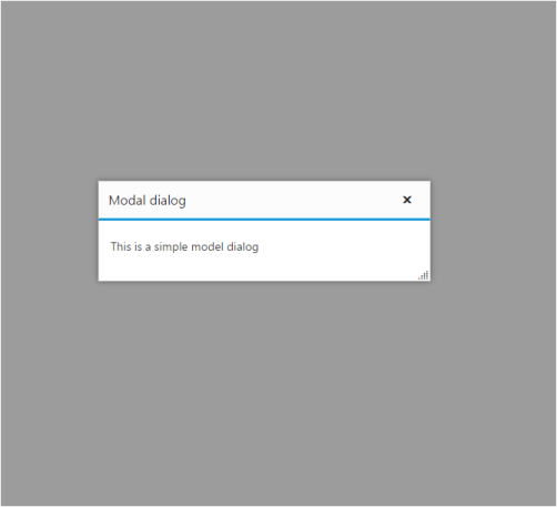
Containment
If the property e- containment is set, then dialog will append to the selected element and it is restricted to move only within the specified container element (i.e.) it is the selector for the container element. It is more useful for the modal dialog the place in a container. You can refer the following code example to set this property.
<div class="cols-sample-area">
                <div id="lognForm" ej-dialog title="Modal dialog" e-enablemodal="true" containment=".cols-sample-area" enableresize="true"  isresponsive="true">
                    <p>This is a simple model dialog</p>
                </div>
                  </div>
In the above code we have restricted to move the dialog component with the given containment (i.e.) with the cols-sample-area
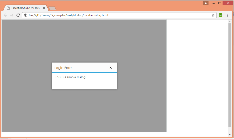
Note: This [e-containtment] property is mostly used for the Modal dialog to restrict to specific container. And this property is similar to the “e-target” property but this additionally sets the drag area for dialog. Also this property overrides target property if both are set.