Textbox Customization
Auto-fill support
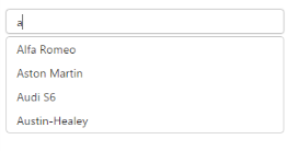
We can automatically fill the Autocomplete text box by the e-enableautofill property. This property fills the Autocomplete textbox with the first matched item from the suggestion list automatically.
<div id="control">

                           <input type="text" ej-autocomplete e-datasource="dataList" e-value="setValue" e-width="25%" e-enableautofill="true" />
</div>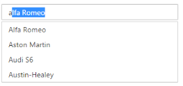
Enabling reset option
We can easily reset the typed or selected value in the Autocomplete textbox using the e-showreseticon property. Using this property, we can reset or clear the text value in the textbox instead of backspace or delete key to clear the textbox value.
<div id="control">
                            <input type="text" ej-autocomplete e-datasource="dataList" e-value="setValue" e-showreseticon="true" e-width="100%" />

</div>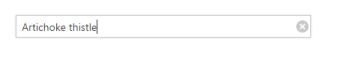
Adding watermark
It provides the short description of the expected value in Autocomplete and will display the text until any item is selected. You can set this text using e-watermarktext property.
<div id="control">
                            <input type="text" ej-autocomplete e-datasource="dataList" e-value="setValue" e-width="100%" e-watermarktext="select a car" />
                        </div>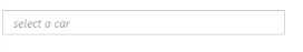
Applying Rounded Corner
You can use [e-showroundedcorner] property to add rounded borders to the input and popup elements. By default, rounded corner property is disabled in Autocomplete.
<div id="control">


    <input type="text" ej-autocomplete e-datasource="dataList" e-value="setValue" e-showroundedcorner="true" e-width="100%" e-watermarktext="select a car" />

   </div>