Behavior and Settings
7 Jun 20175 minutes to read
Automatic Initializing WaitingPopup widget
WaitingPopup widget contains showOnInit property that allows the popup to display over a target on page load automatically. By default, showOnInit property is set as false.
The following code helps you on how to display the WaitingPopup on page load.
<div id="parent">
    <ej-waitingpopup id="waitingPopUp" [target]="target" [showOnInit]="true"></ej-waitingpopup>
</div>import {Component} from '@angular/core';
import {ViewEncapsulation} from '@angular/core';
@Component({
selector: 'sd-home',
templateUrl: 'app/components/waitingpopup/waitingpopup.component.html',
styleUrls: ['app/components/waitingpopup/waitingpopup.component.css'],
encapsulation: ViewEncapsulation.None
})
export class WaitingPopupComponent {
target: string;
constructor() {
this.target = "#parent";
}
}Add the following styles to render WaitingPopup widget in waitingpopup.component.css.
#parent {
    height: 320px;
    width: 600px;
 }
The following screenshot illustrates the WaitingPopup when showOnInit is set to “true”.

Enable / Disable Popup Indicator
You can show or hide the popup indicator of WaitingPopup widget using showImage property. By default, showImage property is set as true.
The following code helps you to enable / disable popup indicator in WaitingPopup widget.
// To configure Enable / Disable popup indicator in WaitingPopup, use the following code.
    //Enable popup indicator:
    <div id="parent">
        <ej-waitingpopup id="waitingPopUp" [target]="target" [showOnInit]="true" [showImage]="true" [text]="text"></ej-waitingpopup>
    </div>

   //Disable popup indicator:
    <div id="parent">
        <ej-waitingpopup id="waitingPopUp" [target]="target" [showOnInit]="true" [showImage]="false" [text]="text"></ej-waitingpopup>
</div>import {Component} from '@angular/core';
import {ViewEncapsulation} from '@angular/core';
@Component({
selector: 'sd-home',
templateUrl: 'app/components/waitingpopup/waitingpopup.component.html',
styleUrls: ['app/components/waitingpopup/waitingpopup.component.css'],
encapsulation: ViewEncapsulation.None
})
export class WaitingPopupComponent {
text: string;
target: string;
constructor(){
this.text="Loading... Please wait...";
this.target = "#parent";
}
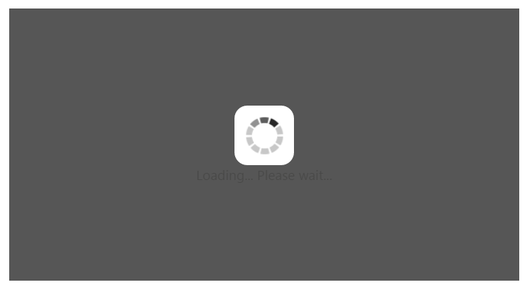
}Add the following styles to render WaitingPopup widget in waitingpopup.component.css.
#parent {
    height: 320px;
    width: 600px;
  }
Execute the above code to render the following output.

Show / Hide WaitingPopup
Using show() and hide() methods, you can display or hide the WaitingPopup widget over the target area.
The following code helps you to show / hide the WaitingPopup widget.
<div id="parent">
    <ej-waitingpopup id="waitingPopUp" [target]="target"></ej-waitingpopup>
</div>import {Component} from '@angular/core';
import {ViewEncapsulation} from '@angular/core';
@Component({
selector: 'sd-home',
templateUrl: 'app/components/waitingpopup/waitingpopup.component.html',
styleUrls: ['app/components/waitingpopup/waitingpopup.component.css'],
encapsulation: ViewEncapsulation.None
})
export class WaitingPopupComponent {
target: string;
constructor() {
this.target = "#parent";
}
}//Create an instance from an existing WaitingPopup.
// only after control creation we can get waitingPopupObj otherwise it throws exception.
var waitingPopupObj = $("#waitingPopUp").data("ejWaitingPopup");
//Show WaitingPopup
waitingPopupObj.show();
//Hide WaitingPopup
waitingPopupObj.hide();Add the following styles to render WaitingPopup widget in the css file as mentioned in above samples.
#parent {
    height: 320px;
    width: 600px;
 }
The following screenshot illustrates a WaitingPopup when show() method is invoked.
