Rows
18 Sep 201716 minutes to read
The TreeGrid rows displays the information of each row from the bounded data source.
Row Template
Row template is used to customize the TreeGrid rows based on requirements. In TreeGrid, rowTemplateID and altRowTemplateID properties are used for customizing the row.
rowTemplateID is used to customize all the rows in TreeGrid. For this property, ID of the row template is to be provided.
altRowTemplateID is used to customize the alternative rows in TreeGrid. For this property, ID of the alternative row template is to be provided.
.e-treegrid .e-selectionbackground {
        background-color: #CED8F6;
        }

      .border {
        border-color: #BDBDBD;
        border-width: 1px;
        border-style: solid;
}<script id="rowTemplateScript" type="text/x-jsrender">
<tr style="background-color:#F2F2F2;color:#000000;">
<td class="border" style='height:30px;'>
<div>{{:#data['EmployeeID']}}</div>
</td>
<td class="border" style='height:30px;'>
<div style="font-size:14px;">
{{:#data['Name']}}
<p style="font-size:9px;">{{:#data['Designation']}}</p>
</div>
</td>
<td class="border">
<div style="padding-top:5px;">
<div style="display:inline-flex !important;">
<img src="../images/treegrid/{{:#data['Full Name']}}.png"/></div>
<div style="display:inline-block;padding-left:10px;">
{{:#data['Address']}}
<p>{{:#data['Country']}}</p>
<p style="font-size:12px;">{{:#data['Contact']}}</p>
</div>
</div>
</td>
<td class="border" style='height:30px;'>
<div>{{:#data['DOB']}}</div>
</td>
</tr>
</script>
<script id="altRowTemplateScript" type="text/x-jsrender">
<tr style="background-color:#E6E6E6;color:#000000;">
<td class="border" style='height:30px;'>
<div>{{:#data['EmployeeID']}}</div>
</td>
<td class="border" style='height:30px;'>
<div style="font-size:14px;">{{:#data['Name']}}
<p style="font-size:9px;">{{:#data['Designation']}}</p>
</div>
</td>
<td class="border">
<div style="padding-top:5px;">
<div style="display:inline-flex !important;">
<img src="../images/treegrid/{{:#data['Full Name']}}.png"/></div>
<div style="display:inline-block;padding-left:10px;">
{{:#data['Address']}}
<p>{{:#data['Country']}}</p>
<p style="font-size:12px;">{{:#data['Contact']}}</p>
</div>
</div>
</td>
<td class="border" style='height:30px;'>
<div>{{:#data['DOB']}}</div>
</td>
</tr>
</script><ej-treegrid id="TreeGridControl" [dataSource]="treeData"
childMapping="Children"
[allowColumnResize]="true"
rowTemplateID= "rowTemplateScript"
altRowTemplateID= "altRowTemplateScript"
[editSettings]="editSettings"
[columns]="columns"
//...>
</ej-treegrid>import {Component} from '@angular/core';
@Component({
selector: 'ej-app',
templateUrl: 'app/app.component.html',
styleUrls: ['app/app.component.css']
})
export class AppComponent {
public projectData: any;
public editSettings: any;
public columns: any;
constructor() {
//...
this.editSettings = {
allowEditing: true,
editMode: "cellEditing"
};
this.projectData = [{
"Name": "Robert King",
"Full Name": "Robert King",
"Designation": "Chief Executive Officer",
"EmployeeID": "EMP001",
"Address": "507 - 20th Ave. E.Apt. 2A, Seattle",
"Contact": "(206) 555-9857",
"Country": "USA",
"DOB": "2/15/1963",
"Children": [{
"Name": "David william",
"Full Name": "David william",
"Designation": "Vice President",
"EmployeeID": "EMP004",
"Address": "722 Moss Bay Blvd., Kirkland",
"Country": "USA",
"Contact": "(206) 555-3412",
"DOB": "5/20/1971",
// ...
}]
}];
this.columns = [{
headerText: "Employee ID",
width: "180"
},
{
field: "Name",
headerText: "Employee Name"
},
{
field: "Address",
headerText: "Employee picture",
width: "300"
},
{
field: "DOB",
headerText: "DOB",
editType: "datepicker"
},
]
}
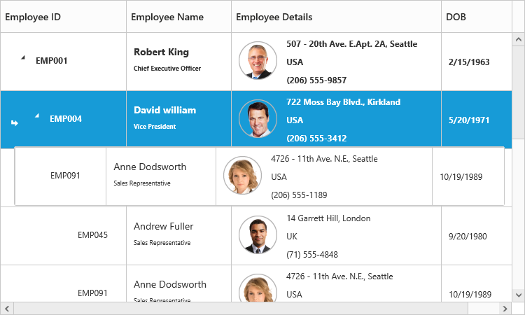
}The output of TreeGrid with Row Template is as follows.
Row Drag and Drop
It is possible to dynamically re-arrange the rows in the TreeGrid control by using the allowDragAndDrop property. With this property, row drag and drop can be enabled or disabled. Rows can be inserted above, below as a sibling or as a child to the existing row with the help of this feature. A default tooltip is rendered while dragging the TreeGrid row and this tooltip can be customized by the dragTooltip property. This property has inner properties such as showTooltip, tooltipItems and tooltipTemplate.
The showTooltip property is used to enable or disable the tooltip. By default, this property value is false.
The following code explains about enabling the row drag and drop with the default tooltip in the TreeGrid.
<ej-treegrid id="TreeGridControl" [dragTooltip]="dragTooltip"
            [allowDragAndDrop]="true"
            [columns]="columns"
    //...>
</ej-treegrid>import {Component} from '@angular/core';
@Component({
selector: 'ej-app',
templateUrl: 'app/app.component.html',
styleUrls: ['app/app.component.css']
})
export class AppComponent {
public dragTooltip: any;
public editSettings: any;
public columns: any;
constructor() {
//...
this.editSettings = {
allowEditing: true,
editMode: "cellEditing"
};
this.dragTooltip = {
showTooltip: true
},
this.columns = [{
field: "taskID",
headerText: "Task Id"
}, {
field: "taskName",
headerText: "Task Name"
},
//...
]
}
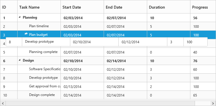
}The following screenshot depicts a row drag and drop in the TreeGrid widget.
Customizing Drag tooltip
The tooltipItems property is used to customize the tooltip items. By using this property, specific fields can be rendered in the tooltip. By default this property value is null, and all the defined field items are rendered in the tooltip.
The following code shows how to render row drag tooltip with the desired field items.
<ej-treegrid id="TreeGridControl" [dragTooltip]="dragTooltip"
            [allowDragAndDrop]="true"
    //...>
</ej-treegrid>import {Component} from '@angular/core';
@Component({
selector: 'ej-app',
templateUrl: 'app/app.component.html',
styleUrls: ['app/app.component.css']
})
export class AppComponent {
public dragTooltip: any;
constructor() {
//...
this.dragTooltip = {
showTooltip: true,
tooltipItems: [
"taskID",
"taskName",
"startDate",
"endDate"
]
}
}
}The tooltipTemplate property renders the template tooltip for row drag and drop in the TreeGrid control by using the JsRender template. You can provide either the id value of the script element or the script element to the property.
The following code shows how to render row drag tooltip with tooltip template.
<script id="customTooltip" type="text/x-jsrender">
      <tr>
         <td class="border" style='height:30px;'>
         <div>{{:#data['TaskId']}}</div>
         </td>

         <td class="border" style='height:30px;'>
         <div>{{:#data['TaskName']}}</div>
         </td>
      </tr>
</script><ej-treegrid id="TreeGridControl" [dragTooltip]="dragTooltip"
[allowDragAndDrop]="true"
//...>
</ej-treegrid>import {Component} from '@angular/core';
@Component({
selector: 'ej-app',
templateUrl: 'app/app.component.html',
styleUrls: ['app/app.component.css']
})
export class AppComponent {
public dragTooltip: any;
constructor() {
//...
this.dragTooltip = {
showTooltip: true,
tooltipTemplate: "#customtooltip"
}
}
}