Columns
18 Sep 201724 minutes to read
Column definitions, specified in the columns option, define how the data in the dataSource have to be displayed, formatted and edited in TreeGrid. The values in the dataSource can be mapped to the appropriate column using the ‘field’ property of the corresponding column object.
Formatting
The values in each column can be formatted using the ‘format’ property of the column object.
The following example shows how to specify the numeric format string to display currency, percentage symbols and date values in a column,
<ej-treegrid id="TreeGridControl" [columns]="columns"
    //...>
</ej-treegrid>import {Component} from '@angular/core';
@Component({
selector: 'ej-app',
templateUrl: 'app/app.component.html'
})
export class AppComponent {
public columns: any;
constructor() {
//...
this.columns = [{
field: "Percentage",
headerText: "Percentage",
format: "{0:P0}"
},
{
field: "Currency",
headerText: "Currency",
format: "{0:C2}"
},
{
field: "startDate",
headerText: "Start Date",
format: "{0:MM/dd/yyyy}"
},
{
field: "endDate",
headerText: "End Date",
format: "{0:MM/dd/yyyy hh:mm:ss}"
}
]
}
}NOTE
For more numeric format strings, please refer this link.
For more date format strings, please refer this link.
Headers
Header text
Using columns.headerText property, you can provide the title for a specific column. The below code snippet is shows how to set header text for the columns,
<ej-treegrid id="TreeGridControl" [columns]="columns"
    //...>
</ej-treegrid>import {Component} from '@angular/core';
@Component({
selector: 'ej-app',
templateUrl: 'app/app.component.html'
})
export class AppComponent {
public columns: any;
constructor() {
//...
this.columns = [{ field: "taskID", headerText: "Task Id" },
{ field: "taskName", headerText: "Task Name" },
{ field: "startDate", headerText: "Start Date" },
{ field: "endDate", headerText: "End Date" }
]
}
}Text wrapping
It is possible to wrap the header text or the title for the column, when the content exceeds the column width using the headerTextOverflow property. By default this property is set to none. To enable wrapping of header text, you have to set headerTextOverflow property to ‘wrap’. The below code snippet demonstrates this,
<ej-treegrid id="TreeGridControl" headerTextOverflow="wrap"
    //...>
</ej-treegrid>
Header Template
Using columns.headerTemplateID property, you can specify the Id of the script element, which contains the JsRender template, to the specific column.
Following code snippet shows how to set the header template,
<script type="text/x-jsrender" id="resource">
        <div>
            <div class="name">
                <img src="13.4.0.53/themes/web/images/treegrid/icon-03.png" width="20" height="20" />
            </div>
            <div style="position:relative; top:3px;">
                Resources
            </div>
        </div>
    </script>

    <script type="text/x-jsrender" id="projectName">
        <div>
            <div>
                <img src="13.4.0.53/themes/web/images/treegrid/icon-01.png" width="20" height="20" />
            </div>
            <div style="position:relative; top:3px;">
                Task Name
            </div>
        </div>
</script><ej-treegrid id="TreeGridControl" [columns]="columns"
//...>
</ej-treegrid>import {Component} from '@angular/core';
@Component({
selector: 'ej-app',
templateUrl: 'app/app.component.html'
})
export class AppComponent {
public columns: any;
constructor() {
//...
this.columns = [{
field: "taskName",
editType: "stringedit",
headerTemplateID: "#projectName"
}, {
field: "startDate",
editType: "datepicker"
}, {
field: "resourceId",
editType: "dropdownedit",
dropdownData: projectResources,
headerTemplateID: "#resource"
}, {
field: "progress",
editType: "numericedit"
}]
}
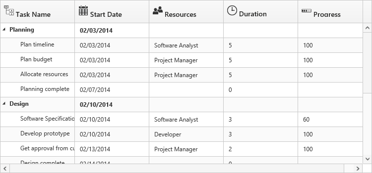
}The below screenshot depicts column headers with custom templates,
Frozen Columns
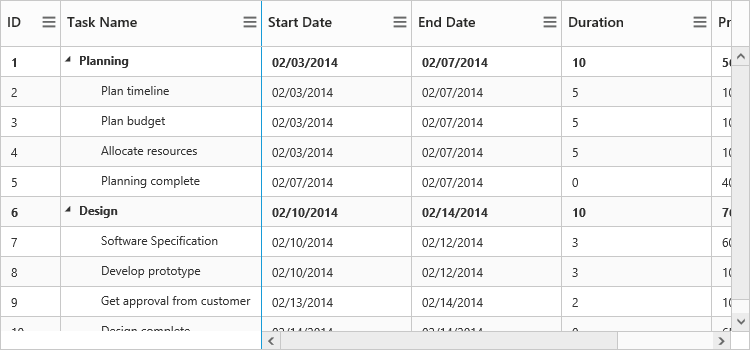
Specific columns can be frozen by enabling columns.isFrozen property of the respective column object. The columns which are frozen remain static while scrolling the content horizontally. You can also freeze or unfreeze a column during runtime, by selecting Freeze or Unfreeze menu item in the column menu. These set of menu options will be displayed in all the columns when columns.isFrozen property is enabled in any of the columns. However you can control the visibility of these menu options in a particular column by enabling/disabling the columns.allowFreezing property of that specific column.
<ej-treegrid id="TreeGridControl" [columns]="columns" [showColumnChooser]="true"
//...>
</ej-treegrid>import {
Component
} from '@angular/core';
@Component({
selector: 'ej-app',
templateUrl: 'app/app.component.html'
})
export class AppComponent {
public columns: any;
constructor() {
//...
this.columns = { field: "taskID", headerText: "ID", width: 60, isFrozen: true, allowFreezing: false},
{ field: "taskName", headerText: "Task Name", width: 200, isFrozen: true },
{ field: "startDate", headerText: "Start Date"},
{ field: "endDate", headerText: "End Date"},
{ field: "duration", headerText: "Duration" },
}
}The below screenshot depicts TreeGrid with frozen columns,
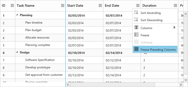
It is also possible to freeze all the preceding columns by choosing Freeze Preceding Columns option in the column menu.
Resizing
You can resize the column width to view the hidden text of the cell. This feature can be enabled by setting allowColumnResize property to true.
<ej-treegrid id="TreeGridControl" [allowColumnResize]="true"
//...>
</ej-treegrid>Checkbox column
It is possible to display a column as checkbox column in TreeGrid by enabling columns.displayAsCheckbox property and by setting editType property as Boolean for the column . If the columns.displayAsCheckbox property is set as false, then the column will be displayed as string column with the value mapped from the data source.
The following code snippet explains how to display a checkbox column in TreeGrid
<ej-treegrid id="TreeGridControl" [columns]="columns"
    //...>
</ej-treegrid>import {Component} from '@angular/core';
@Component({
selector: 'ej-app',
templateUrl: 'app/app.component.html'
})
export class AppComponent {
public columns: any;
constructor() {
//...
this.columns = [
//...
{
field: "approved",
headerText: "Approved",
editType: "booleanedit",
displayAsCheckbox: true
}
]
}
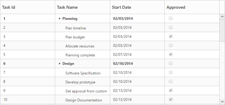
}The below screen shot depicts the Approved column in TreeGrid displayed as a checkbox column
Column Template
Columns can be customized either by using JsRender templates or by AngularJS templates,
Using columns.templateID property, you can specify the Id of the script element, which contains the template for the column. However, you need to enable columns.isTemplateColumn property for the specific column to display the custom template instead of default template.
Following code example show how to define template for the column,
// JsRender template definition.
<script type="text/x-jsrender" id="columnTemplate">
<div style="display:inline-block;position:relative;left:10px;top:1px">
<img src="../images/gantt/.png" height="40" />
</div>
</script><ej-treegrid id="TreeGridControl" [columns]="columns" [rowHeight]="rowHeight"
//...>
</ej-treegrid>import {Component} from '@angular/core';
@Component({
selector: 'ej-app',
templateUrl: 'app/app.component.html'
})
export class AppComponent {
public columns: any;
public rowHeight;
constructor() {
//...
this.rowHeight = 50;
this.columns = [{ field: "taskID", headerText: "Task Id", width: "45" },
{ field: "taskName", headerText: "Task Name" },
{ headerText: "Resource", isTemplateColumn: true, templateID: "columnTemplate", textAlign: "center" },
{ field: "resourceNames", headerText: "Resource Name" },
]
}
}
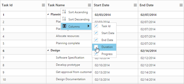
Column Menu
Column menu can be displayed in column header by enabling ‘showColumnChooser’.
Following are the items displayed in the column menu,
- Column Chooser – Display all the column names; you can enable or disable a column by select or deselect the respective column name in the column chooser menu.
- Sort Ascending & Sort Descending – Used to sort the items in the column. These menu options will be displayed only when you enable allowSorting property to true. To perform multilevel sorting, the ‘allowMultiSorting’ property should be enabled.
- Freeze, Unfreeze & Freeze Preceding Columns – Used to freeze or unfreeze the columns. These set of menu options will be displayed in all the columns when columns.isFrozen property is enabled in any of the columns. However you can control the visibility of these menu options in a particular column by enabling/disabling the columns.allowFreezing property of that specific column.
<ej-treegrid id="TreeGridControl" [columns]="columns" [showColumnChooser]="true" [allowSorting]= "true"
[allowMultiSorting]= "true"
//...>
</ej-treegrid>import {Component} from '@angular/core';
@Component({
selector: 'ej-app',
templateUrl: 'app/app.component.html'
})
export class AppComponent {
public columns: any;
public rowHeight;
constructor() {
//...
this.rowHeight = 50;
this.columns = [
// ...
{
field: "duration",
headerText: "Duration",
visible: false
}
// ...
]
}
}
Changing position of expander column
The position of the expander column, which acts as tree column, can be changed using the ‘treeColumnIndex’ property,
Following code example shows how to change the position of the expander column,
<ej-treegrid id="TreeGridControl" [treeColumnIndex]="treeColumnIndex"
//...>
</ej-treegrid>import { Component } from '@angular/core';
@Component({
selector: 'ej-app',
templateUrl: 'app/app.component.html'
})
export class AppComponent {
public treeColumnIndex;
constructor() {
//...
this.treeColumnIndex=1;
}
}Visibility
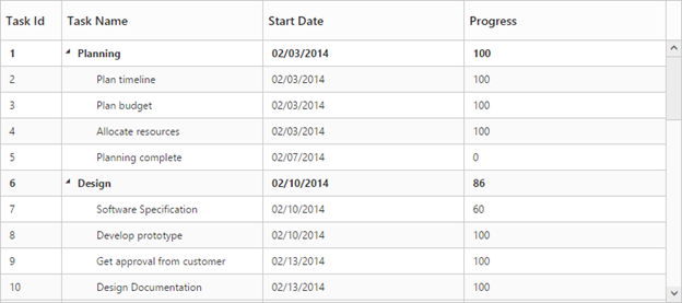
Columns can be hidden on loading by setting the ‘columns.visible’ property as false,
Following code example explains how to hide the fourth column,
<ej-treegrid id="TreeGridControl" [columns]="columns"
    //...>
</ej-treegrid>import { Component } from '@angular/core';
@Component({
selector: 'ej-app',
templateUrl: 'app/app.component.html'
})
export class AppComponent {
public columns:any;
constructor() {
//...
this.columns= [
{ field: "taskID", headerText: "Task Id", width: "45" },
{ field: "taskName", headerText: "Task Name" },
{ field: "startDate", headerText: "Start Date" },
{ field: "endDate", headerText: "End Date", visible: false },
{ field: "progress", headerText: "Progress" }
]
}
}
Read-only
A column can be made read-only by setting the columns.allowEditing property as false,
NOTE
By setting columns.allowEditing as false, that specific column alone is made as read only, and by setting editSettings.allowEditing as false, the entire TreeGrid is made read only.
The below code snippet demonstrates this,
<ej-treegrid id="TreeGridControl" [columns]="columns"
    //...>
</ej-treegrid>import { Component } from '@angular/core';
@Component({
selector: 'ej-app',
templateUrl: 'app/app.component.html'
})
export class AppComponent {
public columns:any;
constructor() {
//...
this.columns=[
{ field: "taskID", headerText: "Task Id"},
{ field: "taskName", headerText: "Task Name",allowEditing: false },
{ field: "startDate", headerText: "Start Date"},
{ field: "endDate", headerText: "End Date" }
]
}
}Validation Rules
At some occasions, we will need to validate the data before updating it to the database. In TreeGrid it is possible to validate the data while performing adding and editing actions. The validation rules must be provided in the column definition. TreeGrid has built-in support for the below validation rules,
- maxlength – Makes the value require a given maximum text length.
- minlength – Makes the value require a given minimum text length.
- required – Makes the value required
- number – Makes the value require a decimal number
- range – Makes the value require a given value range
The below code example explains defining the validation rules for the column.
<ej-treegrid id="TreeGridControl" [columns]="columns"
    //...>
</ej-treegrid>import {Component} from '@angular/core';
@Component({
selector: 'ej-app',
templateUrl: 'app/app.component.html'
})
export class AppComponent {
public columns: any;
constructor() {
//...
this.columns = [{
field: "taskID",
headerText: "Task Id",
validationRules: {
number: true,
required: true
}
},
{
field: "taskName",
headerText: "Task Name",
allowEditing: false,
validationRules: {
maxlength: 5,
minlength: 2
}
},
{
field: "progress",
headerText: "Progress",
validationRules: {
range: [0, 100]
}
},
//...
]
}
}Custom validation error messages can also be defined in the column object. The below code example explains defining the custom error message.
<ej-treegrid id="TreeGridControl" [columns]="columns"
    //...>
</ej-treegrid>import {Component} from '@angular/core';
@Component({
selector: 'ej-app',
templateUrl: 'app/app.component.html'
})
export class AppComponent {
public columns: any;
constructor() {
//...
this.columns = [{
field: "taskID",
headerText: "Task Id",
validationRules: {
number: true,
required: true,
messages: {
"required": "This field should not left blank"
}
}
}, ]
}
}