How can I help you?
Cell
Tooltip
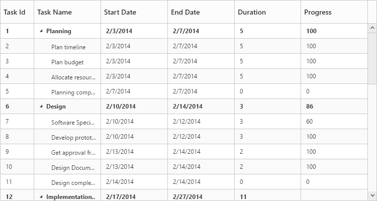
In TreeGrid tooltip can be enabled using showGridCellTooltip property. Using this property tooltip can be enabled for cells both header and content.
Please find the example describes the above behavior.
<ej-treegrid id="TreeGridControl" [showGridCellTooltip]="true"
//...>
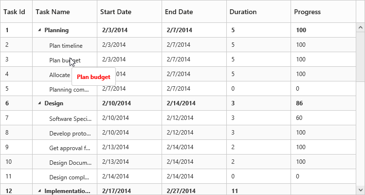
</ej-treegrid>The following output shows the result of above code example.
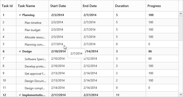
Cell Tooltip
Header Tooltip
Tooltip Template
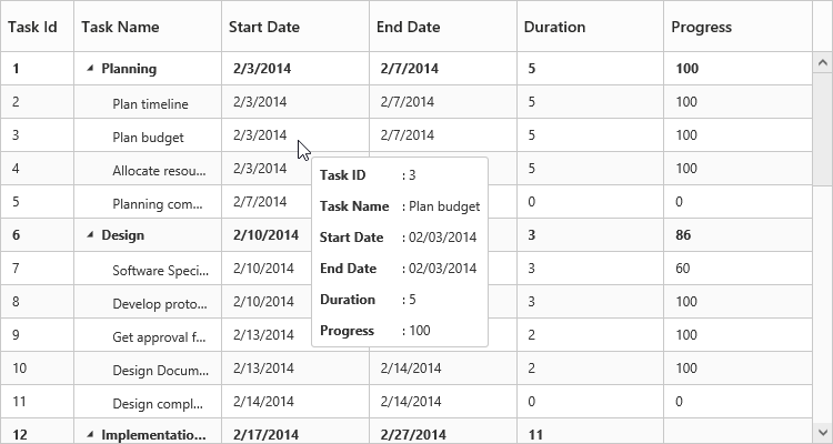
It is possible to display a customized tooltip across the cells using the property cellTooltipTemplate along with the property showGridCellTooltip enabled. We need to set the template of the custom tooltip to this property.
Please find code example describes the cell tooltip template support.
Write the following code in index.html file.
<script type="text/x-jsrender" id="cellTooltipTemplate">
    <table>
        <tr>
            <td style='padding:5px;font-weight: bold;'>
                Task ID
            </td>
            <td style='padding:5px;'>
                : {{:#data['record']['taskID']}}
            </td>
        </tr>
        <tr>
            <td style='padding:5px;font-weight: bold;'>
                Task Name
            </td>
            <td style='padding:5px;'>
                : {{:#data['record']['taskName']}}
            </td>
        </tr>
        <tr>
            <td style='padding:5px;font-weight: bold;'>
                Start Date
            </td>
            <td style='padding:5px;'>
                : {{:#data['record']['startDate']}}
            </td>
        </tr>
        <tr>
            <td style='padding:5px;font-weight: bold;'>
                End Date
            </td>
            <td style='padding:5px;'>
                : {{:#data['record']['endDate']}}
            </td>
        </tr>
        <tr>
            <td style='padding:5px;font-weight: bold;'>
                Duration
            </td>
            <td style='padding:5px;'>
                : {{:#data['record']['duration']}}
            </td>
        </tr>
        <tr>
            <td style='padding:5px;font-weight: bold;'>
                Progress
            </td>
            <td style='padding:5px;'>
                : {{:#data['record']['progress']}}
            </td>
        </tr>
    </table>
</script><ej-treegrid id="TreeGridControl" [showGridCellTooltip]="true" cellTooltipTemplate="#cellTooltipTemplate"
//...>
</ej-treegrid>The following output shows the result of above code example.
Column tooltip
By using the property columns.tooltip it is possible to display a custom tooltip for a specific column. The ID of the script template must be set to the columns.tooltip property.
Please refer the following code example for setting a custom tooltip for a specific column.
Write the following code in index.html file.
<script type="text/x-jsrender" id="template">
    <div style='padding:10px;color:red;font-weight: bold;'>
        {{:#data['record']['taskName']}}
    </div>
</script><ej-treegrid id="TreeGridControl" [columns]="columns"
//...>
</ej-treegrid>import { Component } from '@angular/core';
@Component({
selector: 'ej-app',
templateUrl: 'app/app.component.html'
})
export class AppComponent {
public columns:any;
constructor() {
//...
this.columns= [
//...
{
field: "taskName",
headerText: "Task Name",
tooltip: "template"
},
//...
]
}
}The following output shows the output of above code snippets.
NOTE
Template element should be enclosed with
<script>tag with type as“text/x-jsrender”.
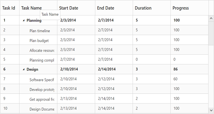
Header tooltip
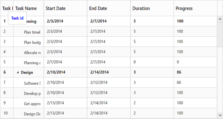
By using the property columns.headerTooltip it is possible to display a custom tooltip for a specific column header. The ID of the script template must be set to the columns.headerTooltip property.
Please refer the following code example for setting a custom tooltip for a specific column header.
<script type="text/x-jsrender" id="template">
<div style='padding:10px;color:blue;font-weight: bold;'>
{{:#data['column']['headerText']}}
</div>
</script><ej-treegrid id="TreeGridControl" [columns]="columns"
//...>
</ej-treegrid>import { Component } from '@angular/core';
@Component({
selector: 'ej-app',
templateUrl: 'app/app.component.html'
})
export class AppComponent {
public columns:any;
constructor() {
//...
this.columns= [
//...
{
field: "taskID",
headerText: "Task Id",
headerTooltip: "template"
},
//...
]
}
}The following output shows the result of above code example.
Clip Mode
Clip mode enables the TreeGrid to clip cell content and header content when the content exceeds the boundary of the cell width.
We can specify the type of clip mode using columns.clipMode property, clip mode will be enabled for both TreeGrid content and header of that specific column.
The below are the available clipping modes in TreeGrid,
- Clip
- Ellipsis
Clip
When clipMode of Columns property set as ej.TreeGrid.ClipMode.Clip, then it truncates the overflown text in the cell.
NOTE
- By default the
clipModewill be set asClip.
The following code example describes the above behavior.
<ej-treegrid id="TreeGridControl" [columns]="columns"
    //...>
</ej-treegrid>import {Component} from '@angular/core';
@Component({
selector: 'ej-app',
templateUrl: 'app/app.component.html'
})
export class AppComponent {
public columns: any;
constructor() {
//...
this.columns = [
//...
{
field: "taskName",
headerText: "Task Name",
clipMode: ej.TreeGrid.ClipMode.Clip
},
//...
]
}
}The following output shows the result of above code example.
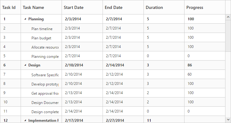
Ellipsis
When columns.clipMode property is set as ej.TreeGrid.ClipMode.Ellipsis then it shows ellipsis for the overflown cell.
The following code example describes the above behavior.
<ej-treegrid id="TreeGridControl" [columns]="columns"
    //...>
</ej-treegrid>import {Component} from '@angular/core';
@Component({
selector: 'ej-app',
templateUrl: 'app/app.component.html'
})
export class AppComponent {
public columns: any;
constructor() {
//...
this.columns = [
//...
{
field: "taskName",
headerText: "Task Name",
clipMode: ej.TreeGrid.ClipMode.Ellipsis
},
//...
]
}
}The following output is shows the result of the above code example.