Template Support
9 Oct 20176 minutes to read
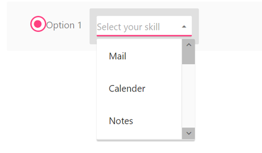
Template allows you to insert custom controls inside the toolbar items. Also you can design simple drop down buttons listing the items and radio button inside the Toolbar.
Set the list for DropDown control inside a list tag and define this tag as a Toolbar item. You can use all simple controls as a Toolbar item. To add RadioButton and DropDownList to Toolbar, use the following code example.
<ej-toolbar>
 <ul>
      <li>
         <div>
            <input ej-radiobutton text="Option" name="Option" value="option" />
         </div>

      </li>
      <li id="Dropdown" title="Dropdown Control">
         <input id="Select" ej-dropdownlist [dataSource]="datasource"  [fields]="fieldsvalues"  width=240 />

      </li>
   </ul>
</ej-toolbar>import { Component } from '@angular/core';
@Component({
selector: 'ej-app',
templateUrl: './orientation.component.html',
})
export class OrientationComponent {
datasource: Array<Object> = [];
fieldsvalues: Object;
constructor() {
this.datasource = [
{ id: 1, text: 'Mail' },
{ id: 2, text: 'Calender' },
{ id: 3, text: 'Notes' },
{ id: 4, text: 'Contacts' },
],
this.fieldsvalues = { dataSource: this.datasource,text: 'text'};
}
}##Through Items API:
<ej-toolbar [Items]="items" (create)=onCreate($event)>
</ej-toolbar>import { Component } from '@angular/core';
@Component({
selector: 'ej-app',
templateUrl: './orientation.component.html',
})
export class OrientationComponent {
items: Array<Object> = [];
list: Array<Object> = [];
constructor() {
this.list = [
{ id: 1, text: 'Mail' },
{ id: 2, text: 'Calender' },
{ id: 3, text: 'Notes' },
{ id: 4, text: 'Contacts' },
];
}
items=[
{id:"item1",group:"group1",template:"<input type='radio' id='Radio1' name='radio'>Option 1</input>"},
{id: "item2",group:"group2",template:"<input type='text' id='dropdown1' />"}
],
onCreate(args){
$("#Radio1").ejRadioButton({size:"medium"});
$('#dropdown1').ejDropDownList({
dataSource: this.list,
fields: { text: "text" },
watermarkText: "Select your skill",
});
}
}##Through template field in dataSource API:
<ej-toolbar [dataSource]="items" [fields]="fieldsvalues" (create)=onloading($event)>
</ej-toolbar>import { Component } from '@angular/core';
@Component({
selector: 'ej-app',
templateUrl: './orientation.component.html',
})
export class OrientationComponent {
items: Array<Object> = [];
list: Array<Object> = [];
fieldsvalues: Object;
constructor() {
this.list = [
{ id: 1, text: 'Mail' },
{ id: 2, text: 'Calender' },
{ id: 3, text: 'Notes' },
{ id: 4, text: 'Contacts' },
];
this.fieldsvalues = { id: "id",tooltipText:"title",group:"group",template:"template"};
}
items=[
{id:"item1",group:"group1",title:"radio",template:"<input type='radio' id='Radio1' name='radio'>Option 1</input>"},
{id: "item2",group:"group2",title:"dropdown",template:"<input type='text' id='dropdown1'/>"},
],
onCreate(args){
$("#Radio1").ejRadioButton({size:"medium"});
$('#dropdown1').ejDropDownList({
dataSource: this.list,
fields: { text: "text" },
watermarkText: "Select your skill",
});
}
}The following screenshot displays a Toolbar with embedded controls.