Miscellaneous
3 Oct 20173 minutes to read
Show Rounded Corner
It sets the corner of Toggle Button in rounded shape. The Toggle Button, by default doesn’t have rounded corner. To set rounded corner, you can enable showRoundedCorner property.
The following steps explains you the details about rendering the Toggle Button with Rounded corner support.
In the HTML page, add the following button elements to configure Toggle Button widget.
<div align="center">
    <table width="500px" align="center">
         <tr>
             <td colspan="2">
                 <ej-togglebutton type="checkbox" id="toggle_roundedCorner" width="100px" height="30px" contentType="textandimage" [showRoundedCorner]="true" defaultText="Play" [toggleState]="state" size="large" activeText="Next" defaultPrefixIcon="e-icon e-mediaplay" activePrefixIcon="e-icon e-mediapause"></ej-togglebutton>
             </td>
         </tr>
     </table>
</div>import { Component } from '@angular/core';
@Component({
selector: 'ej-app',
templateUrl: './togglebutton.component.html'
})
export class ToggleButtonComponent {
state: boolean;
constructor() {
this.state = false;
}
}Execute the above code to render the following output.
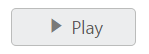
Prevent Toggle
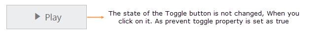
This property is used to prevent the state change of Toggle Button when it is clicked. When you set preventToggle property as true, then the state of the Toggle Button is not changed even though it is clicked.
The following steps explains you the details about rendering the Toggle Button with preventToggle property enabled.
In the HTML page, add the following button elements to configure Toggle Button widget.
<div align="center">
    <table width="500px" align="center">
         <tr>
             <td colspan="2">
                 <ej-togglebutton type="checkbox" size="large" id="toggle_preventtoggle" width="100px" height="30px" contentType="textandimage" [preventToggle]="true" defaultText="Play" [toggleState]="state" activeText="Next" defaultPrefixIcon="e-icon e-mediaplay" activePrefixIcon="e-icon e-mediapause"></ej-togglebutton>
             </td>
         </tr>
     </table>
</div>import { Component } from '@angular/core';
@Component({
selector: 'ej-app',
templateUrl: './togglebutton.component.html'
})
export class ToggleButtonComponent {
state: boolean;
constructor() {
this.state = false;
}
}Execute the above code to render the following output.