How can I help you?
Getting Started with Angular Toggle Button
This section explains briefly about how to create a Toggle Button in your application.
Control structure
The HTML checkbox element can be easily configured as Essential Toggle Button control. The basic rendering of Essential Toggle Button is achieved by using default functionality.


Create a simple Toggle Button in Angular
To get started, you need to refer the basic prerequisites and system configuration to be done from the given Getting started document.
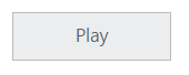
Toggle Button Creation
Adding input Checkbox element for Toggle Button rendering.
<div align="center">
    <table width="500px" align="center">
         <tr>
             <td colspan="2">
                 <ej-togglebutton type="checkbox" id="toggleButton" defaultText="play"></ej-togglebutton>
             </td>
         </tr>
     </table>
</div>import { Component } from '@angular/core';
@Component({
selector: 'ej-app',
templateUrl: './togglebutton.component.html'
})
export class ToggleButtonComponent {
state: boolean;
constructor() {
this.state = false;
}
}NOTE
The advantages of using checkbox element and label element for the rendering of Toggle Button are as follows.
Checkbox Element
The HTML checkbox element is made as the base for Essential JavaScript Toggle Button, because to provide convenient look and feel while building forms and support basic methods and its states.
Label Element
A label element has to be explicitly associate a form control. A label is attached to a specific form control through the use of for attribute. The value of for attribute must be the same as the value of the id attribute of the form control. Clicking on the label or the control will activate the control in order to provide larger area of the control.
Initialization of ToggleButton in script
<div align="center">
    <table width="500px" align="center">
         <tr>
             <td colspan="2">
                 <ej-togglebutton type="checkbox" id="toggleButton" size="large" defaultText="play"></ej-togglebutton>
             </td>
         </tr>
     </table>
</div>import { Component } from '@angular/core';
@Component({
selector: 'ej-app',
templateUrl: './togglebutton.component.html'
})
export class ToggleButtonComponent {
constructor() {
}
}Output of above steps