Behavior Settings
13 Sep 20177 minutes to read
Set value of the TimePicker widget
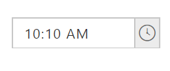
You can use value property to set default time for the TimePicker.
The following steps explains you on how to set the default value of the TimePicker.
In the HTML page, add a <input> element to configure TimePicker widget.
<div align="center">
    <input type="text" id="time" accesskey="j" value="10:10 AM" ej-timepicker/>
</div>import { Component } from '@angular/core';
@Component({
selector: 'ej-app',
templateUrl: './default.component.html'
})
export class DefaultComponent {
}
}
Enable/Disable TimePicker widget
TimePicker widget provides you an option to enable /disable the widget. You can disable the TimePicker by setting the “enabled” property value as false.
The following steps explain you to enable/disable property in TimePicker widget.
In the HTML page, add a <input> element to configure TimePicker widget.
<div align="center">
    <input type="text" id="time"[enabled]="enable" ej-timepicker />
</div>import { Component } from '@angular/core';
@Component({
selector: 'ej-app',
templateUrl: './default.component.html'
})
export class DefaultComponent {
enable: boolean;
constructor() {
this.enable = false;
}
}Execute the above code to render the following output.


Restrict editing
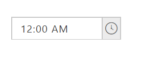
TimePicker widget provides readOnly property to disable editing in the control. Therefore you can only read the value set to TimePicker and cannot modify it. The value property allows you to set the default value for TimePicker widget when it is created.
Configure TimePicker textbox to restrict editing
The following steps allows you to disable editing value in TimePicker.
In the HTML page, add a <input> element to configure TimePicker widget.
<div align="center">
    <input type="text" id="time" [readOnly]="read" ej-timepicker/>
</div>import { Component } from '@angular/core';
@Component({
selector: 'ej-app',
templateUrl: './default.component.html'
})
export class DefaultComponent {
read: boolean;
constructor() {
this.read = true;
}
}The following screenshot illustrates a TimePicker textbox configured to restrict editing.
Rounded Corner
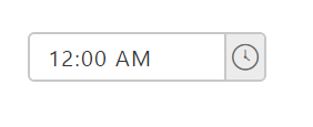
You can customize the shape of the TimePicker widget from regular rectangular shape to rounded rectangle shape using showRoundedCorner property that is set to false by default.
Configure Rounded corner to TimePicker Text box
The following steps explain you to change the edges of the textbox to rounded corner.
In the HTML page, add a <input> element to configure TimePicker widget.
<div align="center">
    <input type="text" id="time" [showRoundedCorner]="round" ej-timepicker/>
</div>import { Component } from '@angular/core';
@Component({
selector: 'ej-app',
templateUrl: './default.component.html'
})
export class DefaultComponent {
round: boolean;
constructor() {
this.round = true;
}
}The following screenshot illustrates a TimePicker when showRoundedCorner is set to “true”.
Scaling
TimePicker widget provides you options to change its height, width and also to change popup height and width.
Change TimePicker widget Height and width
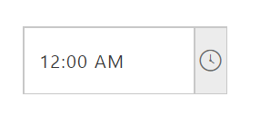
You can use height and width property to customize TimePicker width and height.
In the HTML page, add a <input> element to configure TimePicker widget.
<div align="center">
    <input type="text" id="time" width="150" height="50" ej-timepicker/>
</div>import { Component } from '@angular/core';
@Component({
selector: 'ej-app',
templateUrl: './default.component.html'
})
export class DefaultComponent {
}Execute the above code to render the following output.
Changing TimePicker PopupHeight and PopupWidth
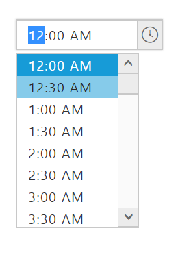
You can use popupHeight and popupWidth property to customize TimePicker popup width and height.
In the HTML page, add a <input> element to configure TimePicker widget.
<div align="center">
    <input type="text" id="time" popupHeight="170" popupWidth="120" ej-timepicker/>
</div>import { Component } from '@angular/core';
@Component({
selector: 'ej-app',
templateUrl: './default.component.html'
})
export class DefaultComponent {
}Execute the above code to render the following output.
State persistence
TimePicker widget provide options to maintain the selected value after you refresh the page by using enablePersistence property.
Steps to use State persistence of the TimePicker
The following steps explains you to use enablePersistence property.
In the HTML page, add a <input> element to configure TimePicker widget.
<div align="center">
    <input type="text" id="time" value="10:00 AM" [enablePersistence]="persistence"  ej-timepicker/>
</div>import { Component } from '@angular/core';
@Component({
selector: 'ej-app',
templateUrl: './default.component.html'
})
export class DefaultComponent {
persistence: boolean;
constructor() {
this.persistence = true;
}
}Strict mode of the TimePicker
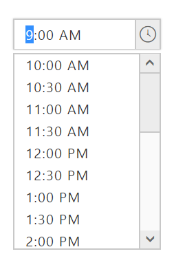
TimePicker widget provides you an option to set default value when there is no default value between minTime and maxTime by using enableStrictMode property.
Steps to use StrictMode property
The following steps explains you to use strict mode property.
In the HTML page, add a <input> element to configure TimePicker widget.
<div align="center">
    <input type="text" id="time" value="10:00 AM" [enableStrictMode]="strict" minTime="10:00 AM" maxTime="9:00 PM"  ej-timepicker/>
</div>import { Component } from '@angular/core';
@Component({
selector: 'ej-app',
templateUrl: './default.component.html'
})
export class DefaultComponent {
strict: boolean;
constructor() {
this.strict = true;
}
}Execute the above code to render the following output.
Interval
TimePicker widget provides you an option to change the interval of the hour, minute and seconds.
Steps to change the Time interval of the TimePicker control
The following steps explains you to change the Time Interval of the TimePicker.
In the HTML page, add a <input> element to configure TimePicker widget.
<div align="center">
    <input type="text" id="time" value="9:00 AM" timeFormat="h:mm:ss tt" [hourInterval]="hour" [minutesInterval]="minutes" [secondsInterval]="seconds" ej-timepicker />
</div>import { Component } from '@angular/core';
@Component({
selector: 'ej-app',
templateUrl: './default.component.html'
})
export class DefaultComponent {
hour: number;
minutes: number;
seconds: number;
constructor() {
this.hour = 2;
this.minutes = 30;
this.seconds = 20;
}
}