Appearance and Styling
11 Jan 20185 minutes to read
Show ToolTip
Rating control provides support for Tooltip values. This is achieved by enabling the showTooltip property to be ‘true’. When you move the mouse over the Rating control it displays the Tooltip value as rating value. By default this property value is set to ‘true’.
The following code example is used to render the Rating control without tooltip.
Add the following HTML to render Rating with Tooltip.
<ej-rating id="rating" [showTooltip]="false"></ej-rating>The following screenshot illustrates Rating without Tooltip.

Adjusting Rating Size
Adjust Shape Width and Shape Height
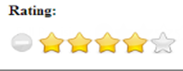
You can customize the width and height of the Rating by shapeWidth and shapeHeight properties. These properties completely depend on rating image’s size. The shapeWidth and shapeHeight are adjusted within the rating image size.
The following code example is used to render the Rating control with customized shapeWidth and shapeHeight.
Add the following HTML to render Rating with customized shapeWidth and shapeHeight.
<ej-rating id="rating" [value]="rate" [shapeWidth]="shapeWidth" [shapeHeight]="shapeHeight"> </ej-rating>import { Component } from '@angular/core';
import {ViewEncapsulation} from '@angular/core';
@Component({
selector: 'ej-app',
templateUrl: 'src/rating/rating.component.html',
styleUrls: ['src/rating/rating.component.css'],
encapsulation: ViewEncapsulation.None
})
export class RatingComponent {
rate: number;
shapeWidth: number;
shapeHeight: number;
constructor() {
this.rate = 4;
this.shapeWidth = 29;
this.shapeHeight = 29;
}
}Add the below CSS in external file named as rating.component.css
.e-rating
    {
        margin-top: -7px;
    }
    .e-rating.e-horizontal .e-shape-list, .e-rating.e-vertical .e-shape-list,
    .e-rating.e-horizontal .e-shape, .e-rating.e-vertical .e-shape, .e-rating.e-horizontal .e-ul,.e-rating.e-vertical .e-ul,.e-rating.e-horizontal .e-reset, .e-rating.e-vertical .e-reset
    {
        height:28px;width:28px;
        background:url(images/crystal-stars.png) no-repeat;
    }
    .e-rating.e-horizontal .e-reset, .e-rating.e-vertical .e-reset {
        background-position: 0 42px;
        margin-left: 2px;
    }
       .e-rating.e-horizontal .e-shape-list
    {
        background-position: 0 -56px;
    }
       .e-rating.e-horizontal .e-reset:hover
    {
        background-position: 0 42px;
    }
    .e-rating .e-shape.inactive
    {
        background-position: 0 -56px;
    }
    .e-rating .e-shape.active {
        background-position: 0 -112px;
    }
    .e-rating .e-shape.selected {
        background-position: 0 -84px;
    }
    .e-tooltip {
        background-color:white;
        border:2px solid #b0c4de;
        color:black
    }
The following screenshot illustrates Rating with customized shapeWidth and shapeHeight.
Theme
Rating control’s style and appearance are controlled based on CSS classes. In order to apply styles to the Rating control, refer the files namely, ej.widgets.core.min.css and ej.theme.min.css. When the file ej.widgets.all.min.css is referred, then it is not necessary to include the files ej.widgets.core.min.css and ej.theme.min.css in your project, as ej.widgets.all.min.css is the combination of these both.
By default, there are 12 themes support available for Rating control namely:
- default-theme
- flat-azure-dark
- fat-lime
- flat-lime-dark
- flat-saffron
- flat-saffron-dark
- gradient-azure
- gradient-azure-dark
- gradient-lime
- gradient-lime-dark
- gradient-saffron
- gradient-saffron-dark
Custom styles
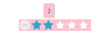
The style of the Rating control is customized by cssClass property.
The following code example is used to render the Rating control with customized style.
Add the following HTML to render Rating with customized style.
<ej-rating id="rating" cssClass="custom"> </ej-rating>import { Component } from '@angular/core';
import {ViewEncapsulation} from '@angular/core';
@Component({
selector: 'ej-app',
templateUrl: 'src/rating/rating.component.html',
styleUrls: ['src/rating/rating.component.css'],
encapsulation: ViewEncapsulation.None
})
export class RatingComponent {
}Add the below CSS in external file named as rating.component.css
.custom {
       background-color: pink;
}
The following screenshot illustrates the Rating with customized style.