Easy Customization
3 Oct 20178 minutes to read
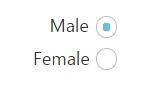
Checked status
You have options to set the state of the radio button as either checked or unchecked. When you select any option from the group of radio buttons, a dot mark appears inside the circle. This is called the checked state. Previously selected radio buttons in this group are unselected that is they go to the unchecked state. The checked property is used to set the state of the radio button.
The following steps explain the details about rendering the RadioButton with the checked option
In the HTML page, add the following input elements to configure RadioButton widget.
<table width="500px">
    <tr>
        <td> Radio Buttons </td>
        <td>
            <input type="radio" id="Radio_checked" ej-radiobutton name="Gender" [(checked)]="checked" />
            <label for="Radio_checked">Male</label>
        </td>
        <td>
            <input ej-radiobutton id="Radio_unchecked" type="radio" name="Gender"/>
            <label for="Radio_unchecked">Female</label>
        </td>
    </tr>
</table>import {Component} from '@angular/core';
@Component({
selector: 'ej-app',
templateUrl: './default.component.html',
})
export class DefaultComponent {
checked: boolean;
constructor() {
this.checked = true;
}
}The following image is displayed as the output for the above steps.
 s
s
Text
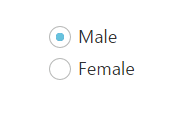
Specifies the text content for the radio button. In previous programs, separate labels were created for each radio button. But now you have the option to set the text for radio button using the text property. So here you do not have to add a label tag for each radio button in the HTML code.
The following steps explain the details about rendering the RadioButton with text and without using the label tag options.
In the HTML page, add the following input elements to configure the RadioButton widget.
<table width="500px">
    <tr>
        <td> Radio Buttons </td>
        <td>
            <input type="radio" id="RadBtn_male" ej-radiobutton name="Gender" text="Male" [(checked)]="checked" />
        </td>
        <td>
            <input ej-radiobutton id="RadBtn_female" type="radio" text="Female" name="Gender" />
        </td>
    </tr>
</table>import {Component} from '@angular/core';
@Component({
selector: 'ej-app',
templateUrl: './default.component.html',
})
export class DefaultComponent {
checked: boolean;
constructor() {
this.checked = true;
}
}The following image is displayed as the output for the above steps.
Size
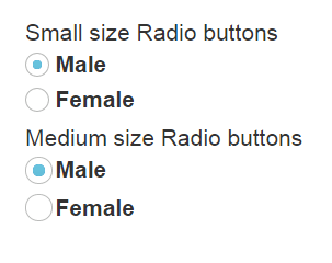
You can render the RadioButton in different sizes. There are some predefined size options available for rendering a RadioButton in an easy way. Each size option has different height and width. It mainly avoids the complexity in rendering RadioButton with complex CSS class.
Size
| Property | Description |
|---|---|
| small | Creates radio button with Built-in small size height, width specified. |
| medium | Creates radio button with Built-in medium size height, width specified. |
The following steps explain the details about rendering RadioButton with different size options.
In the HTML page, add the following input elements to configure RadioButton widget.
<table width="500px">
    <tr>
        <td> Small size Radio buttons </td>
        <td>
            <input type="radio" id="Radio_Male" ej-radiobutton name="Gender" size="small" [(checked)]="smallchecked" />
            <label for="Radio_Male">Male</label>
        </td>
        <td>
            <input ej-radiobutton id="Radio_Female" type="radio"  size="small" name="Gender" />
            <label for="Radio_Female">Female</label>
        </td>
    </tr>
    <tr>
        <td> Medium size Radio buttons </td>
        <td>
            <input type="radio" id="MediumRadio_Male" ej-radiobutton name="Gender" size="medium"  [(checked)]="mediumchecked" />
            <label for="MediumRadio_Male">Male</label>
        </td>
        <td>
            <input ej-radiobutton id="MediumRadio_Female" type="radio"  size="medium" name="Gender" />
            <label for="MediumRadio_Female">Female</label>
        </td>
    </tr>
</table>import {Component} from '@angular/core';
@Component({
selector: 'ej-app',
templateUrl: './default.component.html',
})
export class DefaultComponent {
smallchecked: boolean;
mediumchecked: boolean;
constructor() {
this.smallchecked = true;
this.mediumchecked = true;
}
}The following image is displayed as the output for the above steps.
RTL Support
In some cases you need to use right-to-left alignment. You can give RTL support by using enableRTL property. RTL mode works when you use the text property in RadioButton. The RadioButtons and text are aligned in the right-to-left format. For example, when text is right-aligned and RadioButton is left-aligned, after you apply right-to-left alignment, these positions are interchanged.
The following steps explain the details about rendering the RadioButton with right-to-left alignment support. Here the text property is necessary.
In the HTML page, add the following button elements to configure RadioButton widget.
<table width="500px">
    <tr>
        <td>
            <input type="radio" id="RadBtn_male" ej-radiobutton name="Gender" text="Male" size="small" [(enableRTL)]="m_enablertl" [(checked)]="checked" />
        </td>
        <td>
            <input ej-radiobutton id="RadBtn_female" type="radio" size="small" text="Female" [(enableRTL)]="f_enablertl" name="Gender" />
        </td>
    </tr>
</table>import {Component} from '@angular/core';
@Component({
selector: 'ej-app',
templateUrl: './default.component.html',
})
export class DefaultComponent {
checked: boolean;
m_enablertl: boolean;
f_enablertl: boolean;
constructor() {
this.checked = true;
this.m_enablertl = true;
this.f_enablertl = true;
}
}In the above mentioned code, the text property has been used. In LTR format, the RadioButton is on the left side. In RTL format, the RadioButton appears on the right side. Here the text property is used and the enableRTL property is set as “True”. It changes the alignment to right-to-left.
The following image is displayed as the output for the above steps.