Behavior settings
The following are some properties that enables you to an option to enhance the behavior of RadialSlider component.
Show hide RadialSlider on initial rendering
The RadialSlider property autoOpen allow you to make the component visible on initial rendering. By default, the value of the property is set as true. Setting it as false will hide the component on initial rendering.
Add the following code in your HTML page to render the RadialSlider.
<ej-radialslider innerCircleImageUrl="http://js.syncfusion.com/demos/web/content/images/radialslider/chevron-right.png" [radius]="radius" [autoOpen]="autoopen">
    </ej-radialslider>
Add the following code in constructor file.
export class AppComponent {
        radius: number;
    autoopen:any;
        constructor() {
            this.radius = 100;
            this.autoopen=false;
        }
    }
Value accuracy
The RadialSlider property enableRoundOff allow to show the rounded off value when user changes it. By default, the value of the property is set as true. For accurate values, you can set this as false.
Add the following code in your HTML page to render the RadialSlider.
<ej-radialslider innerCircleImageUrl="http://js.syncfusion.com/demos/web/content/images/radialslider/chevron-right.png" [radius]="radius" [enableRoundOff]="enableroundoff">
    </ej-radialslider>
Add the following code in constructor file.
export class AppComponent {
        radius: number;
    enableroundoff:any;
        constructor() {
            this.radius = 100;
            this.enableroundoff=false;
        }
    }
Display inline
The RadialSlider property inline is used to show the component values inline of the slider. By default, the value of the property is set as false.
Add the following code in your HTML page to render the RadialSlider.
<ej-radialslider innerCircleImageUrl="http://js.syncfusion.com/demos/web/content/images/radialslider/chevron-right.png" [radius]="radius" [inline]="inline">
    </ej-radialslider>
Add the following code in constructor file.
export class AppComponent {
        radius: number;
        inline:any;
        constructor() {
            this.radius = 100;
            this.inline=true;
        }
    }
Modifying Label Space
The RadialSlider property labelSpace allow to define the space of label in it. By default, the RadialSlider labelSpace is set as 30. Refer to the following code example.
Add the following code in your HTML page to render the RadialSlider.
<ej-radialslider innerCircleImageUrl="http://js.syncfusion.com/demos/web/content/images/radialslider/chevron-right.png" [radius]="radius" [labelSpace]="labelspace">
    </ej-radialslider>
Add the following code in constructor file.
export class AppComponent {
        radius: number;
        labelspace:any;
        constructor() {
            this.radius = 100;
            this.labelspace=40;
        }
    }
The following screenshot shows the output for the above code example.
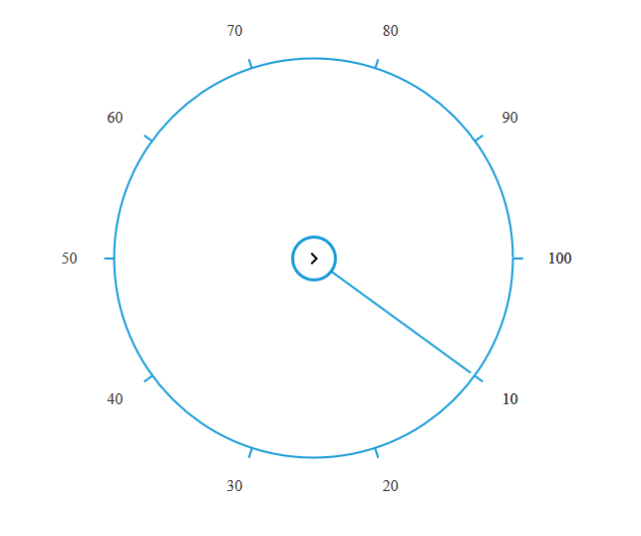
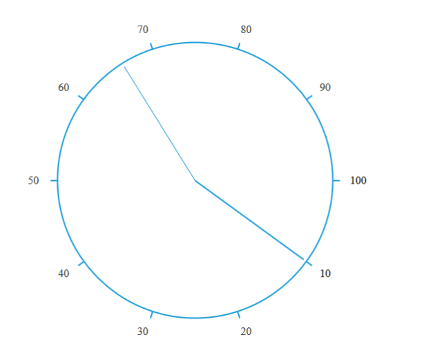
Show Hide inner circle
The RadialSlider property showInnerCircle allow to show or hide the inner circle of the RadialSlider. By default, the value of the property is set as true and type of the property is Boolean.
Add the following code in your HTML page to render the RadialSlider.
<ej-radialslider innerCircleImageUrl="http://js.syncfusion.com/demos/web/content/images/radialslider/chevron-right.png" [radius]="radius" [showInnerCircle]="innercircle">
    </ej-radialslider>
Add the following code in constructor file.
export class AppComponent {
        radius: number;
        innercircle:any;
        constructor() {
            this.radius = 100;
            this.innercircle=false;
        }
    }
The following screenshot shows the output for the above code example.
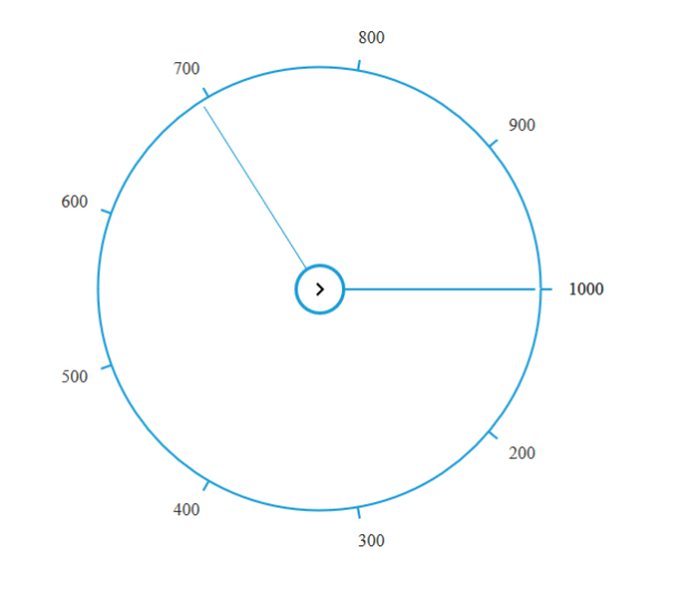
Values customization
The RadialSlider property ticks allow to set an array of a numeric value which will be displayed in it. By Default RadialSlider ticks value is a set to an array of length 11 as following,
ticks = { 0, 10, 20, 30, 40, 50, 60, 70, 80, 90, 100 }. You can refer the below code for reference.
Add the following code in your HTML page to render the RadialSlider.
<ej-radialslider innerCircleImageUrl="http://js.syncfusion.com/demos/web/content/images/radialslider/chevron-right.png" [radius]="radius" [ticks]="ticks">
    </ej-radialslider>
Add the following code in constructor file.
export class AppComponent {
        radius: number;
        ticks:any;
        constructor() {
            this.radius = 100;
            this.ticks=[100,200,300,400,500,600,700,800,900,1000];
        }
    }
The following screenshot shows the output for the above code example.