Labels
28 Sep 20176 minutes to read
Adding Label Collection
Label collection can be directly added to the scales option within the PivotGauge widget as an array.
<ej-pivotgauge [scales]="scales" >
</ej-pivotgauge>
//..
export class PivotGaugeComponent {
public scales;
constructor() {
//..
this.scales = [{
//...
labels: [{
angle: 20
}]
}];
}
}Appearance Customization
The appearance of the Label can be customized through the following properties.
- angle – used to display labels in a rotated manner. By default, the value is 0.
- color – displays the label in specified color.
- opacity – sets the opacity of the label. By default, the value is 1.
- type – indicates the label for major intervals or minor intervals. By default, it takes major intervals.
- includeFirstValue – includes the initial value based on user requirement. By default, the value is “true”.
- font – sets the font size, font style and font family of the label.
//..

export class PivotGaugeComponent {
public scales;
    constructor() {
        //..
        this.scales = [{
                //...
                labels: [{
                //customizing major labels
                type: "major",
                color: "#1AFF01",
                opacity: 0.8,
                includeFirstValue: false,
                font: {
                    size: "15px",
                    fontFamily: "Arial",
                    fontStyle: "bold"
                }
                },
                {
                    //customizing minor labels
                    type: "minor",
                    color: "#FF103F",
                    opacity: 0.8,
                    includeFirstValue: true,
                    font: {
                        size: "10px",
                        fontFamily: "Arial",
                        fontStyle: "normal"
                    }
                }]
        }];
    }
}
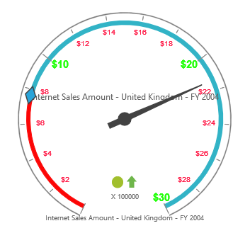
Unit Text
The unitText property is used to add some text along with the labels. Normally, we indicate the unit/measurement of the numeric value through unit text. Using the unitTextPosition property, the text can be positioned either in front or back.
NOTE
By default, text appears at the back.
//..

export class PivotGaugeComponent {
public scales;
    constructor() {
        //..
        this.scales = [{
                //...
                labels: [{
                //for Major labels
                type: "major",
                unitText: "$",
                unitTextPosition: "front"
            },
            {
                //for Minor labels
                type: "minor",
                unitText: "$",
                unitTextPosition: "front"
            }]
        }];
    }
}