Legend
28 Sep 20176 minutes to read
Legend Visibility
You can enable or disable legend using the visible property inside the legend object.
NOTE
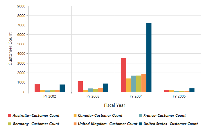
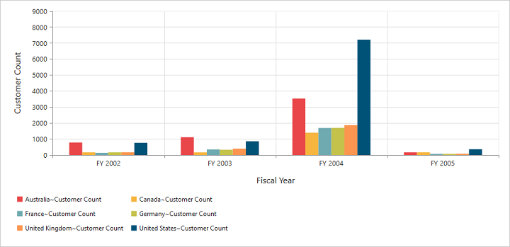
By default, the legend is visible in PivotChart.
<ej-pivotchart [legend]="legend">
</ej-pivotchart>
//..
export class PivotChartComponent {
public legend;
constructor() {
//..
this.legend = { visible: true };
}
}
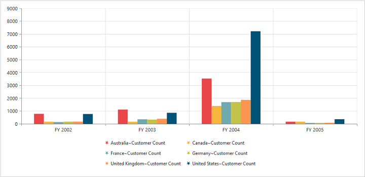
Legend Shape
You can customize the legend shape in PivotChart control. Default value of legend shape is “rectangle”. Following legend shapes that are supported:
- rectangle
- circle
- cross
- diamond
- pentagon
- hexagon
- star
- ellipse
- triangle etc.
//..

export class PivotChartComponent {
    public legend;
    constructor() {
      //..
      this.legend = { visible: true, shape: "Star" };
    }
}
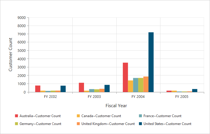
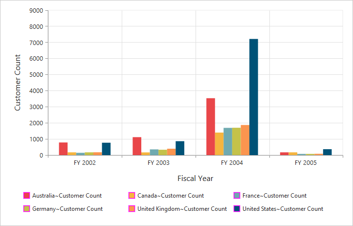
Legend Position
By using the Position property, you can place the legend at top, bottom, left or right of the PivotChart.
NOTE
Default value of legend position is “bottom” in PivotChart.
//..

export class PivotChartComponent {
    public legend;
    constructor() {
      //..
      this.legend = { visible: true, shape: "Star", position: "top" };
    }
}
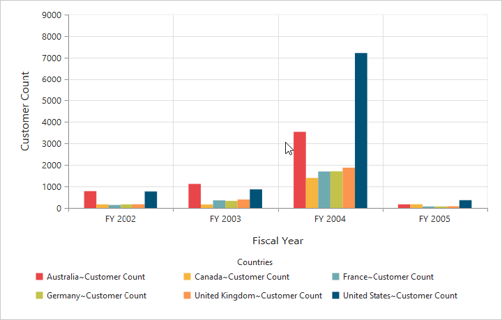
Legend Title
To add the legend title, you have to specify the title text in Title.text property.
//..

export class PivotChartComponent {
    public legend;
    constructor() {
      //..
      this.legend = { visible: true, title:{ text: "Countries" } };
    }
}
Legend Alignment
You can align the legend to center, far and near based on its position in the Chart area using the Alignment option.
//..

export class PivotChartComponent {
    public legend;
    constructor() {
      //..
      this.legend = { visible: true, alignment: "Near" };
    }
}
Legend Items - Size and Border
By using the legend ItemStyle.Width, ItemStyle.Height and ItemStyle.Border properties, you can change the legend items - size and border.
//..

export class PivotChartComponent {
    public legend;
    constructor() {
      //..
      this.legend = { visible: true, itemStyle:
            {
                height: 12,
                width: 12,
                border:
                {
                    color: 'magenta',
                    width: 1.5
                }
            }
        };
    }
}
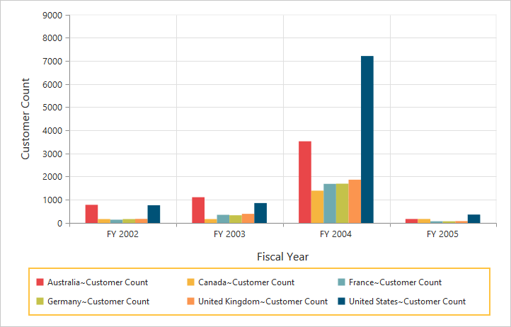
Legend Border
By using the Border option in legend, you can customize border color and width.
//..

export class PivotChartComponent {
    public legend;
    constructor() {
      //..
      this.legend = { visible: true, border:{
                color: "#FFC342",
                width: 2
            }
        };
    }
}
Legend Text
By using the Font option, you can customize the font family, font style, font weight and size of the legend text.
//..

export class PivotChartComponent {
    public legend;
    constructor() {
      //..
      this.legend = { visible: true, font:
            {
                fontFamily: 'Segoe UI',
                fontStyle: 'italic',
                fontWeight: 'bold',
                size: '13px'
            }
        };
    }
}