Selection
8 Jun 20178 minutes to read
The ListBox component allows to highlight the selected item in the List items. It allows multiple selection also.
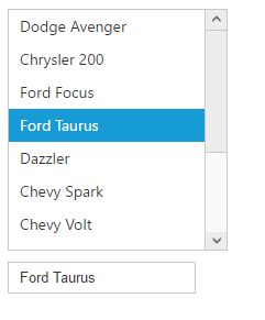
Selection with two-way binding
By default, the ListBox component allows to select the single list item. Also, Listbox component supports the two-way binding feature. When a component model attribute is bound to a ngModel variable, it can reflect the changes both ways.
Please use the below code the bind the ListBox in two-way support.
<div class="ctrllabel"></div>
    <ej-listbox [dataSource]="data" [fields]="fieldList" [value]="value"> </ej-listbox>
<br />
<div id="binding">
    <input type="text" id="listValue" class="input ejinputtext" [(ngModel)]="value" />
</div>
export class AppComponent {
data:array;
fieldList:object;
value:string;
constructor() {
this.data=[
{ empid: "cr1", text: "Dodge Avenger", value: "Dodge Avenger" },
{ empid: "cr2", text: "Chrysler 200", value: "Chrysler 200" },
{ empid: "cr3", text: "Ford Focus", value: "Ford Focus" },
{ empid: "cr4", text: "Ford Taurus", value: "Ford Taurus" },
{ empid: "cr5", text: "Dazzler", value: "Dazzler" },
{ empid: "cr6", text: "Chevy Spark", value: "Chevy Spark" },
{ empid: "cr7", text: "Chevy Volt", value: "Chevy Volt" },
{ empid: "cr8", text: "Honda Fit", value: "Honda Fit" },
{ empid: "cr9", text: "Honda Crosstour", value: "Honda Crosstour" },
{ empid: "cr10", text: "Acura RL", value: "Acura RL" },
{ empid: "cr11", text: "Hyundai Elantra", value: "Hyundai Elantra" },
{ empid: "cr12", text: "Mazda3", value: "Mazda3" }
];
this.fieldList={text:"text"};
this.value="Ford Taurus";
}
}
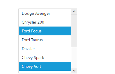
Multiple selection
To enable the multiple selection by using “allowMultiSelection” property. You can select the multiple list items using “Ctrl” and “Shift” keys.
See Also
<ej-listbox [dataSource]="data" [fields]="fieldList" [allowMultiSelection]="true"> </ej-listbox>export class AppComponent {
data:array;
fieldList:object;
constructor() {
this.data=[
{ empid: "cr1", text: "Dodge Avenger", value: "Dodge Avenger" },
{ empid: "cr2", text: "Chrysler 200", value: "Chrysler 200" },
{ empid: "cr3", text: "Ford Focus", value: "Ford Focus" },
{ empid: "cr4", text: "Ford Taurus", value: "Ford Taurus" },
{ empid: "cr5", text: "Dazzler", value: "Dazzler" },
{ empid: "cr6", text: "Chevy Spark", value: "Chevy Spark" },
{ empid: "cr7", text: "Chevy Volt", value: "Chevy Volt" },
{ empid: "cr8", text: "Honda Fit", value: "Honda Fit" },
{ empid: "cr9", text: "Honda Crosstour", value: "Honda Crosstour" },
{ empid: "cr10", text: "Acura RL", value: "Acura RL" },
{ empid: "cr11", text: "Hyundai Elantra", value: "Hyundai Elantra" },
{ empid: "cr12", text: "Mazda3", value: "Mazda3" }
];
this.fieldList={text:"text"};
}
}
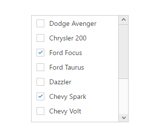
Checkbox
To enable the checkbox in the ListBox component by using “showCheckbox” property. The ListBox component allows the selection of list items through checkbox.
The specified list items can be checked on initialization of the ListBox component by using “checkedIndices” property.
See Also
<ej-listbox [dataSource]="data" [fields]="fieldList" [showCheckbox]="true" [checkedIndices]="checkedindices"> </ej-listbox>export class AppComponent {
data:array;
fieldList:object;
checkedindices:any;
constructor() {
this.data=[
{ empid: "cr1", text: "Dodge Avenger", value: "Dodge Avenger" },
{ empid: "cr2", text: "Chrysler 200", value: "Chrysler 200" },
{ empid: "cr3", text: "Ford Focus", value: "Ford Focus" },
{ empid: "cr4", text: "Ford Taurus", value: "Ford Taurus" },
{ empid: "cr5", text: "Dazzler", value: "Dazzler" },
{ empid: "cr6", text: "Chevy Spark", value: "Chevy Spark" },
{ empid: "cr7", text: "Chevy Volt", value: "Chevy Volt" },
{ empid: "cr8", text: "Honda Fit", value: "Honda Fit" },
{ empid: "cr9", text: "Honda Crosstour", value: "Honda Crosstour" },
{ empid: "cr10", text: "Acura RL", value: "Acura RL" },
{ empid: "cr11", text: "Hyundai Elantra", value: "Hyundai Elantra" },
{ empid: "cr12", text: "Mazda3", value: "Mazda3" }
];
this.fieldList={text:"text"};
this.checkedindices=[2,5];
}
}