How can I help you?
Getting Started
The Angular ListBox widget that contains a list of selectable items. It performs exceptionally well with thousands of items and supports checkboxes, template, single and multiple selection, keyboard navigation and virtual scrolling.
This section explains briefly about how to create a web ListBox in your application with Angular by step-by-step instructions
Create an ListBox widget in Angular
Create a new HTML file and include the below code:
<!DOCTYPE html>
<html>
   <head>
    <link href="//cdn.syncfusion.com/32.2.3/js/web/flat-azure/ej.web.all.min.css" rel="stylesheet" />
    <script src="node_modules/core-js/client/shim.min.js"></script>
    <script src="node_modules/zone.js/dist/zone.js"></script>
    <script src="node_modules/reflect-metadata/Reflect.js"></script>
    <script src="node_modules/systemjs/dist/system.src.js"></script>
    <script src="https://code.jquery.com/jquery-3.1.1.min.js"></script>
    <script src="http://cdn.syncfusion.com/js/assets/external/jsrender.min.js" type="text/javascript"></script>
    <script src="https://ajax.aspnetcdn.com/ajax/jquery.validate/1.14.0/jquery.validate.min.js">
    </script>
        <script src="http://cdn.syncfusion.com/32.2.3/js/web/ej.web.all.min.js" type="text/javascript"></script>
    <script src ="http://cdn.syncfusion.com/32.2.3/js/common/ej.angular2.min.js"></script>

    <script src="systemjs.config.js"></script>
  </head>
  <body>
   <ej-app>Loading...</ej-app>
  </body>
Create input element and add in the body tag as below.
<div class="container" style="padding-top:100px">

<div class="row">
<div class="ctrllabel" style="padding-bottom: 12px"><b>Select a car</b></div>

<ej-listbox [dataSource]="data" [fields]="fieldList" > </ej-listbox>
        </div>
</div>
To render the Angular ListBox use the below code.
import {Component,NgModule} from '@angular/core';
import {FormsModule} from '@angular/forms';
import {BrowserModule} from '@angular/platform-browser';
@Component({
selector: 'home',
templateUrl: 'app/app.component.html',
styles: [
".e-listbox.e-ul li { height: 25px; padding-top: 6px; }"
],
encapsulation: ViewEncapsulation.None,
})
export class AppComponent {
data:array;
fieldList:object;
value:string;
constructor() {
this.data=[
{ employeeId: "cr1", text: "Dodge Avenger", value: "Dodge Avenger" },
{ employeeId: "cr2", text: "Chrysler 200", value: "Chrysler 200" },
{ employeeId: "cr3", text: "Ford Focus", value: "Ford Focus" },
{ employeeId: "cr4", text: "Ford Taurus", value: "Ford Taurus" },
{ employeeId: "cr5", text: "Dazzler", value: "Dazzler" },
{ employeeId: "cr6", text: "Chevy Spark", value: "Chevy Spark" },
{ employeeId: "cr7", text: "Chevy Volt", value: "Chevy Volt" },
{ employeeId: "cr8", text: "Honda Fit", value: "Honda Fit" },
{ employeeId: "cr9", text: "Honda Cross tour", value: "Honda Cross tour" },
{ employeeId: "cr10", text: "Hyundai Elantra", value: "Hyundai Elantra" },
{ employeeId: "cr11", text: "Mazda3", value: "Mazda3" }
];
this.fieldList={dataSource:this.data,text:"text",value:"value"};
}
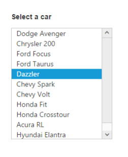
}Run the above code to render the following output.
Model binding
The Angular ListBox supports the data binding feature. When a widget’s model attribute is bound to ngModel variable, it will be reflected the changes.
The below table depicts the properties of ListBox widget that supports model binding:
| control | Supported properties |
| ejListbox | [`valuedataSource`] |
Add in the ngModel value as below.
<div class="container" style="padding-top:100px">
<div class="row">
<div class="ctrllabel" style="padding-bottom: 12px"><b>Select a car</b></div>
<ej-listbox [dataSource]="data" [fields]="fieldList" [value]="value" > </ej-listbox>
               <br/>
<div id="binding">
                  <input type="text" id="listValue" class="input ejinputtext" [(ngModel)]="value" />
             </div>
        </div>
</div>import {Component,NgModule} from '@angular/core';
import {FormsModule} from '@angular/forms';
import {BrowserModule} from '@angular/platform-browser';
@Component({
selector: 'ej-app',
templateUrl: 'app/app.component.html',
})
export class AppComponent {
data:array;
fieldList:object;
value:string;
constructor() {
this.data=[
{ employeeId: "cr1", text: "Dodge Avenger", value: "Dodge Avenger" },
{ employeeId: "cr2", text: "Chrysler 200", value: "Chrysler 200" },
{ employeeId: "cr3", text: "Ford Focus", value: "Ford Focus" },
{ employeeId: "cr4", text: "Ford Taurus", value: "Ford Taurus" },
{ employeeId: "cr5", text: "Dazzler", value: "Dazzler" },
{ employeeId: "cr6", text: "Chevy Spark", value: "Chevy Spark" },
{ employeeId: "cr7", text: "Chevy Volt", value: "Chevy Volt" },
{ employeeId: "cr8", text: "Honda Fit", value: "Honda Fit" },
{ employeeId: "cr9", text: "Honda Cross tour", value: "Honda Cross tour" },
{ employeeId: "cr10", text: "Hyundai Elantra", value: "Hyundai Elantra" },
{ employeeId: "cr11", text: "Mazda3", value: "Mazda3" }
];
this.fieldList={text:"text"};
this.value="Mazda3";
}
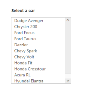
}Run the above code to render the following output.
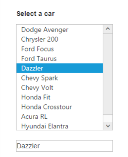
Enable Selection
The selection property is used to render the ListBox list item by Selection.
<div class="container" style="padding-top:100px">

<div class="row">
<div class="ctrllabel" style="padding-bottom: 12px"><b>Select a car</b></div>

<ej-listbox [dataSource]="data" [fields]="fieldList" [selectedIndex]="4" > </ej-listbox>

        </div>
</div>
Run the above code to render the following output.