Customization
3 Oct 20176 minutes to read
Size
GroupButton component size can be varied based on the Size property values. Size is the enum type API and it is has the following Built-in values
List of predefined button size
|
Button Types |
Description |
|---|---|
|
Normal |
Creates GroupButton with content size. |
|
Mini |
Creates GroupButton with Built-in mini size height, width specified. |
|
Small |
Creates GroupButton with Built-in small size height, width specified. |
|
Medium |
Creates GroupButton with Built-in medium size height, width specified. |
|
Large |
Creates GroupButton with Built-in large size height, width specified. |
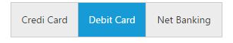
Set Dimension
By default GroupButton has standard height and width. You can change this height and width by using height and width property respectively.
<table width="500px">
    <tr>
        <td> Group Buttons </td>
        <td>
			<ej-groupbutton  groupButtonMode="checkbox" width="300px" height="50px" [(selectedItemIndex)]="selected">
            <ul>
            <li>
            Credit Card
            </li>
            <li>
            Debit Card
            </li>
            <li>
            Net Banking
            </li>
            </ul>
			</ej-groupbutton></td>
    </tr>
    </table>
<br /><br />import { Component } from '@angular/core';
@Component({
selector: 'ej-app',
templateUrl: './groupbutton.component.html'
})
export class GroupButtonComponent {
selected: object;
constructor() {
this.selected = [0];
}
}
ContentType
The content of the Button items in GroupButton can have a text and images. GroupButton provides the some predefined contentType options to easily customize the appearance of each button associated with GroupButton component without any complex CSS tricks. GroupButton items supports the following content types.
List of content types for button
|
Content Types |
Description |
|---|---|
|
textOnly |
Supports only for text content only. |
|
imageOnly |
Supports only for image content only |
|
imageBoth |
Supports image for both ends of the button. |
|
textAndImage |
Supports image with the text content. |
|
imageTextImage |
Supports image with both ends and middle in text. |
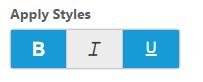
Icons
GroupButton has the option to add the icons to button elements which enhance the appearance. Icons inside the button can be added easily using prefixIcon and suffixIcon fields with dataSource property. GroupButton control also supports the Built-in icon libraries. The ej.widgets.core.min.css contains definitions for important icons that can be used in buttons. You can get the details about available icons with that corresponding class from here.
Simply you can use these Built-in icons by mentioning the icon class name as value in prefixIcon and suffixIcon property. You can use any font icons that are defined in ej.widgets.core.min.css. It avoids the complexity in specifying icon using sprite image and CSS.
<table width="500px">
    <tr>
        <td> Group Buttons </td>
        <td>
			<ej-groupbutton  groupButtonMode="checkbox" width="170px" [dataSource] ="data"[(selectedItemIndex)]="selected">

			</ej-groupbutton></td>
    </tr>
    </table>
<br /><br />import { Component } from '@angular/core';
@Component({
selector: 'ej-app',
templateUrl: './groupbutton.component.html'
})
export class GroupButtonComponent {
selected: object;
data: any;
constructor() {
this.selected = [0, 2];
this.data = [
{ contentType: "imageonly", prefixIcon: "e-icon e-bold_01" },
{ contentType: "imageonly", prefixIcon: "e-icon e-italic_01" },
{ contentType: "imageonly", prefixIcon: "e-icon e-underline_01" }]
}
}
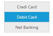
Orientation
GroupButton has two Built-in orientation support called vertical and horizontal orientations which defines the direction of rendered GroupButton component. You can set the value to this property as enum or string type.
- ej.Orientation.Horizontal or “Horizontal”
- ej.Orientation.Vertical or “Vertical”
<table width="500px">
    <tr>
        <td> Group Buttons </td>
        <td>
			<ej-groupbutton  groupButtonMode="radiobutton" orientation="Vertical" [(selectedItemIndex)]="selected">
            <ul>

            <li>

            Credit Card

            </li>

            <li>

            Debit Card

            </li>

            <li>

            Net Banking

            </li>

            </ul>

			</ej-groupbutton></td>
    </tr>
    </table>
<br /><br />import { Component } from '@angular/core';
@Component({
selector: 'ej-app',
templateUrl: './groupbutton.component.html'
})
export class GroupButtonComponent {
selected: object;
constructor() {
this.selected = [1];
}
}