How can I help you?
Toolbar
In Gantt we can show/hide the Toolbar by using toolbarSettings.showToolbar property.We can add default toolbar items by toolbarSettings.toolbarItems. User can also create a custom toolbar items by using toolbarSettings.customToolbarItems.
Default Toolbar Items
Using Gantt default toolbar items we can perform below operations.
-
Add- To add new task.
-
Edit-To edit a selected task.
-
Delete- To delete a selected task.
-
Cancel- To cancel the edited changes in a task.
-
Update- To save the edited changes in a task.
-
ExpandAll- To expand all the Gantt rows.
-
CollapseAll- To collapse all the Gantt rows.
-
Indent- To indent the selected task in Gantt.
-
Outdent- To outdent the selected task in Gantt.
-
CriticalPath- To support critical path in Gantt.
-
PrevTimeSpan- To navigate the Gantt timeline to previous time span.
-
NextTimeSpan- To navigate the Gantt timeline to Next time span.
-
Search- To perform search operation in Gantt.
-
ExcelExport- To export Gantt in Excel format.
-
PdfExport- To export Gantt in PDF format.
We can enable Gantt toolbar by using below code example:
<ej-gantt id="GanttControl" [toolbarSettings]="toolbarSettings"
    //...>
</ej-gantt>import {Component} from '@angular/core';
@Component({
selector: 'ej-app',
templateUrl: 'app/app.component.html'
})
export class AppComponent {
public toolbarSettings: any;
constructor() {
//...
this.toolbarSettings = {
showToolbar: true,
toolbarItems: [
ej.Gantt.ToolbarItems.Add,
ej.Gantt.ToolbarItems.Edit,
ej.Gantt.ToolbarItems.Delete,
ej.Gantt.ToolbarItems.Update,
ej.Gantt.ToolbarItems.Cancel,
ej.Gantt.ToolbarItems.Indent,
ej.Gantt.ToolbarItems.Outdent,
ej.Gantt.ToolbarItems.ExpandAll,
ej.Gantt.ToolbarItems.CollapseAll,
ej.Gantt.ToolbarItems.Search,
ej.Gantt.ToolbarItems.PrevTimeSpan,
ej.Gantt.ToolbarItems.NextTimeSpan,
ej.Gantt.ToolbarItems.CriticalPath,
ej.Gantt.ToolbarItems.ExcelExport,
ej.Gantt.ToolbarItems.PdfExport
],
}
}
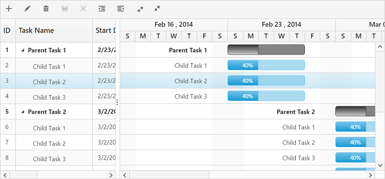
}The following screenshot displays the toolbar option in Gantt control.
NOTE
To perform add,edit,delete,cancel,update,indent,outdent using Toolbar items we need to enable add/edit/delete/indent using
editSettings.
Custom Toolbar Items
CustomToolbarItems allows us to insert custom icons and custom template in Gantt toolbar. By using below properties we can customize Gantt toolbar as per our requirement.
-
text- To insert the custom icons in toolbar using CSS class name selector.
-
templateID-To insert the custom icons in toolbar using script templates. Using this property we can bind HTML elements and other EJ controls to Gantt toolbar.
-
tooltipText-Displays tooltip text for the custom icons.
To insert EJ Controls in Gantt toolbar we need to initiate the control in create client side event.In toolbarClick client side event we can bind actions to the custom toolbar items.
Write the following code in index.html file.
<script id="ColumnVisibility" type="text/x-jsrender">
        <input id="dropdownContainer" />
</script><ej-gantt id="GanttControl" [toolbarSettings]="toolbarSettings"
(toolbarClick)="toolbarClick($event)"
(create)="create($event)"
//...>
</ej-gantt>import {Component} from '@angular/core';
@Component({
selector: 'ej-app',
templateUrl: 'app/app.component.html'
})
export class AppComponent {
public toolbarSettings: any;
constructor() {
//...
this.toolbarSettings = {
showToolbar: true,
customToolbarItems: [{
templateID: "#ColumnVisibility",
tooltipText: "Column Visibility"
},
{
text: "Reset",
tooltipText: "Reset"
}
],
}
}
toolbarClick(sender) {
if (sender.itemName == "Reset") {
//we can bind the custom actions here
}
}
create(sender) {
//Here we can append custom EJ controls
$("#dropdownContainer").ejDropDownList({});
}
}And write the following styles in app.component.css file
<style type="text/css" class="cssStyles">
        #GanttContainer_ColumnVisibility {
            padding-top: 2px;
            padding-bottom: 0px;
        }
        .Reset:before {
            content: "\e677";
        }
    </style>
Click here to view the demo sample for custom toolbar item