Template Support
20 Dec 20187 minutes to read
By default you can add any text or image to the DropDownList list item. To customize the items layout or to create your own visualized elements you can use this template support.
Header Template
You can create the popup header by using headerTemplate property. You can add any HTML content in header template.
NOTE
Refer the check all option in popup list : link
Template Field
Create a set of div containers with common syntax or elements and assign it to the template property. You can add any HTML mark-up element inside the DropDownList list using this property.
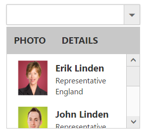
In the demo, a JSON array is created with text, Id, role and country which is initialized with dataSource property. Content template is created by using the corresponding fields and assigned in template property. The content template is customized with images and custom CSS styles to visualize the items in popup.
<input type="text" id="dropdown1" ej-dropdownlist [dataSource]="List" [width]="width" [headerTemplate]="header" [template]="template">import {Component} from '@angular/core';
import {ViewEncapsulation} from '@angular/core';
@Component({
selector: 'ej-app',
templateUrl: 'app/components/dropdown/dropdown.component.html',
styleUrls: ['app/components/dropdown/dropdown.component.css'],
encapsulation: ViewEncapsulation.None
})
export class DropDownListComponent {
List: Array<Object>;
header: string;
template: string;
width: any;
constructor() {
this.List = [{
text: "Erik Linden",
Id: "3",
role: "Representative",
country: "England"
}, {
text: "John Linden",
Id: "6",
role: "Representative",
country: "Norway"
}, {
text: "Louis",
Id: "7",
role: "Representative",
country: "Australia"
}, {
text: "Lawrence",
Id: "8",
role: "Representative",
country: "India"
}];
this.header = "<div class='header'><span>PHOTO</span> <span>DETAILS</span></div>";
this.template = '<div><img class="Id" src="Employee/${Id}.png" alt="employee"/>' + '<div class="ename"> ${text} </div><div class="role"> ${role} </div><div class="cont"> ${country} </div></div>';
this.width = "200";
}
}Add the below css in dropdown.component.css file.
.Id {
        margin: 0;
        padding: 3px 10px 3px 3px;
        border: 0 none;
        width: 60px;
        height: 60px;
        float: left;
    }

    .header {
        font-weight: bold;
        border-bottom: 1px solid #c8c8c8;
        background: #c8c8c8;
    }

    .header > span {
        display: inline-block;
        padding: 10px;
    }

    .ename {
        font-weight: bold;
        padding: 6px 3px 1px 3px;
    }

    .role, .cont {
        font-size: smaller;
        padding: 3px 3px -1px 0px;
    }
NOTE
Images for this sample are available in (installed location)\Syncfusion\Essential Studio\25.1.35\JavaScript\ng2 app\app\content\images
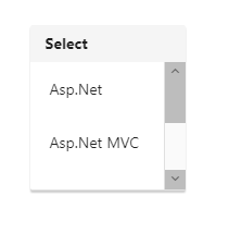
Modify position of popup to show over the DropDownList
DropDownList popup element can be repositioned over the DropDownList input through popupShown event. Please refer to the below given code.
<div style="padding:3%;">
<input #skills id="skillsets" ej-dropdownlist [dataSource]="data" [fields]="fields" watermarkText="Select type"  [headerTemplate]="template" (popupShown)="open($event)" />
</div>import {Component,ViewEncapsulation, ViewChild } from '@angular/core';
import { EJComponents } from './../../../node_modules/ej-angular2/src/ej/core';
@Component({
selector: 'ej-app',
templateUrl: 'app/components/dropdown/dropdown.component.html',
styleUrls: ['app/components/dropdown/dropdown.component.css'],
encapsulation: ViewEncapsulation.None
})
export class DropDownListComponent {
data: Array<Object> = [];
fields: Object;
template: string;
@ViewChild('skills') skills: EJComponents<ej.DropDownList, any>;
constructor() {
this.data = [
{ skill: "Asp.Net" }, { skill: "Asp.Net MVC" }, { skill: "C#" },
{ skill: "Basic" }, { skill: "Java" }
];
this.fields = { dataSource: this.data, text: 'skill' };
this.template = "<div id='header'> <span class='con-head'><b>Select</b></span></div>";
}
open(args){
var instance = this.skills.widget.element.ejDropDownList("instance");
instance.popupListWrapper.offset({ top: instance.popupListWrapper.offset().top - instance.wrapper.height() - 3});
}
}Add the below css in dropdown.component.css file.
#header{
        padding-left: 14px;
        padding-top: 7px;
        padding-bottom: 7px;
        background-color: whitesmoke;
    }
Now the popup will be opened over the input element as shown below