Appearance and Styling
30 Nov 20174 minutes to read
Theme
DateTimePicker control support rich appearance. This control consist of six flat themes, six gradient themes and two other themes. To use these fourteen themes, refer the themes files in HTML file.
You need two style sheets to apply styles to DateTimePicker control; one ej.widgets.core.min.css and one ej.theme.min.css. If you use ej.widgets.all.min.css then you don’t need to use ej.widgets.core.min.css and ej.theme.min.css because ej.widgets.all.min.css is a combination of these two.
The core style sheet applies styles related to positioning and size, but are not related to the color scheme and always require the control to look correct and function properly. The theme styles sheet applies theme-specific styles like colors and backgrounds.
The following list is of the fourteen themes supported by DateTimePicker:
- default-theme
- flat-azure-dark
- flat-lime
- flat-lime-dark
- flat-saffron
- flat-saffron-dark
- gradient-azure
- gradient-azure-dark
- gradient-lime
- gradient-lime-dark
- gradient-saffron
- gradient-saffron-dark
- material
- office-365
Add the following code in your HTML page.
<input type="text" id="dateTime" />import { Component, ViewEncapsulation } from '@angular/core';
@Component({
selector: 'ej-app',
templateUrl: './datetimepicker.component.html'
})
export class DateTimePickerComponent {
}Add the following code in vendor.ts file to change the theme of DateTimePicker control.
// Angular
import '@angular/platform-browser';
import '@angular/platform-browser-dynamic';
import '@angular/core';
import '@angular/common';
import '@angular/http';
import '@angular/router';
// RxJS
import 'rxjs';
// Other vendors for example jQuery, Lodash or Bootstrap
// You can import js, ts, css, sass, ...
import * as $ from 'jquery';
window["jQuery"] = $;
window["$"] = $;
import 'jsrender';
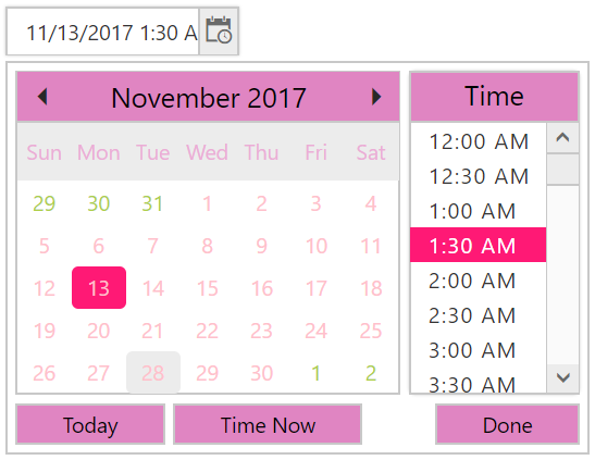
import '../node_modules/syncfusion-javascript/Content/ej/web/flat-lime/ej.web.all.min.css';
import '../node_modules/bootstrap/dist/css/bootstrap.min.css';The following screenshot displays the output of the above code example.
CSS Class
DateTimePicker control also allows you to customize its appearance using user-defined CSS and custom skin options such as colors and backgrounds. To apply custom themes you have a property called cssClass. cssClass property sets the root class for DateTimePicker theme.
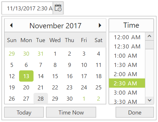
Using this cssClass you can override the existing styles under the theme style sheet. The theme style sheet applies theme-specific styles like colors and backgrounds. In the following example, the value of cssClass property is set as “Purple-dark”. Purple-dark is added as root class to DateTimePicker control at the runtime. From this root class you can customize the DateTimePicker control theme.
Add the following code in your HTML page to render the DateTimePicker.
<input id="datetime" ej-datetimepicker [cssClass]= "Class"/>import { Component, ViewEncapsulation } from '@angular/core';
@Component({
selector: 'ej-app',
templateUrl: './datetimepicker.component.html',
styleUrls: ['./common.component.css'], encapsulation: ViewEncapsulation.None,
})
export class DateTimePickerComponent {
Class: string;
constructor(){
this.Class = 'Purple-dark';
}
}Add the following styles in common.component.css file.
.Purple-dark .e-week-header {
         color: #EBADD6;
   }
   .Purple-dark .e-text {
         color: black;
   }
   .Purple-dark .e-state-default {
         color: pink;
   }
   .Purple-dark .e-active {
         background-color: #FF1975;
   }
   .Purple-dark .e-state-default:hover {
         color: #EBADD6;
   }
   .Purple-dark .e-dt-button {
         color: black;
         background-color: #E085C2;
   }
   .Purple-dark .e-header {
         background-color: #E085C2;
         color: black;
   }
   .Purple-dark .e-timecontainer .e-header {
         background-color: #E085C2;
         color: black;
   }
   .Purple-dark .e-datepicker table td:hover,
   .Purple-dark .e-datepicker td.e-state-hover,
   .Purple-dark .e-datepicker .current-month.e-state-default.e-special-day:hover {
         background-color: #FF1975;
   }
   .Purple-dark .e-timewidget .e-select:hover,
   .Purple-dark .e-time-popup.e-popup .e-hover {
         background: #FF1975;
         color: white;
   }
   .Purple-dark .e-datetime-wrap:hover {
         background: #FF1975;
   }
The following screenshot displays the output of the above code example.