Behavior Settings
14 Aug 201814 minutes to read
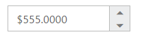
Decimal Places
The property decimalPlaces declares the decimal point to the value of CurrencyTextBox control. The default value of decimalPlaces is 0 in CurrencyTextBox control. To set the decimalPlaces to “-1”, that allows the decimals without any limit in CurrencyTextBox control.
Configure Decimal Places
The following steps explain the implementation of decimalPlaces in CurrencyTextBox.
In the HTML page set the corresponding <input> elements for rendering CurrencyTextBox control.
<input id="currency" type="text" ej-currencytextbox [value]="value"
[decimalPlaces]="decimalPlaces" />import { Component } from '@angular/core';
@Component({
selector: 'ej-app',
templateUrl: 'src/currencytextbox/currencytextbox.component.html'
})
export class CurrencyTextboxComponent {
public value: number;
public decimalPlaces: number;
constructor() {
this.value = 555;
this.decimalPlaces = 4;
}
}The output for CurrencyTextBox with decimalPlaces is as follows.
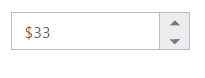
Persistence Support
The CurrencyTextBox widget provides the state maintenance support. You can maintain the previous changes made in the control after a page loads.
Configure Persistence Support
The following steps explain the implementation of enablePersistence in CurrencyTextBox.
In the HTML page set the corresponding <input> elements for rendering CurrencyTextBox control.
<input id="currency" type="text" ej-currencytextbox [value]="value"
[enablePersistence]="true" />import { Component } from '@angular/core';
@Component({
selector: 'ej-app',
templateUrl: 'src/currencytextbox/currencytextbox.component.html'
})
export class CurrencyTextboxComponent {
public value: number;
constructor() {
this.value = 33;
}
}The output for CurrencyTextBox with enablePersistence is as follows. You can change the value of CurrencyTextBox and reload the web page.
CurrencyTextBox at initial load
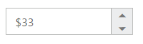
CurrencyTextBox after changing the value and a page load
Strict Mode Support
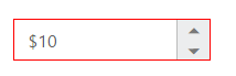
The CurrencyTextBox widget allows you to use the strict mode option by setting the enableStrictMode property. You can set the minValue and maxValue to the controls to enable strict mode functionality. When the CurrencyTextBox value exceeds the maxValue, it restricts the exceeded value and returns the maxValue. Likewise when the CurrencyTextBox value goes below minValue, it restricts the new value and returns the minValue.When this property is true, it will not restrict the specified value and an error class will be added to indicate wrong value is provided to the CurrencyTextBox.
Configure Strict Mode Support
The following steps explain the implementation of enableStrictMode in CurrencyTextBox .
In the HTML page set the corresponding <input> elements for rendering CurrencyTextBox control.
<input id="currency" type="text" ej-currencytextbox [value]="value" [minValue]="minValue"
[maxValue]="maxValue" [enableStrictMode]="true" />import { Component } from '@angular/core';
@Component({
selector: 'ej-app',
templateUrl: 'src/currencytextbox/currencytextbox.component.html'
})
export class CurrencyTextboxComponent {
public value: number;
public minValue: number;
public maxValue: number;
constructor() {
this.value = 10;
this.minValue = -1;
this.maxValue = 8;
}
}The output for CurrencyTextBox when enableStrictMode is “true” is as follows.
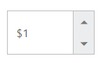
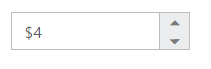
Enabled or Disabled
The CurrencyTextBox control has an option to enable or disable its element. You can set the enabled property as “true” to enable the CurrencyTextBox control. Also you can enable/disable the CurrencyTextBox by using enable and disable methods.
Configure Enabled or Disabled
The following steps explains the implementation of enabled in CurrencyTextBox .
In the HTML page set the corresponding <input> elements for rendering CurrencyTextBox control.
<input id="currency" type="text" ej-currencytextbox [value]="value" [enabled]="false" />import { Component } from '@angular/core';
@Component({
selector: 'ej-app',
templateUrl: 'src/currencytextbox/currencytextbox.component.html',
})
export class CurrencyTextboxComponent {
public value: number;
constructor() {
this.value = 3;
}
}The output for CurrencyTextBox when enabled is “false” and when enabled is “true”.
CurrencyTextBox with enabled as false
CurrencyTextBox with enabled as true
Adjusting CurrencyTextBox Size
The CurrencyTextBox size can be modified by using the height and width properties. You can customize the size of CurrencyTextBox by using these properties.
Configure Height and Width
The following steps explain the implementation of height and width in CurrencyTextBox.
In the HTML page set the corresponding <input> elements for rendering CurrencyTextBox control.
<input id="currency" type="text" ej-currencytextbox [value]="value" [width]="width"
[height]="height" />import { Component } from '@angular/core';
@Component({
selector: 'ej-app',
templateUrl: 'src/currencytextbox/currencytextbox.component.html'
})
export class CurrencyTextboxComponent {
public value: number;
public width: any;
public height: any;
constructor() {
this.value = 10;
this.width = 100;
this.height = 50;
}
}The output for CurrencyTextBox after setting “height” and “width” is as follows.
Increment Step
The incrementStep property is used to increase or decrease the amount of value in the CurrencyTextBox control.
Configure Increment Step
The following steps explain the implementation of incrementStep in CurrencyTextBox .
In the HTML page set the corresponding <input> elements for rendering CurrencyTextBox control.
<input id="currency" type="text" ej-currencytextbox [value]="value"
[incrementstep]="incrementStep" />import { Component } from '@angular/core';
@Component({
selector: 'ej-app',
templateUrl: 'src/currencytextbox/currencytextbox.component.html'
})
export class CurrencyTextboxComponent {
public value: number;
public incrementStep: number;
constructor() {
this.value = 5;
this.incrementStep = 4;
}
}The output for CurrencyTextBox with incrementStep is as follows.
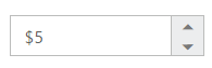
CurrencyTextBox at initial load
CurrencyTextBox after increasing one step
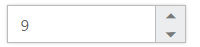
Define Name
When you have placed the CurrencyTextBox in a form, the name property is used to send the field value at form submission. The default value of the name property is null.
Configure Name
The following steps explain the implementation of name in CurrencyTextBox .
In the HTML page set the corresponding <input> elements for rendering CurrencyTextBox control.
<input id="currency" type="text" ej-currencytextbox [name]="name"/>import { Component } from '@angular/core';
@Component({
selector: 'ej-app',
templateUrl: 'src/currencytextbox/currencytextbox.component.html'
})
export class CurrencyTextboxComponent {
public name: string;
constructor() {
this.name = "currency";
}
}Define Value
The value of CurrencyTextBox can be assigned by using the value property. The default value for value property is null.
You can get the value of CurrencyTextBox by using getValue method.
Configure Value
The following steps explain the implementation of value in CurrencyTextBox .
In the HTML page set the corresponding <input> elements for rendering CurrencyTextBox control.
<input id="currency" type="text" ej-currencytextbox [value]="value" />import { Component } from '@angular/core';
@Component({
selector: 'ej-app',
templateUrl: 'src/currencytextbox/currencytextbox.component.html'
})
export class CurrencyTextboxComponent {
public value: number;
constructor() {
this.value = 33;
}
}The output for CurrencyTextBox with the value property is as follows.
Define maxValue and minValue
maxValue
The maximum limit value can be assigned to the CurrencyTextBox by using the maxValue property. The default value of maxValue property is 1.7976931348623157e+308.
minValue
The minimum limit value can be assigned to the CurrencyTextBox by using the minValue property. The default value of minValue property is -1.7976931348623157e+308.
Configure maxValue and minValue
The following steps explain the implementation of maxValue and minValue in CurrencyTextBox .
In the HTML page set the corresponding <input> elements for rendering CurrencyTextBox control.
<input id="currency" type="text" ej-currencytextbox [value]="value" [maxValue]="maxValue" />import { Component } from '@angular/core';
@Component({
selector: 'ej-app',
templateUrl: 'src/currencytextbox/currencytextbox.component.html'
})
export class CurrencyTextboxComponent {
public value: number;
public maxValue: number;
constructor() {
this.value = 8;
this.maxValue = 4;
}
}<input id="currency" type="text" ej-currencytextbox [value]="value" [minValue]="minValue" />import { Component } from '@angular/core';
@Component({
selector: 'ej-app',
templateUrl: 'src/currencytextbox/currencytextbox.component.html'
})
export class CurrencyTextboxComponent {
public value: number;
public maxValue: number;
constructor() {
this.value = -8;
this.minValue = -3;
}
}The output for CurrencyTextBox with basic properties is as follows.
CurrencyTextBox with maxValue
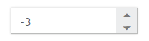
CurrencyTextBox with minValue
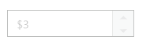
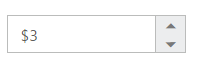
Read Only Support
The CurrencyTextBox supports read only option. When you enable the readOnly property to the control, the value cannot be changed in the CurrencyTextBox. You can set the readOnly property as “true” to enable this option.
Configure Read Only
The following steps explain the implementation of readOnly in CurrencyTextBox .
In the HTML page set the corresponding <input> elements for rendering CurrencyTextBox control.
<input id="currency" type="text" ej-currencytextbox [value]="value" [readOnly]="true" />import { Component } from '@angular/core';
@Component({
selector: 'ej-app',
templateUrl: 'src/currencytextbox/currencytextbox.component.html'
})
export class CurrencyTextboxComponent {
public value: number;
constructor() {
this.value = 3;
}
}The output for CurrencyTextBox when readOnly is “true” is as follows. The CurrencyTextBox values cannot be edited or changed.
Appearance
Theme
The CurrencyTextBox control’s style and appearance can be controlled based on CSS classes. In order to apply styles to the CurrencyTextBox control, you need to refer 2 files namely, ej.widgets.core.min.css and ej.theme.min.css. If the file ej.web.all.min.css is referred, then it is not necessary to include the files ej.widgets.core.min.css and ej.theme.min.css in your project, as ej.web.all.min.css is the combination of these two.
By default, there are 17 themes support available for CurrencyTextBox control namely:
- bootstrap
- flat-azure
- flat-azure-dark
- fat-lime
- flat-lime-dark
- flat-saffron
- flat-saffron-dark
- gradient-azure
- gradient-azure-dark
- gradient-lime
- gradient-lime-dark
- gradient-saffron
- gradient-saffron-dark
- high-contrast-01
- high-contrast-02
- material
- office-365
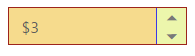
CSS Class
The CSS can be customized by using the cssClass in the CurrencyTextBox. You can customize the CurrencyTextBox with various cssClass properties to appear like your desired control.
Configure CSS Class
The following steps explain the implementation of cssClass in CurrencyTextBox .
In the HTML page set the corresponding <input> elements for rendering CurrencyTextBox control.
<input id="currency" type="text" ej-currencytextbox [value]="value" [cssClass]="customCss"/>import {Component,ViewEncapsulation} from '@angular/core';
@Component({
selector: 'ej-app',
templateUrl: 'app/components/currencytextbox/currencytextbox.component.html',
styleUrls: ['app/components/currencytextbox/currencytextbox.component.css'],
encapsulation: ViewEncapsulation.None
})
export class CurrencyTextboxComponent {
public value: number;
constructor() {
this.value = 3;
}
}Customize the CSS properties in custom CSS class.
.customCss .e-box {
    border-color: #9d241b;
}
.customCss .e-input {
    background-color: #f6db8d;
}
.customCss .e-select {
    background-color: #ecf6ac;
    border-color: #3c36e7;
}
The output for CurrencyTextBox after applying cssClass is as follows.
Rounded Corner Support
The CurrencyTextBox provides you with rounded corner support whose appearance is different from normal textbox controls.
Configure Rounded Corner Support
The following steps explain the implementation of showRoundedCorner in CurrencyTextBox .
In the HTML page set the corresponding <input> elements for rendering CurrencyTextBox controls.
<input id="currency" type="text" ej-currencytextbox [value]="value"
[showRoundedCorner]="true"/>import { Component } from '@angular/core';
@Component({
selector: 'ej-app',
templateUrl: 'src/currencytextbox/currencytextbox.component.html'
})
export class CurrencyTextboxComponent {
public value: number;
constructor() {
this.value = 3;
}
}The output for CurrencyTextBox when showRoundedCorner is “true”.
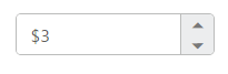
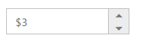
Spin Button Support
The CurrencyTextBox provides you the option as to whether to display the spin button in the widget or remove it from the control by using showSpinButton property.
Configure Spin Button
The following steps explain the implementation of showSpinButton in CurrencyTextBox .
In the HTML page set the corresponding <input> elements for rendering CurrencyTextBox control.
<input id="currency" type="text" ej-currencytextbox [value]="value" [showSpinButton]="true"/>import { Component } from '@angular/core';
@Component({
selector: 'ej-app',
templateUrl: 'src/currencytextbox/currencytextbox.component.html'
})
export class CurrencyTextboxComponent {
public value: number;
constructor() {
this.value = 3;
}
}The output for CurrencyTextBox when showSpinButton is “true”.
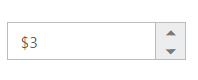
CurrencyTextBox with showSpinButton is true
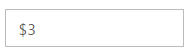
CurrencyTextBox with showSpinButton is false
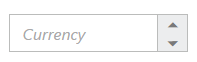
Water Mark Text Support
The CurrencyTextBox provide water mark text support. You can display the initial value in the control by water mark.
Configure Water Mark Text
The following steps explain the implementation of watermarkText in CurrencyTextBox .
In the HTML page set the corresponding <input> elements for rendering CurrencyTextBox control.
<input id="currency" type="text" ej-currencytextbox [watermarkText]="watermarkText"/>import { Component } from '@angular/core';
@Component({
selector: 'ej-app',
templateUrl: 'src/currencytextbox/currencytextbox.component.html'
})
export class CurrencyTextboxComponent {
public watermarkText: string;
constructor() {
this.watermarkText = "Currency";
}
}The output for CurrencyTextBox after applying watermarkText is as follows.