How can I help you?
Behavior Settings
showPreview
The ColorPicker control provides live preview support for current cursor selection color and selected color. showPreview property allows you to preview the selected color in the picker or from the palette.
The showPreview property is Boolean type and its default value is true.
In the HTML page, add a <input> element to render ColorPicker widget
<div align="center">
    <input id="colorPicker" type="text" [showPreview]="true" ej-colorpicker [(ngModel)]="value" />
</div>import { Component } from '@angular/core';
@Component({
selector: 'ej-app',
templateUrl: './default.component.html'
})
export class DefaultComponent {
value: string;
constructor() { this.value = '#278787'; }
}The following screenshot displays the output of the above code example.
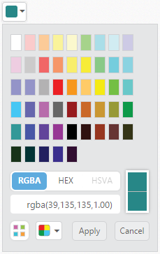
showRecentColors
The ColorPicker control allows you to store the color values in custom list by using showRecentColors property. The ColorPicker keeps up to 11 colors in a custom list. By clicking the add button, the selected color from picker or palette gets added in the recent color list.
The showRecentColors property is Boolean type and its default value is false.
In the HTML page, add a <input> element to render ColorPicker widget
<div align="center">
    <input id="colorPicker" type="text" [showRecentColors]="true" ej-colorpicker [(ngModel)]="value" />
</div>import { Component } from '@angular/core';
@Component({
selector: 'ej-app',
templateUrl: './default.component.html'
})
export class DefaultComponent {
value: string;
constructor() { this.value = '#278787'; }
}The following screenshot displays the output of the above code example.
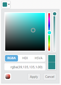
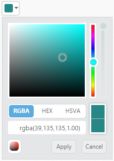
enableOpacity
The ColorPicker control allows you to enable or disable the opacity slider. You can achieve this by using the enableOpacity property.
The enableOpacity property is Boolean type and its default value is true.
In the HTML page, add a <input> element to render ColorPicker widget
<div align="center">
    <input id="colorPicker" type="text" [enableOpacity]="false" ej-colorpicker [(ngModel)]="value" />
</div>import { Component } from '@angular/core';
@Component({
selector: 'ej-app',
templateUrl: './default.component.html'
})
export class DefaultComponent {
value: string;
constructor() { this.value = '#278787'; }
}The following screenshot displays the output of the above code example.
columns
The palette model consists of color values in the rows and columns order. Palette only consists of predefined colors and allows you to select anyone color from it. The columns property allows you to modify the number of columns in palette model.
The columns property is Number type and its default value is 10.
In the HTML page, add a <input> element to render ColorPicker widget
<div align="center">
    <input id="picker" ej-colorpicker [(ngModel)]="value" [(columns)]="columns" [(modelType)]="type"/>
</div>import { Component } from '@angular/core';
@Component({
selector: 'ej-app',
templateUrl: './colorpalette.component.html'
})
export class PaletteComponent {
value: string;
type: string;
columns: number;
constructor() {
this.value = '#ec2024';
this.type = 'palette';
this.columns = 9;
}
}The following screenshot displays the output of the above code example.