TreeNodeAdv Features in Windows Forms MultiColumn TreeView
8 Jul 20265 minutes to read
This section discusses the following topics.
OptionButton
Option button allows the user to select only one node from all nodes.
Property Table
MultiColumnTreeView Properties
| MultiColumnTreeView Property | Description |
|---|---|
| ShowOptionButtons | Indicates if the option button will be shown for the nodes. |
TreeNodeAdv properties
| TreeNodeAdv Property | Description |
|---|---|
| ShowOptionButton | Indicates if the option button will be shown for the node. |
| Optioned | Gets or sets the optioned state of a node. |
| OptionButtonColor | Gets or sets the option button back color for selected option node. |
//Option button for all nodes in MultiColumnTreeView
this.multiColumnTreeView1.ShowOptionButtons = true;

//Option button for particular nodes
this.multiColumnTreeView1.Nodes[0].ShowOptionButton = true;

this.multiColumnTreeView1.Nodes[0].Optioned = true;Me.multiColumnTreeView1.ShowOptionButtons = True
Me.multiColumnTreeView1.Nodes(0).ShowOptionButton = True
Me.multiColumnTreeView1.Nodes(0).Optioned = True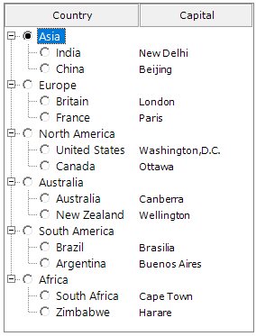
CheckBox
The ShowCheckBoxes property, when set, displays a check box for all the nodes. To apply the check box to individual nodes, set the TreeNodeAdv.ShowCheckBox property only for the required nodes in the NodeCollection Editor.
The InteractiveCheckBoxes property indicates whether the state of the parent node’s check box is based on the check state of its child nodes’ check boxes. To set this for individual nodes, set the InteractiveCheckBox property of the TreeNodeAdv.
Property Table
MultiColumnTreeView Properties
| MultiColumnTreeView Property | Description |
|---|---|
| ShowCheckBoxes | Indicates if the checkbox will be shown for the nodes. |
| InteractiveCheckBoxes | Indicates if the state of the node's checkbox indicates the check state of the child node's checkboxes. |
| CheckedNodes | Gets the Checked nodes collection |
TreeNodeAdv Properties
| TreeNodeAdv Property | Description |
|---|---|
| ShowCheckBox | Indicates if the checkbox of the node is visible. |
| InteractiveCheckBox | Indicates if the node will have an interactive checkbox. |
//Check box for all nodes in MultiColumnTreeView
this.multiColumnTreeView1.ShowCheckBoxes = true;

//Check box for particular nodes
this.multiColumnTreeView1.Nodes[0].ShowCheckBox = true;

this.multiColumnTreeView1.Nodes[0].Checked = true;Me.multiColumnTreeView1.ShowCheckBoxes = True
Me.multiColumnTreeView1.Nodes(0).ShowCheckBox = True
Me.multiColumnTreeView1.Nodes(0).Checked = True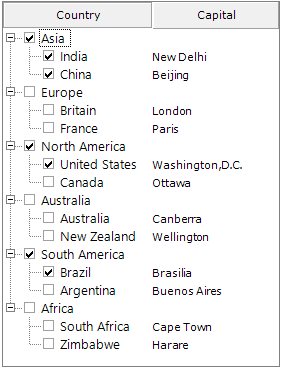
Tristate CheckBox Settings
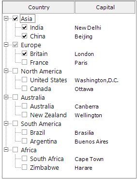
In the MultiColumnTreeView, the partial checking of the child nodes is supported. They are Checked State, Unchecked State, and Intermediate State.
The CheckColor and CheckState properties are used to set the color and the state of the check mark of the selected node. The options for the CheckState property are Checked, Unchecked, and Indeterminate.
Property Table
| TreeNodeAdv Property | Description |
|---|---|
| CheckColor | Indicates the color of the check mark. |
| CheckState | Indicates the check state of the node. |
| IntermediateCheckColor | Indicates the color of the check mark when it is in intermediate state or when its CheckState property is set to indeterminate. |
| Checked | This indicates if the node's checkbox is checked. |
| EnsureDefaultOptionedChild | This specifies if at least one child of the parent node should be selected always. |
CustomControls
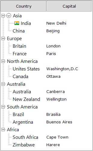
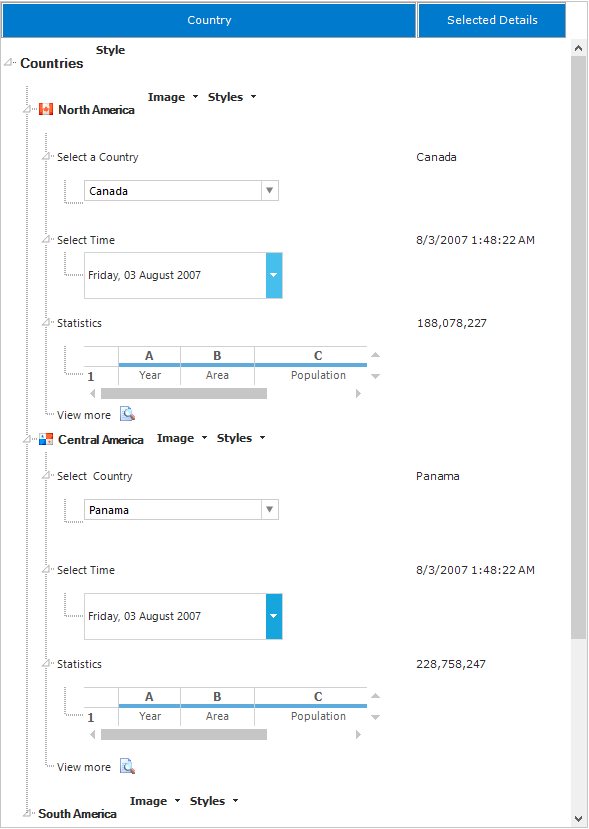
TreeNodeAdv can hold controls using custom control feature. This increases the functionality of the node, the nodes can hold controls like combo box, calendar etc.
Editing the Node
LabelEdit
Indicates whether the label text of the tree nodes can be edited. By default, it is false. To edit a node, the LabelEdit property must be set to true. The BeforeEdit event occurs before a node enters edit mode.
For further details, refer to the Editing Event.
this.multiColumnTreeView1.LabelEdit = true;Me.multiColumnTreeView1.LabelEdit = True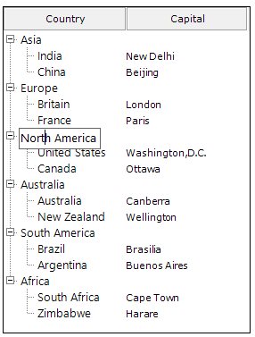
Primitives
The MultiColumnTreeView control supports a set of primitive collections, that can be set through the Primitives Collection Editor available with each node in the MultiColumnTreeView controls.
The types of primitives available are LabelPrimitive, LeftImagePrimitive, RightImagePrimitive, CheckBoxPrimitive, OptionButtonPrimitive and CustomControlPrimitive.
The Primitive Collection Editor available for each node provides index property. Using this index set, for each primitive, the position for each of these node contents can be set.
-
LabelPrimitive - LabelPrimitive is used to display the text of the label.
-
LeftImagePrimitive - LeftImagePrimitive is used to display the image to the left of the nodes.
-
RightImagePrimitive - RightImagePrimitive is used to display the image that is added to the right of the nodes.
-
StateImagePrimitive - StateImagePrimitive is used to display the state image of the node depending on its state, whether expanded or collapsed.
-
CheckBoxPrimitive - CheckBoxPrimitive is used to display the checkbox for the nodes. When user clicks on this, the node will be checked.
-
OptionButtonPrimitive - OptionButtonPrimitive is used to display the Option button available for the nodes. When the user clicks this primitive, the corresponding node will be selected.
-
CustomControlPrimitives - CustomControlPrimitive displays the custom control for the nodes. User can use the functionality of the custom control primitive which is added to the nodes.
For adding the Primitives to the nodes, follow the steps below.
- Open the Primitives Collection Editor .
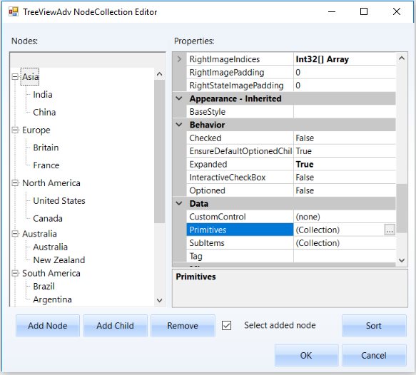
- Select the type of primitive in the combo box present at bottom left of the window and click Add.
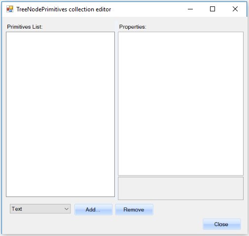
- Now the selected Primitive is added to that selected node.