Track in Flutter Slider (SfSlider)
18 Nov 201817 minutes to read
This section explains how to customize the track in the slider.
You must import the
theme.dartlibrary from theCorepackage to useSfSliderThemein all the examples shown below.
Track color
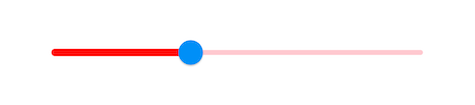
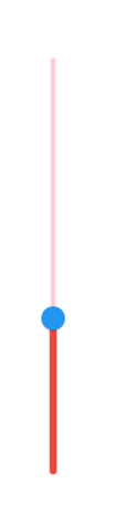
You can change the active and inactive track color of the Flutter Slider using the activeTrackColor and inactiveTrackColor properties respectively.
The active side of the Flutter Slider is between the min value and the thumb.
The inactive side of the Flutter Slider is between the thumb and the max value.
Horizontal
import 'package:flutter/material.dart';
import 'package:syncfusion_flutter_core/theme.dart';
import 'package:syncfusion_flutter_sliders/sliders.dart';

class TrackColorPage extends StatefulWidget {
  @override
  _TrackColorPageState createState() => _TrackColorPageState();
}

class _TrackColorPageState extends State<TrackColorPage> {
  double _value = 5.0;

  @override
  Widget build(BuildContext context) {
    return MaterialApp(
        home: Scaffold(
            body: Center(
                child: SfSliderTheme(
                  data: SfSliderThemeData(
                    activeTrackColor: Colors.red,
                    inactiveTrackColor: Colors.red[100],
                  ),
                  child:  SfSlider(
                    min: 2.0,
                    max: 10.0,
                    value: _value,
                    onChanged: (double newValue){
                      setState(() {
                        _value = newValue;
                      });
                    },
                  ),
                )
            )
        )
    );
  }
}
Vertical
import 'package:flutter/material.dart';
import 'package:syncfusion_flutter_core/theme.dart';
import 'package:syncfusion_flutter_sliders/sliders.dart';

class VerticalTrackColorPage extends StatefulWidget {
  @override
  _VerticalTrackColorPageState createState() => _VerticalTrackColorPageState();
}

class _VerticalTrackColorPageState extends State<VerticalTrackColorPage> {
  double _value = 5.0;

  @override
  Widget build(BuildContext context) {
    return MaterialApp(
        home: Scaffold(
            body: Center(
                child: SfSliderTheme(
                  data: SfSliderThemeData(
                    activeTrackColor: Colors.red,
                    inactiveTrackColor: Colors.red[100],
                  ),
                  child:  SfSlider.vertical(
                    min: 2.0,
                    max: 10.0,
                    value: _value,
                    onChanged: (double newValue){
                      setState(() {
                        _value = newValue;
                      });
                    },
                  ),
                )
            )
        )
    );
  }
}
Track height
You can change the track height of the Flutter Slider using the activeTrackHeight and inactiveTrackHeight properties. The default value of the activeTrackHeight and the inactiveTrackHeight properties are 6.0 and 4.0.
Horizontal
import 'package:flutter/material.dart';
import 'package:syncfusion_flutter_core/theme.dart';
import 'package:syncfusion_flutter_sliders/sliders.dart';

class TrackHeightPage extends StatefulWidget {
  @override
  _TrackHeightPageState createState() => _TrackHeightPageState();
}

class _TrackHeightPageState extends State<TrackHeightPage> {
  double _value = 5.0;

  @override
  Widget build(BuildContext context) {
    return MaterialApp(
        home: Scaffold(
            body: Center(
                child: SfSliderTheme(
                  data: SfSliderThemeData(
                    activeTrackHeight: 8,
                    inactiveTrackHeight: 8,
                  ),
                  child: SfSlider(
                    min: 2.0,
                    max: 10.0,
                    value: _value,
                    onChanged: (double newValue){
                      setState(() {
                        _value = newValue;
                      });
                    },
                  ),
                )
            )
        )
    );
  }
}
Vertical
import 'package:flutter/material.dart';
import 'package:syncfusion_flutter_core/theme.dart';
import 'package:syncfusion_flutter_sliders/sliders.dart';

class VerticalTrackHeightPage extends StatefulWidget {
  @override
  _VerticalTrackHeightPageState createState() => _VerticalTrackHeightPageState();
}

class _VerticalTrackHeightPageState extends State<VerticalTrackHeightPage> {
  double _value = 5.0;

  @override
  Widget build(BuildContext context) {
    return MaterialApp(
        home: Scaffold(
            body: Center(
                child: SfSliderTheme(
                  data: SfSliderThemeData(
                    activeTrackHeight: 8,
                    inactiveTrackHeight: 8,
                  ),
                  child: SfSlider.vertical(
                    min: 2.0,
                    max: 10.0,
                    value: _value,
                    onChanged: (double newValue){
                      setState(() {
                        _value = newValue;
                      });
                    },
                  ),
                )
            )
        )
    );
  }
}
Track corner radius
You can change the corner of the track to be round in the Slider using the trackCornerRadius property. The default value of the trackCornerRadius property is 1.0.
Horizontal
import 'package:flutter/material.dart';
import 'package:syncfusion_flutter_core/theme.dart';
import 'package:syncfusion_flutter_sliders/sliders.dart';

class TrackCornerRadiusPage extends StatefulWidget {
  @override
  _TrackCornerRadiusPageState createState() => _TrackCornerRadiusPageState();
}

class _TrackCornerRadiusPageState extends State<TrackCornerRadiusPage> {
  double _value = 5.0;

  @override
  Widget build(BuildContext context) {
    return MaterialApp(
        home: Scaffold(
            body: Center(
                child: SfSliderTheme(
                  data: SfSliderThemeData(
                    // Track height is increased so that the rounded corners are clearly visible.
                    activeTrackHeight: 10,
                    inactiveTrackHeight: 10,
                    trackCornerRadius: 5,
                  ),
                  child: SfSlider(
                    min: 2.0,
                    max: 10.0,
                    value: _value,
                    onChanged: (double newValue){
                      setState(() {
                        _value = newValue;
                      });
                    },
                  ),
                )
            )
        )
    );
  }
}
Vertical
import 'package:flutter/material.dart';
import 'package:syncfusion_flutter_core/theme.dart';
import 'package:syncfusion_flutter_sliders/sliders.dart';

class VerticalTrackCornerRadiusPage extends StatefulWidget {
  @override
  _VerticalTrackCornerRadiusPageState createState() => _VerticalTrackCornerRadiusPageState();
}

class _VerticalTrackCornerRadiusPageState extends State<VerticalTrackCornerRadiusPage> {
  double _value = 5.0;

  @override
  Widget build(BuildContext context) {
    return MaterialApp(
        home: Scaffold(
            body: Center(
                child: SfSliderTheme(
                  data: SfSliderThemeData(
                    // Track height is increased so that the rounded corners are clearly visible.
                    activeTrackHeight: 10,
                    inactiveTrackHeight: 10,
                    trackCornerRadius: 5,
                  ),
                  child: SfSlider.vertical(
                    min: 2.0,
                    max: 10.0,
                    value: _value,
                    onChanged: (double newValue){
                      setState(() {
                        _value = newValue;
                      });
                    },
                  ),
                )
            )
        )
    );
  }
}