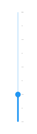
Ticks in Flutter Slider (SfSlider)
18 Nov 201824 minutes to read
This section explains how to add major and minor ticks in the Flutter Slider.
You must import the
theme.dartlibrary from theCorepackage to useSfSliderThemefor customizing tick colors, sizes, and offsets shown in the examples below.
Show major ticks
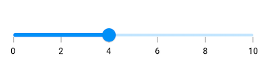
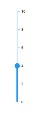
You can enable the major ticks on the track. It is a shape which is used to represent the points at each major interval on the track. The default value of showTicks property is false.
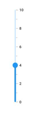
For example, if min is 0.0 and max is 10.0 and interval is 2.0, the Flutter Slider will render the major ticks at 0.0, 2.0, 4.0 and so on.
Horizontal
import 'package:flutter/material.dart';
import 'package:syncfusion_flutter_sliders/sliders.dart';

class MajorTicksPage extends StatefulWidget {
  @override
  _MajorTicksPageState createState() => _MajorTicksPageState();
}

class _MajorTicksPageState extends State<MajorTicksPage> {
  double _value = 4.0;

  @override
  Widget build(BuildContext context) {
    return MaterialApp(
        home: Scaffold(
            body: Center(
              child: SfSlider(
                min: 0.0,
                max: 10.0,
                interval: 2,
                showTicks: true,
                showLabels: true,
                value: _value,
                onChanged: (double newValue) {
                  setState(() {
                    _value = newValue;
                  });
                },
              ),
            )
        )
    );
  }
}
Vertical
import 'package:flutter/material.dart';
import 'package:syncfusion_flutter_sliders/sliders.dart';

class VerticalMajorTicksPage extends StatefulWidget {
  @override
  _VerticalMajorTicksPageState createState() => _VerticalMajorTicksPageState();
}

class _VerticalMajorTicksPageState extends State<VerticalMajorTicksPage> {
  double _value = 4.0;

  @override
  Widget build(BuildContext context) {
    return MaterialApp(
        home: Scaffold(
            body: Center(
              child: SfSlider.vertical(
                min: 0.0,
                max: 10.0,
                interval: 2,
                showTicks: true,
                showLabels: true,
                value: _value,
                onChanged: (double newValue) {
                  setState(() {
                    _value = newValue;
                  });
                },
              ),
            )
        )
    );
  }
}
Refer the
tickShapeandSfSliderThemeDatafor customizing the major tick’s visual appearance.
Show minor ticks
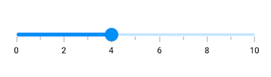
It is used to represent the number of smaller ticks between two major ticks. For example, if min is 0.0 and max is 10.0 and interval is 2.0, the Flutter Slider will render the major ticks at 0.0, 2.0, 4.0 and so on. If minorTicksPerInterval is 1, then smaller ticks will be rendered on 1.0 and 3.0 and so on.
The default value of
minorTicksPerIntervalproperty is null and it must be greater than 0. When null, no minor ticks are rendered.
Horizontal
import 'package:flutter/material.dart';
import 'package:syncfusion_flutter_sliders/sliders.dart';

class MinorTicksPage extends StatefulWidget {
  @override
  _MinorTicksPageState createState() => _MinorTicksPageState();
}

class _MinorTicksPageState extends State<MinorTicksPage> {
  double _value = 4.0;

  @override
  Widget build(BuildContext context) {
    return MaterialApp(
        home: Scaffold(
            body: Center(
              child: SfSlider(
                min: 0.0,
                max: 10.0,
                interval: 2,
                showTicks: true,
                minorTicksPerInterval: 1,
                showLabels: true,
                value: _value,
                onChanged: (double newValue) {
                  setState(() {
                    _value = newValue;
                  });
                },
              ),
            )
        )
    );
  }
}
Vertical
import 'package:flutter/material.dart';
import 'package:syncfusion_flutter_sliders/sliders.dart';

class VerticalMinorTicksPage extends StatefulWidget {
  @override
  _VerticalMinorTicksPageState createState() => _VerticalMinorTicksPageState();
}

class _VerticalMinorTicksPageState extends State<VerticalMinorTicksPage> {
  double _value = 4.0;

  @override
  Widget build(BuildContext context) {
    return MaterialApp(
        home: Scaffold(
            body: Center(
              child: SfSlider.vertical(
                min: 0.0,
                max: 10.0,
                interval: 2,
                showTicks: true,
                minorTicksPerInterval: 1,
                showLabels: true,
                value: _value,
                onChanged: (double newValue) {
                  setState(() {
                    _value = newValue;
                  });
                },
              ),
            )
        )
    );
  }
}
- Refer the
showTicksto know about the rendering major ticks at given interval.- Refer the
minorTickShapeandSfSliderThemeDatafor customizing the minor tick’s visual appearance.
Major ticks color
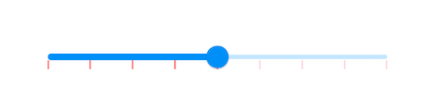
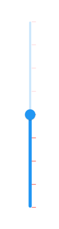
You can change the active and inactive major ticks color of the Flutter Slider using the activeTickColor and inactiveTickColor properties respectively.
The active side of the Flutter Slider is between the min and the thumb.
The inactive side of the Flutter Slider is between the thumb and the max value.
Horizontal
import 'package:flutter/material.dart';
import 'package:syncfusion_flutter_core/theme.dart';
import 'package:syncfusion_flutter_sliders/sliders.dart';

class MajorTicksColorPage extends StatefulWidget {
  @override
  _MajorTicksColorPageState createState() => _MajorTicksColorPageState();
}

class _MajorTicksColorPageState extends State<MajorTicksColorPage> {
  double _value = 6.0;

  @override
  Widget build(BuildContext context) {
    return MaterialApp(
        home: Scaffold(
            body: Center(
                child: SfSliderTheme(
                  data: SfSliderThemeData(
                    activeTickColor: Colors.red,
                    inactiveTickColor: Colors.red[100],
                  ),
                  child: SfSlider(
                    min: 2.0,
                    max: 10.0,
                    value: _value,
                    interval: 1,
                    showTicks: true,
                    onChanged: (double newValue){
                      setState(() {
                        _value = newValue;
                      });
                    },
                  ),
                )
            )
        )
    );
  }
}
Vertical
import 'package:flutter/material.dart';
import 'package:syncfusion_flutter_core/theme.dart';
import 'package:syncfusion_flutter_sliders/sliders.dart';

class VerticalMajorTicksColorPage extends StatefulWidget {
  @override
  _VerticalMajorTicksColorPageState createState() => _VerticalMajorTicksColorPageState();
}

class _VerticalMajorTicksColorPageState extends State<VerticalMajorTicksColorPage> {
  double _value = 6.0;

  @override
  Widget build(BuildContext context) {
    return MaterialApp(
        home: Scaffold(
            body: Center(
                child: SfSliderTheme(
                  data: SfSliderThemeData(
                    activeTickColor: Colors.red,
                    inactiveTickColor: Colors.red[100],
                  ),
                  child: SfSlider.vertical(
                    min: 2.0,
                    max: 10.0,
                    value: _value,
                    interval: 1,
                    showTicks: true,
                    onChanged: (double newValue){
                      setState(() {
                        _value = newValue;
                      });
                    },
                  ),
                )
            )
        )
    );
  }
}
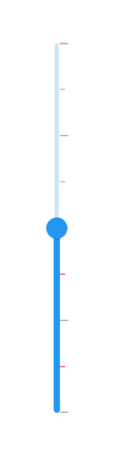
Minor ticks color
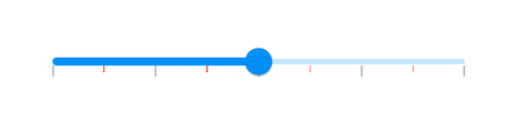
You can change the active and inactive minor ticks color of the Flutter Slider using the activeMinorTickColor and inactiveMinorTickColor properties respectively.
The active side of the Flutter Slider is between the min and the thumb.
The inactive side of the Flutter Slider is between the thumb and the max value.
Horizontal
import 'package:flutter/material.dart';
import 'package:syncfusion_flutter_core/theme.dart';
import 'package:syncfusion_flutter_sliders/sliders.dart';

class MinorTicksColorPage extends StatefulWidget {
  @override
  _MinorTicksColorPageState createState() => _MinorTicksColorPageState();
}

class _MinorTicksColorPageState extends State<MinorTicksColorPage> {
  double _value = 6.0;

  @override
  Widget build(BuildContext context) {
    return MaterialApp(
        home: Scaffold(
            body: Center(
                child: SfSliderTheme(
                  data: SfSliderThemeData(
                    activeMinorTickColor: Colors.red,
                    inactiveMinorTickColor: Colors.red[200],
                  ),
                  child: SfSlider(
                    min: 2.0,
                    max: 10.0,
                    value: _value,
                    interval: 2,
                    minorTicksPerInterval: 1,
                    showTicks: true,
                    onChanged: (double newValue){
                      setState(() {
                        _value = newValue;
                      });
                    },
                  ),
                )
            )
        )
    );
  }
}
Vertical
import 'package:flutter/material.dart';
import 'package:syncfusion_flutter_core/theme.dart';
import 'package:syncfusion_flutter_sliders/sliders.dart';

class VerticalMinorTicksColorPage extends StatefulWidget {
  @override
  _VerticalMinorTicksColorPageState createState() => _VerticalMinorTicksColorPageState();
}

class _VerticalMinorTicksColorPageState extends State<VerticalMinorTicksColorPage> {
  double _value = 6.0;

  @override
  Widget build(BuildContext context) {
    return MaterialApp(
        home: Scaffold(
            body: Center(
                child: SfSliderTheme(
                  data: SfSliderThemeData(
                    activeMinorTickColor: Colors.red,
                    inactiveMinorTickColor: Colors.red[200],
                  ),
                  child: SfSlider.vertical(
                    min: 2.0,
                    max: 10.0,
                    value: _value,
                    interval: 2,
                    minorTicksPerInterval: 1,
                    showTicks: true,
                    onChanged: (double newValue){
                      setState(() {
                        _value = newValue;
                      });
                    },
                  ),
                )
            )
        )
    );
  }
}
Tick size
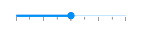
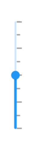
You can change the major and minor ticks size of the Flutter Slider using the tickSize and minorTickSize properties respectively.
Horizontal
The default value of the tickSize property is Size(1.0, 8.0) and minorTickSize property is Size(1.0, 5.0).
import 'package:flutter/material.dart';
import 'package:syncfusion_flutter_core/theme.dart';
import 'package:syncfusion_flutter_sliders/sliders.dart';

class TickSizePage extends StatefulWidget {
  @override
  _TickSizePageState createState() => _TickSizePageState();
}

class _TickSizePageState extends State<TickSizePage> {
  double _value = 6.0;

  @override
  Widget build(BuildContext context) {
    return MaterialApp(
        home: Scaffold(
            body: Center(
                child: SfSliderTheme(
                  data: SfSliderThemeData(
                    tickSize: Size(3.0, 12.0),
                    minorTickSize: Size(3.0, 8.0),
                  ),
                  child: SfSlider(
                    min: 2.0,
                    max: 10.0,
                    interval: 2,
                    minorTicksPerInterval: 1,
                    showTicks: true,
                    value: _value,
                    onChanged: (double newValue){
                      setState(() {
                        _value = newValue;
                      });
                    },
                  ),
                )
            )
        )
    );
  }
}
Vertical
The default value of the tickSize property is Size(8.0, 1.0) and minorTickSize property is Size(5.0, 1.0).
import 'package:flutter/material.dart';
import 'package:syncfusion_flutter_core/theme.dart';
import 'package:syncfusion_flutter_sliders/sliders.dart';

class VerticalTickSizePage extends StatefulWidget {
  @override
  _VerticalTickSizePageState createState() => _VerticalTickSizePageState();
}

class _VerticalTickSizePageState extends State<VerticalTickSizePage> {
  double _value = 6.0;

  @override
  Widget build(BuildContext context) {
    return MaterialApp(
        home: Scaffold(
            body: Center(
                child: SfSliderTheme(
                  data: SfSliderThemeData(
                    tickSize: Size(12.0, 3.0),
                    minorTickSize: Size(8.0, 3.0),
                  ),
                  child: SfSlider.vertical(
                    min: 2.0,
                    max: 10.0,
                    interval: 2,
                    minorTicksPerInterval: 1,
                    showTicks: true,
                    value: _value,
                    onChanged: (double newValue){
                      setState(() {
                        _value = newValue;
                      });
                    },
                  ),
                )
            )
        )
    );
  }
}
Ticks offset
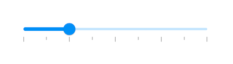
You can adjust the space between track and ticks of the Flutter Slider using the tickOffset property in the SfSliderThemeData. The default value of the tickOffset property is null.
Horizontal
import 'package:flutter/material.dart';
import 'package:syncfusion_flutter_core/theme.dart';
import 'package:syncfusion_flutter_sliders/sliders.dart';

class TicksOffsetPage extends StatefulWidget {
  @override
  _TicksOffsetPageState createState() => _TicksOffsetPageState();
}

class _TicksOffsetPageState extends State<TicksOffsetPage> {
  double _value = 4.0;

  @override
  Widget build(BuildContext context) {
    return MaterialApp(
        home: Scaffold(
            body: Center(
                child: SfSliderTheme(
                  data: SfSliderThemeData(
                    tickOffset: Offset(0.0, 10.0),
                  ),
                  child: SfSlider(
                    min: 2.0,
                    max: 10.0,
                    interval: 2,
                    minorTicksPerInterval: 1,
                    showTicks: true,
                    value: _value,
                    onChanged: (double newValue){
                      setState(() {
                        _value = newValue;
                      });
                    },
                  ),
                )
            )
        )
    );
  }
}
Vertical
import 'package:flutter/material.dart';
import 'package:syncfusion_flutter_core/theme.dart';
import 'package:syncfusion_flutter_sliders/sliders.dart';

class VerticalTicksOffsetPage extends StatefulWidget {
  @override
  _VerticalTicksOffsetPageState createState() => _VerticalTicksOffsetPageState();
}

class _VerticalTicksOffsetPageState extends State<VerticalTicksOffsetPage> {
  double _value = 4.0;

  @override
  Widget build(BuildContext context) {
    return MaterialApp(
        home: Scaffold(
            body: Center(
                child: SfSliderTheme(
                  data: SfSliderThemeData(
                    tickOffset: Offset(0.0, 10.0),
                  ),
                  child: SfSlider.vertical(
                    min: 2.0,
                    max: 10.0,
                    interval: 2,
                    minorTicksPerInterval: 1,
                    showTicks: true,
                    value: _value,
                    onChanged: (double newValue){
                      setState(() {
                        _value = newValue;
                      });
                    },
                  ),
                )
            )
        )
    );
  }
}