Overview
29 Jun 20181 minute to read
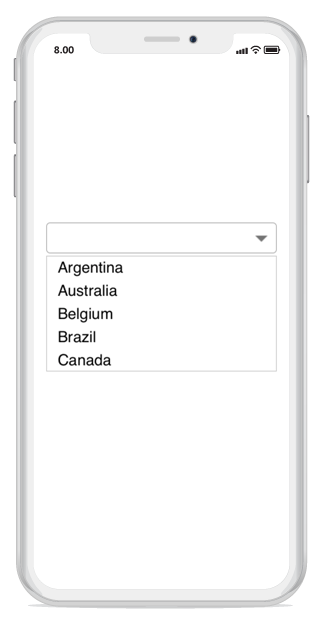
The combo box control allows users to choose an option from the list of predefined options. When the arrow icon accompanied with this component is pressed, the drop-down displays a list of values, from which users can select an option.
Key Features
-
ComboBox Mode- Provides an option to select an item from the drop-down list by either editing or non-editing the combobox textbox. -
Suggestion Mode- Suggestions can be displayed in eight different modes, such as StartsWith, EndWith, Contains, Equals, etc. -
Multiple Selection- Provides two different ways to select multiple items from the dropdown list using token representation and delimiter. -
Filtering- Provides options to support both filtering and non-filtering suggestion list. The combo box provides three different ways to display the filtered suggestions. They displays suggestions using the drop-down list, appends the first suggestion to text and both of these. -
Header and Footer- Header and footer content can be given in the top and bottom of the dropdown list. -
Highlighting Text- Highlights the matching text in the dropdown list based on the input. -
Customization support- Provides options to customize both the Entry and dropdown. -
Watermark– Supports explanatory text inside the combo box control until users inputs the text. Watermark is restored again if user clears the text.