# Dealing with Toolbars in WPF ToolBarAdv
The following sections describe how to position, customize, and populate the items in a `ToolBarAdv`.
## Specifying the position of ToolBarAdv in a ToolBarTrayAdv
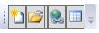
The position of the ToolBarAdv in the ToolBarTrayAdv can be specified using the [Band](https://help.syncfusion.com/cr/wpf/Syncfusion.Windows.Tools.Controls.ToolBarAdv.html#Syncfusion_Windows_Tools_Controls_ToolBarAdv_Band) and [BandIndex](https://help.syncfusion.com/cr/wpf/Syncfusion.Windows.Tools.Controls.ToolBarAdv.html#Syncfusion_Windows_Tools_Controls_ToolBarAdv_BandIndex) properties. `Band` indicates the band in the ToolBarTrayAdv where the ToolBarAdv has to be placed. `BandIndex` indicates the order in which the ToolBarAdv is placed within the band.
{% tabs %}
{% highlight XAML %}
{% endhighlight %}
{% highlight C# %}
ToolBarTrayAdv tray = new ToolBarTrayAdv();
ToolBarAdv toolBar = new ToolBarAdv();
Button button = new Button();
button.Width = 16;
button.Height = 16;
button.Content = new Image() { Source = new BitmapImage() { UriSource = new Uri("Images/NewDocumentHS.png", UriKind.RelativeOrAbsolute) } };
toolBar.Items.Add(button);
button = new Button();
button.Width = 16;
button.Height = 16;
button.Content = new Image() { Source = new BitmapImage() { UriSource = new Uri("Images/openHS.png", UriKind.RelativeOrAbsolute) } };
toolBar.Items.Add(button);
tray.ToolBars.Add(toolBar);
toolBar = new ToolBarAdv();
toolBar.Band = 1;
button = new Button();
button.Width = 16;
button.Height = 16;
button.Content = new Image() { Source = new BitmapImage() { UriSource = new Uri("Images/InsertPictureHS.png", UriKind.RelativeOrAbsolute) } };
toolBar.Items.Add(button);
button = new Button();
button.Width = 16;
button.Height = 16;
button.Content = new Image() { Source = new BitmapImage() { UriSource = new Uri("Images/InsertHyperlinkHS.png", UriKind.RelativeOrAbsolute) } };
toolBar.Items.Add(button);
button = new Button();
button.Width = 16;
button.Height = 16;
button.Content = new Image() { Source = new BitmapImage() { UriSource = new Uri("Images/TableHS.png", UriKind.RelativeOrAbsolute) } };
toolBar.Items.Add(button);
tray.ToolBars.Add(toolBar);
Grid1.Children.Add(tray);
{% endhighlight %}
{% endtabs %}

## ToolBarAdv with overflow items
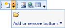
When a ToolBarAdv control contains more items than can be displayed within its size, the additional items are listed in the overflow popup. On clicking the overflow button, the items are listed.
ToolBarAdv allows you to set the overflow mode for each item.
* `OverflowMode.Always` – the specified item will always be listed in the overflow popup.
* `OverflowMode.Never` – the specified item will never be moved to the overflow popup.
* `OverflowMode.AsNeeded` – the specified item will be listed in the overflow popup if required. This is the default value.
## Show or hide Gripper
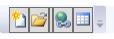
The gripper can show and hide in ToolBarAdv using the [GripperVisibility](https://help.syncfusion.com/cr/wpf/Syncfusion.Windows.Tools.Controls.ToolBarAdv.html#Syncfusion_Windows_Tools_Controls_ToolBarAdv_GripperVisibility) property. To collapse the gripper in the ToolBarAdv, set the GripperVisibility as Collapsed. By default its value is visibility.
Following code illustrates how to hide the gripper:
{% tabs %}
{% highlight XAML %}
{% endhighlight %}
{% highlight C# %}
ToolBarAdv toolBar = new ToolBarAdv();
toolBar.GripperVisibility = Visibility.Collapsed;
{% endhighlight %}
{% endtabs %}
## Orientation of ToolBarTrayAdv
ToolBarAdv provide two different orientation support such as Horizontal and Vertical. The desired orientation for ToolBarAdv can be changed using the [Orientation](https://help.syncfusion.com/cr/wpf/Syncfusion.Windows.Tools.Controls.ToolBarAdv.html#Syncfusion_Windows_Tools_Controls_ToolBarAdv_Orientation) property of ToolBarTrayAdv.
{% tabs %}
{% highlight xaml %}
{% endhighlight %}
{% highlight C# %}
ToolBarTrayAdv tray = new ToolBarTrayAdv();
tray.Orientation = Orientation.Vertical;
ToolBarAdv toolBar = new ToolBarAdv();
Button button = new Button();
button.Content = new Image() { Source = new BitmapImage() { UriSource = new Uri("Images/InsertPictureHS.png", UriKind.RelativeOrAbsolute) } };
toolBar.Items.Add(button);
button = new Button();
button.Content = new Image() { Source = new BitmapImage() { UriSource = new Uri("Images/InsertHyperlinkHS.png", UriKind.RelativeOrAbsolute) } };
toolBar.Items.Add(button);
button = new Button();
button.Content = new Image() { Source = new BitmapImage() { UriSource = new Uri("Images/TableHS.png", UriKind.RelativeOrAbsolute) } };
toolBar.Items.Add(button);
tray.ToolBars.Add(toolBar);
Grid1.Children.Add(tray);
{% endhighlight %}
{% endtabs %}

## Add or Remove buttons
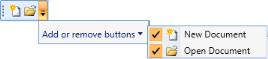
ToolBarAdv provides the option to show or hide an item at runtime using the **Add or Remove** button. To enable it, set the [EnableAddRemoveButton](https://help.syncfusion.com/cr/wpf/Syncfusion.Windows.Tools.Controls.ToolBarAdv.html#Syncfusion_Windows_Tools_Controls_ToolBarAdv_EnableAddRemoveButton) property of ToolBarAdv to `True`. The default value is `false`. Users can unselect the checkboxes of items to hide them from the toolbar.
### Adding an item to the Add or Remove button
Following code illustrates how to add an item in Add or Remove Buttons:
{% tabs %}
{% highlight xaml %}
{% endhighlight %}
{% highlight C# %}
ToolBarTrayAdv tray = new ToolBarTrayAdv();
ToolBarAdv toolBar = new ToolBarAdv();
toolBar.EnableAddRemoveButton = true;
Button button = new Button();
button.Width = 16;
button.Height = 16;
button.Content = new Image() { Source = new BitmapImage() { UriSource = new Uri("Images/NewDocumentHS.png", UriKind.RelativeOrAbsolute) } };
ToolBarAdv.SetLabel(button, "New Document");
ToolBarAdv.SetIcon(button, new BitmapImage() { UriSource = new Uri("Images/NewDocumentHS.png", UriKind.RelativeOrAbsolute) });
toolBar.Items.Add(button);
button = new Button();
button.Width = 16;
button.Height = 16;
button.Content = new Image() { Source = new BitmapImage() { UriSource = new Uri("Images/openHS.png", UriKind.RelativeOrAbsolute) } };
ToolBarAdv.SetLabel(button, "Open Document");
ToolBarAdv.SetIcon(button, new BitmapImage() { UriSource = new Uri("Images/openHS.png", UriKind.RelativeOrAbsolute) });
toolBar.Items.Add(button);
tray.ToolBars.Add(toolBar);
Grid1.Children.Add(tray);
{% endhighlight %}
{% endtabs %}
## Hiding the ToolBarItem
To hide a particular ToolBarItem, set the `IsAvailable` attached property of the ToolBarAdv to `False`. The default value is `True`.
{% tabs %}
{% highlight xaml %}
{% endhighlight %}
{% endtabs %}