---
layout: post
title: Month View in WPF Scheduler control | Syncfusion
description: Learn here all about Month View support in Syncfusion WPF Scheduler (SfScheduler) control, its elements and more.
platform: scheduler-sdk
control: SfScheduler
documentation: ug
---
# Month View in WPF Scheduler (SfScheduler)
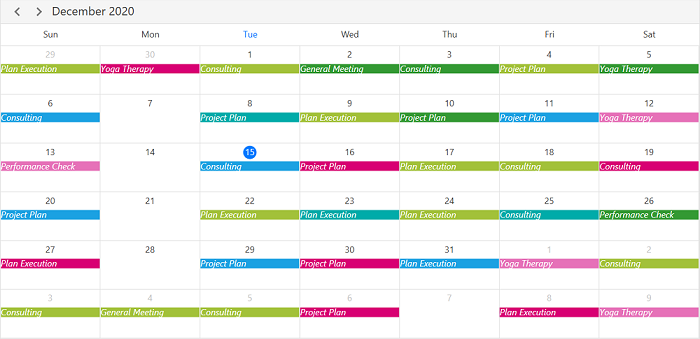
The month view of the scheduler displays the days of a specific month; the current month is shown by default initially. The current date is highlighted differently from other dates of the current month.

## Month agenda view
The scheduler month view displays a divided agenda view that is used to show the selected date’s appointments below the month. Show the agenda view by setting the [ShowAgendaView](https://help.syncfusion.com/cr/wpf/Syncfusion.UI.Xaml.Scheduler.MonthViewSettings.html#Syncfusion_UI_Xaml_Scheduler_MonthViewSettings_ShowAgendaView) property to `true` in the [MonthViewSettings](https://help.syncfusion.com/cr/wpf/Syncfusion.UI.Xaml.Scheduler.MonthViewSettings.html).

{% tabs %}
{% highlight xaml %}
<Window 
    . . .
    xmlns:syncfusion="http://schemas.syncfusion.com/wpf">
    <Grid>
        <syncfusion:SfScheduler x:Name="Schedule"
                            ViewType="Month" >
            <syncfusion:SfScheduler.MonthViewSettings>
                <syncfusion:MonthViewSettings ShowAgendaView="True"/>
            </syncfusion:SfScheduler.MonthViewSettings>
        </syncfusion:SfScheduler>
    </Grid>
</Window>
{% endhighlight %}
{% highlight c#%}
using Syncfusion.UI.Xaml.Scheduler;

this.Schedule.ViewType = SchedulerViewType.Month;
this.Schedule.MonthViewSettings.ShowAgendaView = true;
{% endhighlight %}
{% endtabs %}
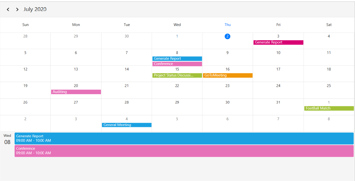

![WPF Scheduler month view ShowAgendaView](Month-View_Images/wpf-scheduler-agenda-view.png)

>**NOTE**
* An agenda view displays text as **No Selected Date** until a date is selected.
* If there is no appointment on a selected day, the agenda view displays the text as **No Events**.

### Agenda view height
Customize the month agenda view height from the Scheduler by using the [AgendaViewHeight](https://help.syncfusion.com/cr/wpf/Syncfusion.UI.Xaml.Scheduler.MonthViewSettings.html#Syncfusion_UI_Xaml_Scheduler_MonthViewSettings_AgendaViewHeight) property of MonthViewSettings. By default, the agenda view will occupy 30% of the Scheduler height.

{% tabs %}
{% highlight xaml %}
<Window 
    . . .
    xmlns:syncfusion="http://schemas.syncfusion.com/wpf">
    <Grid>
        <syncfusion:SfScheduler x:Name="Schedule"
                            ViewType="Month" >
            <syncfusion:SfScheduler.MonthViewSettings>
                <syncfusion:MonthViewSettings AppointmentDisplayMode="Indicator"
                ShowAgendaView="True"
                AgendaViewHeight="300"/>
            </syncfusion:SfScheduler.MonthViewSettings>
        </syncfusion:SfScheduler>   
    </Grid>
</Window>
{% endhighlight %}
{% highlight c#%}
using Syncfusion.UI.Xaml.Scheduler;

this.Schedule.ViewType = SchedulerViewType.Month;
this.Schedule.MonthViewSettings.AppointmentDisplayMode = AppointmentDisplayMode.Indicator;
this.Schedule.MonthViewSettings.ShowAgendaView = true;
this.Schedule.MonthViewSettings.AgendaViewHeight = 300;
{% endhighlight %}
{% endtabs %}
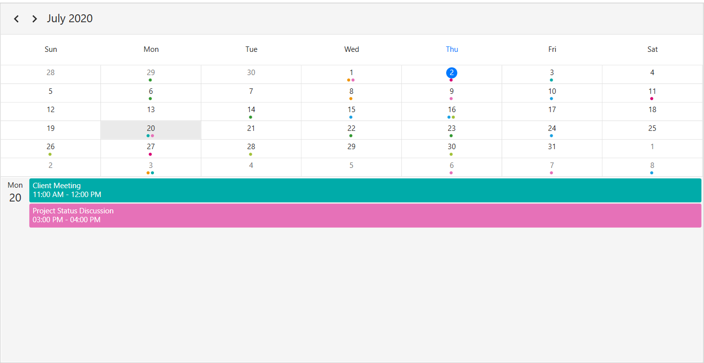

![WPF Scheduler month view AgendaViewHeight](Month-View_Images/wpf-scheduler-agenda-view-height.png)

## Appointment display mode
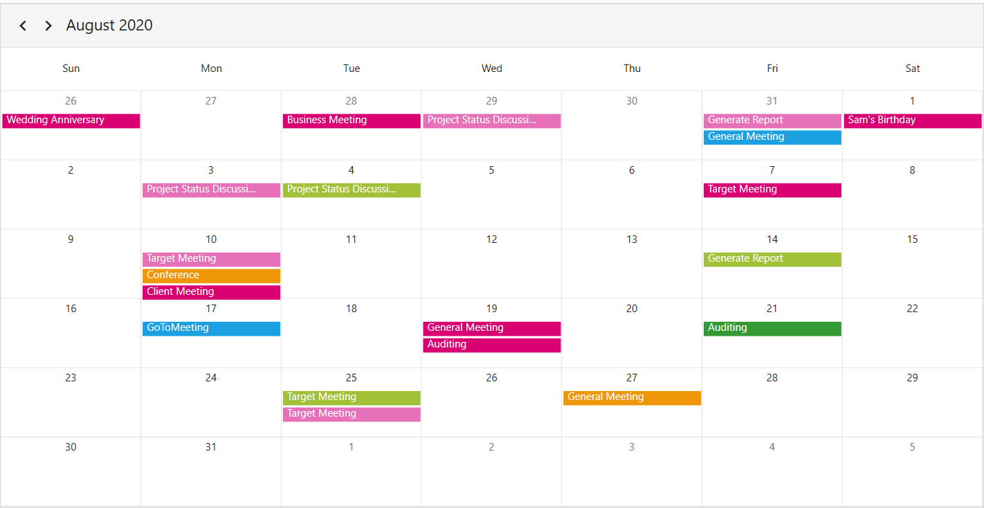
Handle the Scheduler month view appointment display by using the [AppointmentDisplayMode](https://help.syncfusion.com/cr/wpf/Syncfusion.UI.Xaml.Scheduler.MonthViewSettings.html#Syncfusion_UI_Xaml_Scheduler_MonthViewSettings_AppointmentDisplayMode) property of `MonthViewSettings`. By default, the `AppointmentDisplayMode` is set to `Appointment`. By using the `AppointmentDisplayMode`, set the month view appointments display as follows.
* `None`:  Appointment will not be displayed.
* `Indicator`:  Appointment will be denoted as the circle.
* `Appointment`:  Appointment subject will be displayed in the month cell.

{% tabs %}
{% highlight xaml %}
<Window 
    . . .
    xmlns:syncfusion="http://schemas.syncfusion.com/wpf">
    <Grid>
        <syncfusion:SfScheduler x:Name="Schedule"
                            ViewType="Month" >
               <syncfusion:SfScheduler.MonthViewSettings>
                    <syncfusion:MonthViewSettings AppointmentDisplayMode="Appointment"/>
               </syncfusion:SfScheduler.MonthViewSettings>
        </syncfusion:SfScheduler>
    </Grid>
</Window>
{% endhighlight %}
{% highlight c#%}
using Syncfusion.UI.Xaml.Scheduler;

this.Schedule.ViewType = SchedulerViewType.Month; 
this.Schedule.MonthViewSettings.AppointmentDisplayMode = AppointmentDisplayMode.Appointment;
{% endhighlight %}
{% endtabs %}

![WPF Scheduler month view AppointmentDisplayMode](Month-View_Images/wpf-scheduler-appointment-display-mode.png)

## Appointment display count
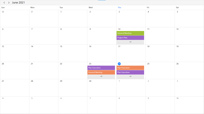
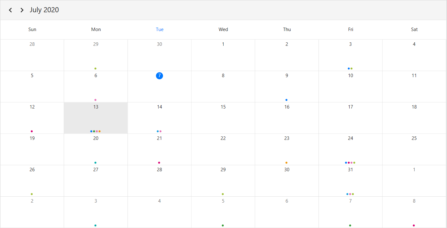
Customize the number of appointments displayed in a month cell using the [AppointmentDisplayCount](https://help.syncfusion.com/cr/wpf/Syncfusion.UI.Xaml.Scheduler.MonthViewSettings.html#Syncfusion_UI_Xaml_Scheduler_MonthViewSettings_AppointmentDisplayCount) property of a `MonthViewSettings` in the Scheduler. By default, the appointment display count is 3, and the month cell has more than 3 appointments, 3 appointments will be displayed and the remaining appointments in the month cell will be displayed as more appointments.

{% tabs %}
{% highlight xaml %}
<Window 
    . . .
    xmlns:syncfusion="http://schemas.syncfusion.com/wpf">
    <Grid>
        <syncfusion:SfScheduler x:Name="Schedule"
                            ViewType="Month" >
            <syncfusion:SfScheduler.MonthViewSettings>
                <syncfusion:MonthViewSettings AppointmentDisplayMode="Indicator"    
                                              AppointmentDisplayCount="4"/>
            </syncfusion:SfScheduler.MonthViewSettings>
        </syncfusion:SfScheduler>
    </Grid>
</Window>
{% endhighlight %}
{% highlight c#%}
using Syncfusion.UI.Xaml.Scheduler;

this.Schedule.ViewType = SchedulerViewType.Month;
this.Schedule.MonthViewSettings.AppointmentDisplayMode = AppointmentDisplayMode.Indicator;
this.Schedule.MonthViewSettings.AppointmentDisplayCount = 4;
{% endhighlight %}
{% endtabs %}

N> 
* By clicking more option, the scheduler navigates to the day view.
* Appointment height will be changed based on the `AppointmentDisplayCount` property.

![WPF Scheduler month view AppointmentDisplayCount](Month-View_Images/wpf-scheduler-appointment-display-count.png)

## Month navigation direction
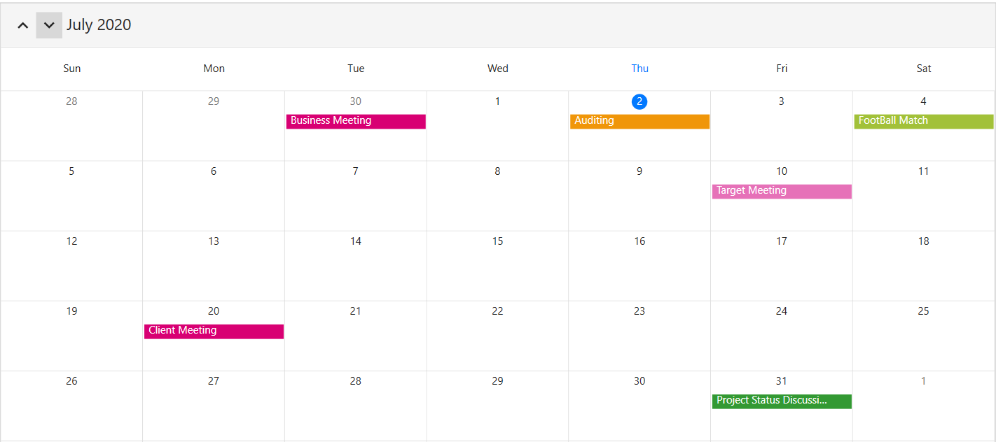
The month view of a Scheduler can be navigated in both horizontal and vertical directions. Change the direction of the navigation using the [MonthNavigationDirection](https://help.syncfusion.com/cr/wpf/Syncfusion.UI.Xaml.Scheduler.MonthViewSettings.html#Syncfusion_UI_Xaml_Scheduler_MonthViewSettings_MonthNavigationDirection) property of `MonthViewSettings`. By default, the month navigation direction is set to `Horizontal`.

{% tabs %}
{% highlight xaml %}
<Window 
    . . .
    xmlns:syncfusion="http://schemas.syncfusion.com/wpf">
    <Grid>
        <syncfusion:SfScheduler x:Name="Schedule"
                            ViewType="Month" >
            <syncfusion:SfScheduler.MonthViewSettings>
                <syncfusion:MonthViewSettings MonthNavigationDirection="Vertical"/>
            </syncfusion:SfScheduler.MonthViewSettings>
         </syncfusion:SfScheduler>
    </Grid>
</Window>
{% endhighlight %}
{% highlight c#%}
using Syncfusion.UI.Xaml.Scheduler;

this.Schedule.ViewType = SchedulerViewType.Month;
this.Schedule.MonthViewSettings.MonthNavigationDirection = MonthNavigationDirection.Vertical;
{% endhighlight %}
{% endtabs %}

![WPF Scheduler month view MonthNavigationDirection](Month-View_Images/wpf-scheduler-month-navigation-direction.png)

## Date format
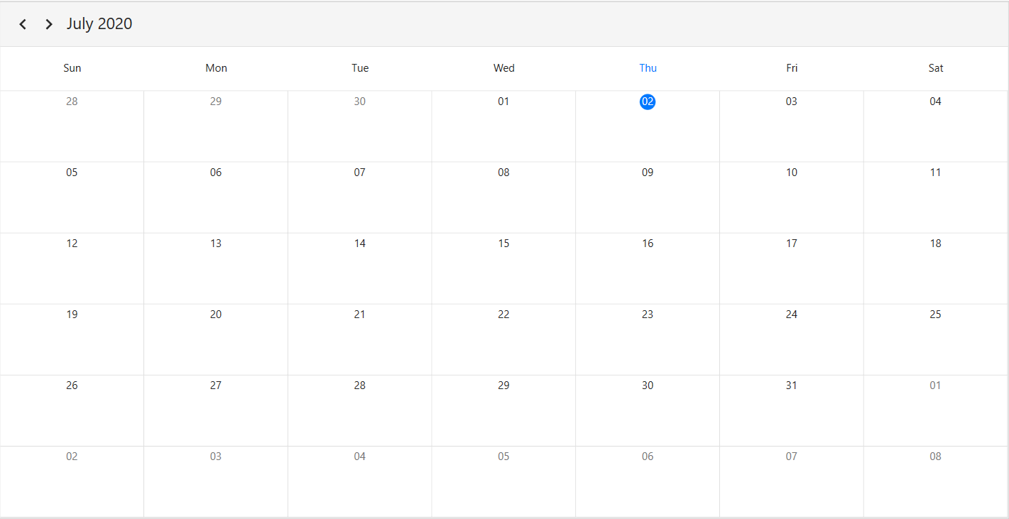
Customize the date format of the scheduler month view by using the [DateFormat](https://help.syncfusion.com/cr/wpf/Syncfusion.UI.Xaml.Scheduler.MonthViewSettings.html#Syncfusion_UI_Xaml_Scheduler_MonthViewSettings_DateFormat) property of `MonthViewSettings`. By default, the month date format is `%d`.

{% tabs %}
{% highlight xaml %}
<Window 
    . . .
    xmlns:syncfusion="http://schemas.syncfusion.com/wpf">
    <Grid>
        <syncfusion:SfScheduler x:Name="Schedule"
                            ViewType="Month" >
            <syncfusion:SfScheduler.MonthViewSettings>
                <syncfusion:MonthViewSettings DateFormat="dd"/>
            </syncfusion:SfScheduler.MonthViewSettings>
        </syncfusion:SfScheduler>
    </Grid>
</Window>
{% endhighlight %}
{% highlight c#%}
using Syncfusion.UI.Xaml.Scheduler;

this.Schedule.ViewType = SchedulerViewType.Month;
this.Schedule.MonthViewSettings.DateFormat = "dd";
{% endhighlight %}
{% endtabs %}

![WPF Scheduler month view DateFormat](Month-View_Images/wpf-scheduler-date-formatting.png)

## View header
Customize the default appearance of view header in month view by setting `ViewHeaderDayFormat`, `DateFormat` ,`ViewHeaderHeight` and `ViewHeaderTemplate` of `MonthViewSettings`.

### View header text formatting
Customize the day format of the Scheduler view header by using the [ViewHeaderDayFormat](https://help.syncfusion.com/cr/wpf/Syncfusion.UI.Xaml.Scheduler.ViewSettingsBase.html#Syncfusion_UI_Xaml_Scheduler_ViewSettingsBase_ViewHeaderDayFormat) property of `MonthViewSettings`. By default, the month view header day format is `ddd`.

{% tabs %}
{% highlight xaml %}
<Window 
    . . .
    xmlns:syncfusion="http://schemas.syncfusion.com/wpf">
    <Grid>
        <syncfusion:SfScheduler x:Name="Schedule"
                            ViewType="Month" >
            <syncfusion:SfScheduler.MonthViewSettings>
                <syncfusion:MonthViewSettings ViewHeaderDayFormat="dddd"/>
            </syncfusion:SfScheduler.MonthViewSettings>
        </syncfusion:SfScheduler>
    </Grid>
</Window>
{% endhighlight %}
{% highlight c#%}
using Syncfusion.UI.Xaml.Scheduler;

this.Schedule.ViewType = SchedulerViewType.Month;
this.Schedule.MonthViewSettings.ViewHeaderDayFormat = "dddd";
{% endhighlight %}
{% endtabs %}
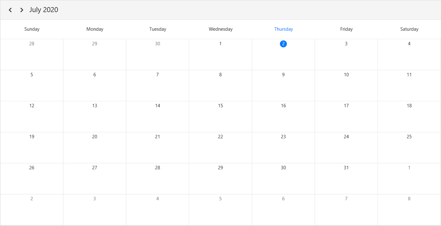

![WPF Scheduler month view ViewHeaderDayFormat](Month-View_Images/wpf-scheduler-viewheader-text-formatting.png)

### View header height
Customize the view header height by using the [ViewHeaderHeight](https://help.syncfusion.com/cr/wpf/Syncfusion.UI.Xaml.Scheduler.ViewSettingsBase.html#Syncfusion_UI_Xaml_Scheduler_ViewSettingsBase_ViewHeaderHeight) property of `MonthViewSettings`. By default, the `ViewHeaderHeight` is set to 50.

{% tabs %}
{% highlight xaml %}
<Window 
    . . .
    xmlns:syncfusion="http://schemas.syncfusion.com/wpf">
    <Grid>
        <syncfusion:SfScheduler x:Name="Schedule"
                            ViewType="Month" >
            <syncfusion:SfScheduler.MonthViewSettings>
                <syncfusion:MonthViewSettings ViewHeaderHeight="100"/>
            </syncfusion:SfScheduler.MonthViewSettings>
        </syncfusion:SfScheduler>
    </Grid>
</Window>
{% endhighlight %}
{% highlight c#%}
using Syncfusion.UI.Xaml.Scheduler;

this.Schedule.ViewType = SchedulerViewType.Month;
this.Schedule.MonthViewSettings.ViewHeaderHeight = 100;
{% endhighlight %}
{% endtabs %}
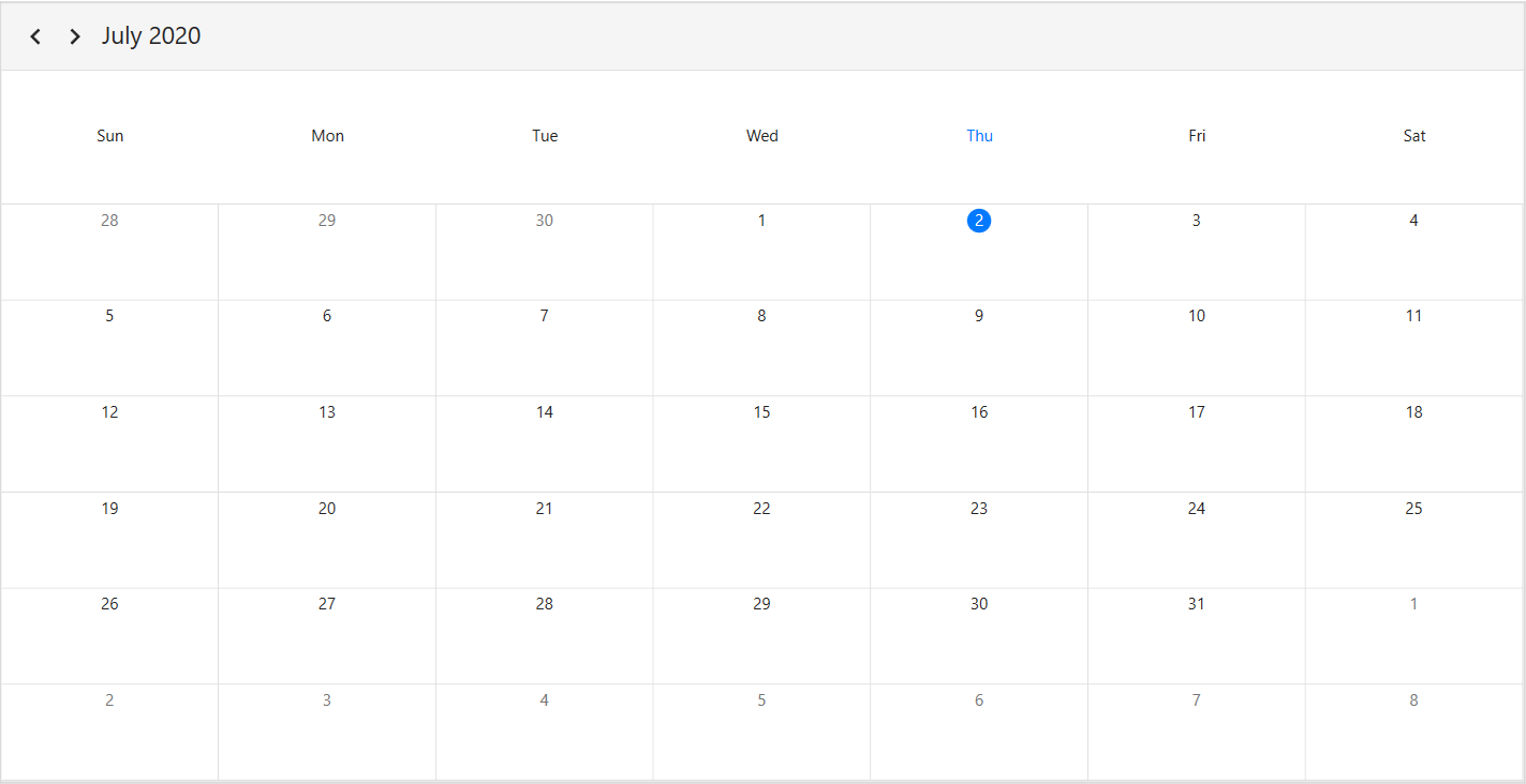

![WPF Scheduler month view ViewHeaderHeight](Month-View_Images/wpf-scheduler-viewheader-height.png)

### View header appearance customization
Customize the default appearance of the month view header by using the [ViewHeaderTemplate](https://help.syncfusion.com/cr/wpf/Syncfusion.UI.Xaml.Scheduler.ViewSettingsBase.html#Syncfusion_UI_Xaml_Scheduler_ViewSettingsBase_ViewHeaderTemplate) property of `MonthViewSettings`.

{% tabs %}
{% highlight xaml %}
<Window 
    . . .
    xmlns:syncfusion="http://schemas.syncfusion.com/wpf">
    <Window.Resources>
        <Style TargetType="syncfusion:ViewHeaderControl">
            <Setter Property="Background" Value="Blue"/>
        </Style>
    </Window.Resources>
    <Grid>
        <syncfusion:SfScheduler x:Name="Schedule"
                            ViewType="Month" >
            <syncfusion:SfScheduler.MonthViewSettings>
                <syncfusion:MonthViewSettings>
                    <syncfusion:MonthViewSettings.ViewHeaderTemplate>
                        <DataTemplate>
                            <TextBlock FontFamily="Segoe UI"
                                        FontSize="20"
                                        FontStyle="Italic"
                                        Foreground="Red"
                                        Background="AntiqueWhite"
                                Text="{Binding DayText}"/>
                        </DataTemplate>
                    </syncfusion:MonthViewSettings.ViewHeaderTemplate>
                </syncfusion:MonthViewSettings>
            </syncfusion:SfScheduler.MonthViewSettings>
        </syncfusion:SfScheduler>
    </Grid>
</Window>
{% endhighlight %}
{% endtabs %}

![WPF Scheduler month view ViewHeadeTemplate](Month-View_Images/wpf-scheduler-viewheader-template.png)

## Leading and Trailing days visibility
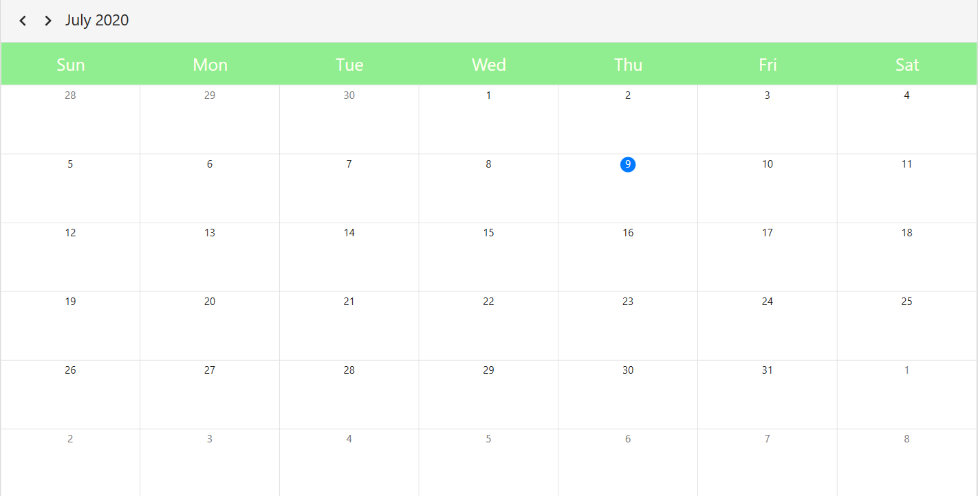
Customize the leading and trailing days visibility of the scheduler month view by using the [LeadingDaysVisibility](https://help.syncfusion.com/cr/wpf/Syncfusion.UI.Xaml.Scheduler.MonthViewSettings.html#Syncfusion_UI_Xaml_Scheduler_MonthViewSettings_LeadingDaysVisibility) and the [TrailingDaysVisibility](https://help.syncfusion.com/cr/wpf/Syncfusion.UI.Xaml.Scheduler.MonthViewSettings.html#Syncfusion_UI_Xaml_Scheduler_MonthViewSettings_TrailingDaysVisibility) properties of `MonthViewSettings.` By default, the `LeadingDaysVisibility` and `TrailingDaysVisibility` are set to `Visible`.

{% tabs %}
{% highlight xaml %}
<Window 
    . . .
    xmlns:syncfusion="http://schemas.syncfusion.com/wpf">
    <Grid>
        <syncfusion:SfScheduler x:Name="Schedule"
                            ViewType="Month" >
            <syncfusion:SfScheduler.MonthViewSettings>
                <syncfusion:MonthViewSettings
                 LeadingDaysVisibility="Collapsed"
                 TrailingDaysVisibility="Collapsed"/>
            </syncfusion:SfScheduler.MonthViewSettings>
        </syncfusion:SfScheduler>
    </Grid>
</Window>
{% endhighlight %}
{% highlight c#%}
using Syncfusion.UI.Xaml.Scheduler;

this.Schedule.ViewType = SchedulerViewType.Month;
this.Schedule.MonthViewSettings.LeadingDaysVisibility = Visibility.Collapsed;
this.Schedule.MonthViewSettings.TrailingDaysVisibility = Visibility.Collapsed;
{% endhighlight %}
{% endtabs %}
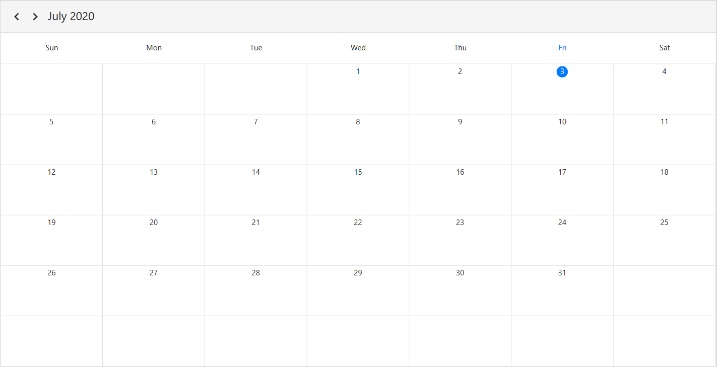

![WPF Scheduler month view Leading and Trailing Days Visibility](Month-View_Images/wpf-scheduler-leading-and-trailing-days-visibility.png)

## Change the number of visible weeks

The number of weeks visible in the month view can be changed by setting the [NumberOfVisibleWeeks](https://help.syncfusion.com/cr/wpf/Syncfusion.UI.Xaml.Scheduler.MonthViewSettings.html#Syncfusion_UI_Xaml_Scheduler_MonthViewSettings_NumberOfVisibleWeeks) property of [MonthViewSettings](https://help.syncfusion.com/cr/wpf/Syncfusion.UI.Xaml.Scheduler.MonthViewSettings.html) in the [`SfScheduler`](https://help.syncfusion.com/cr/wpf/Syncfusion.UI.Xaml.Scheduler.html). By default, 6 weeks are visible.

{% tabs %}
{% highlight xaml hl_lines="8" %}

<Window 
    . . .
    xmlns:syncfusion="http://schemas.syncfusion.com/wpf">
    <Grid>
        <syncfusion:SfScheduler x:Name="Schedule" 
                            ViewType="Month">
            <syncfusion:SfScheduler.MonthViewSettings>
                <syncfusion:MonthViewSetting NumberOfVisibleWeeks="3"/>
            </syncfusion:SfScheduler.MonthViewSettings>
        </syncfusion:SfScheduler>
    </Grid>
</Window>

{% endhighlight %}
{% highlight c# hl_lines="4" %}
using Syncfusion.UI.Xaml.Scheduler;

this.Schedule.ViewType = SchedulerViewType.Month;
this.Schedule.MonthViewSettings.NumberOfVisibleWeeks = 3;

{% endhighlight %}
{% endtabs %}
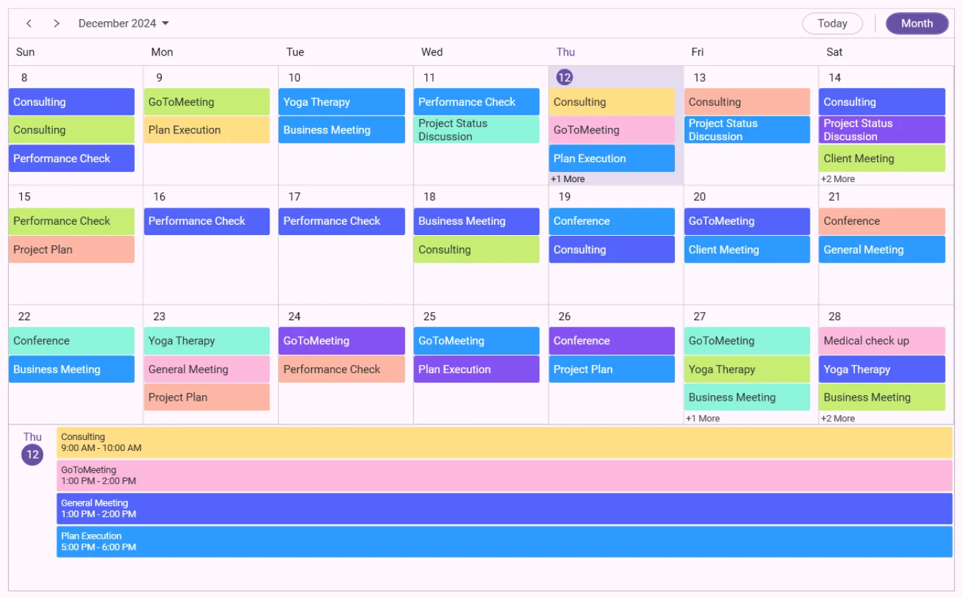

![Number-of-visible-weeks-in-month-view-in-WPF-Scheduler](Month-View_Images/number-of-visible-weeks-in-month-view-in-wpf-scheduler.webp)

N>
* The week number range is limited to values between 1 and 6. Any value outside this range will cause the `NumberOfVisibleWeeks` to default to 6.
* The `NumberOfVisibleWeeks` property dynamically controls the number of weeks displayed in the scheduler's month view.
* The  [DisplayDate](https://help.syncfusion.com/cr/wpf/Syncfusion.UI.Xaml.Scheduler.SfScheduler.html#Syncfusion_UI_Xaml_Scheduler_SfScheduler_DisplayDate) property defines the first row of dates shown in the scheduler's month view.
* The [LeadingDaysVisibility](https://help.syncfusion.com/cr/wpf/Syncfusion.UI.Xaml.Scheduler.MonthViewSettings.html#Syncfusion_UI_Xaml_Scheduler_MonthViewSettings_LeadingDaysVisibility) and [TrailingDaysVisibility](https://help.syncfusion.com/cr/wpf/Syncfusion.UI.Xaml.Scheduler.MonthViewSettings.html#Syncfusion_UI_Xaml_Scheduler_MonthViewSettings_TrailingDaysVisibility) properties are applicable only when the number of visible weeks is set to 6.

## Blackout dates
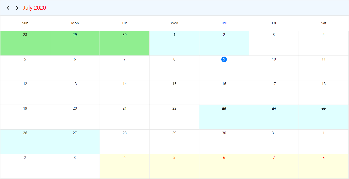
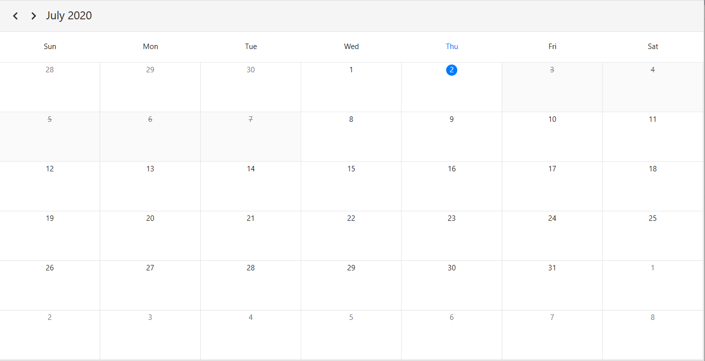
Disable the interaction for certain dates in the scheduler month view by adding those specific dates to the [BlackoutDates](https://help.syncfusion.com/cr/wpf/Syncfusion.UI.Xaml.Scheduler.SfScheduler.html?tabs=tabid-1#Syncfusion_UI_Xaml_Scheduler_SfScheduler_BlackoutDates) collection property of the `SfScheduler.` Using this, allocate or restrict specific dates for the predefined events.

{% tabs %}
{% highlight c#%}
using Syncfusion.UI.Xaml.Scheduler;

this.Schedule.ViewType = SchedulerViewType.Month;
this.Schedule.BlackoutDates = GetBlackoutDates();

private ObservableCollection<DateTime> GetBlackoutDates()
        {
            var blackoutDateCollection = new ObservableCollection<DateTime>()
            {
                DateTime.Now.Date.AddDays(1),
                DateTime.Now.Date.AddDays(2),
                DateTime.Now.Date.AddDays(3),
                DateTime.Now.Date.AddDays(4),
                DateTime.Now.Date.AddDays(5)
            };
            return blackoutDateCollection;
        }
{% endhighlight %}
{% endtabs %}

![WPF Scheduler month view BlackoutDates](Month-View_Images/wpf-scheduler-blackoutdates.png)

#### Customize blackout dates appearance 
 Customize the blacked out dates (trailing, leading, normal days, and current date) by using the setting style.

{% tabs %}
{% highlight xaml %}
<Window 
    . . .
    xmlns:syncfusion="http://schemas.syncfusion.com/wpf">
    <Window.Resources>
        <Style TargetType="syncfusion:MonthCell">
            <Style.Triggers>
                <Trigger Property="DayType" Value="NormalDay, BlockOutDay">
                    <Setter Property="Foreground" Value="Black"/>
                    <Setter Property="Background" Value="Gray"/>
                </Trigger>
                <Trigger Property="DayType" Value="LeadingDay, BlockoutDay">
                    <Setter Property="Foreground" Value="Black"/>
                    <Setter Property="Background" Value="Green"/>
                </Trigger>
                <Trigger Property="DayType" Value="TrailingDay, BlockoutDay">
                    <Setter Property="Foreground" Value="Red"/>
                    <Setter Property="Background" Value="Yellow"/>
                </Trigger>
                <Trigger Property="DayType" Value="Today, BlockoutDay">
                    <Setter Property="Foreground" Value="Red"/>
                    <Setter Property="Background" Value="Green"/>
                </Trigger>
            </Style.Triggers>
        </Style>
    </Window.Resources>
</Window>
{% endhighlight %}
{% endtabs %}

![WPF Scheduler month view BlackoutDatesCustomization](Month-View_Images/wpf-scheduler-blackoutdates-appearance-customization.png)

## Show week number
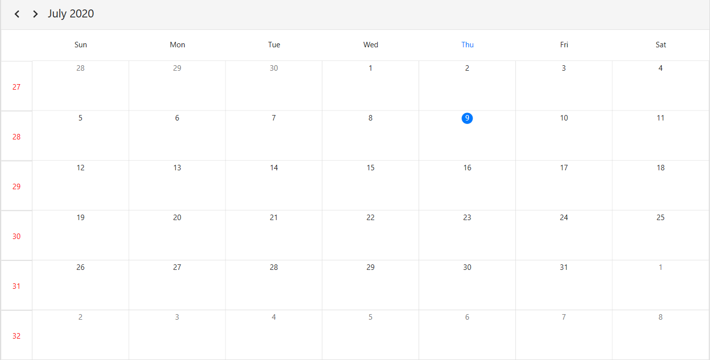
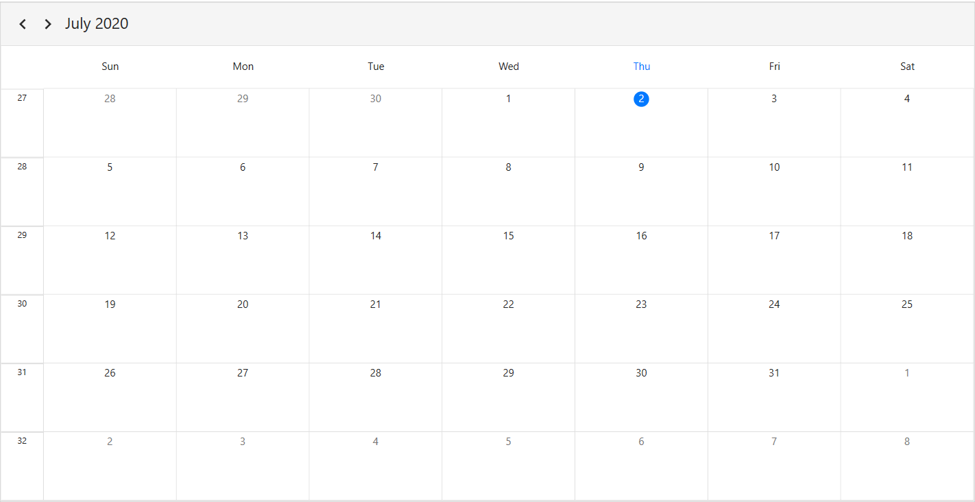
Display the week number of a year in the scheduler month view by setting the [ShowWeekNumber](https://help.syncfusion.com/cr/wpf/Syncfusion.UI.Xaml.Scheduler.MonthViewSettings.html#Syncfusion_UI_Xaml_Scheduler_MonthViewSettings_ShowWeekNumber) property of `MonthViewSettings` to `true`. By default, it is set to `false`.

{% tabs %}
{% highlight xaml %}
<Window 
    . . .
    xmlns:syncfusion="http://schemas.syncfusion.com/wpf">
    <Grid>
        <syncfusion:SfScheduler x:Name="Schedule"
                            ViewType="Month" >
            <syncfusion:SfScheduler.MonthViewSettings>
                <syncfusion:MonthViewSettings ShowWeekNumber="True"/>
            </syncfusion:SfScheduler.MonthViewSettings>
        </syncfusion:SfScheduler>
    </Grid>
</Window>
{% endhighlight %}
{% highlight c#%}
using Syncfusion.UI.Xaml.Scheduler;

this.Schedule.ViewType = SchedulerViewType.Month;
this.Schedule.MonthViewSettings.ShowWeekNumber = true;
{% endhighlight %}
{% endtabs %}

![WPF Scheduler month view ShowWeekNumber](Month-View_Images/wpf-scheduler-showweeknumber.png)

#### Customize week number template
Customize the default appearance of a week number template in the month view by using the [WeekNumberTemplate](https://help.syncfusion.com/cr/wpf/Syncfusion.UI.Xaml.Scheduler.MonthViewSettings.html#Syncfusion_UI_Xaml_Scheduler_MonthViewSettings_WeekNumberTemplate) property of `MonthViewSettings`.

{% tabs %}
{% highlight xaml %}
<Window 
    . . .
    xmlns:syncfusion="http://schemas.syncfusion.com/wpf">
    <Grid>
        <syncfusion:SfScheduler x:Name="Schedule"
                            ViewType="Month" >
            <syncfusion:SfScheduler.MonthViewSettings>
                        <syncfusion:MonthViewSettings ShowWeekNumber="True">
                            <syncfusion:MonthViewSettings.WeekNumberTemplate>
                                <DataTemplate>
                                     <Grid >
                                        <Label  Foreground="Red"
                                                Content="{Binding}"
                                                VerticalAlignment="Center"
                                                HorizontalAlignment="Center"/>
                                    </Grid>
                                </DataTemplate>
                            </syncfusion:MonthViewSettings.WeekNumberTemplate>
                        </syncfusion:MonthViewSettings>
            </syncfusion:SfScheduler.MonthViewSettings>
        </syncfusion:SfScheduler>
    </Grid>
</Window>
{% endhighlight %}
{% endtabs %}

![WPF Scheduler month view WeekNumberTemplate](Month-View_Images/wpf-scheduler-weeknumber-template.png)

## Customize month cell appearance 

#### Using the DataTemplate 
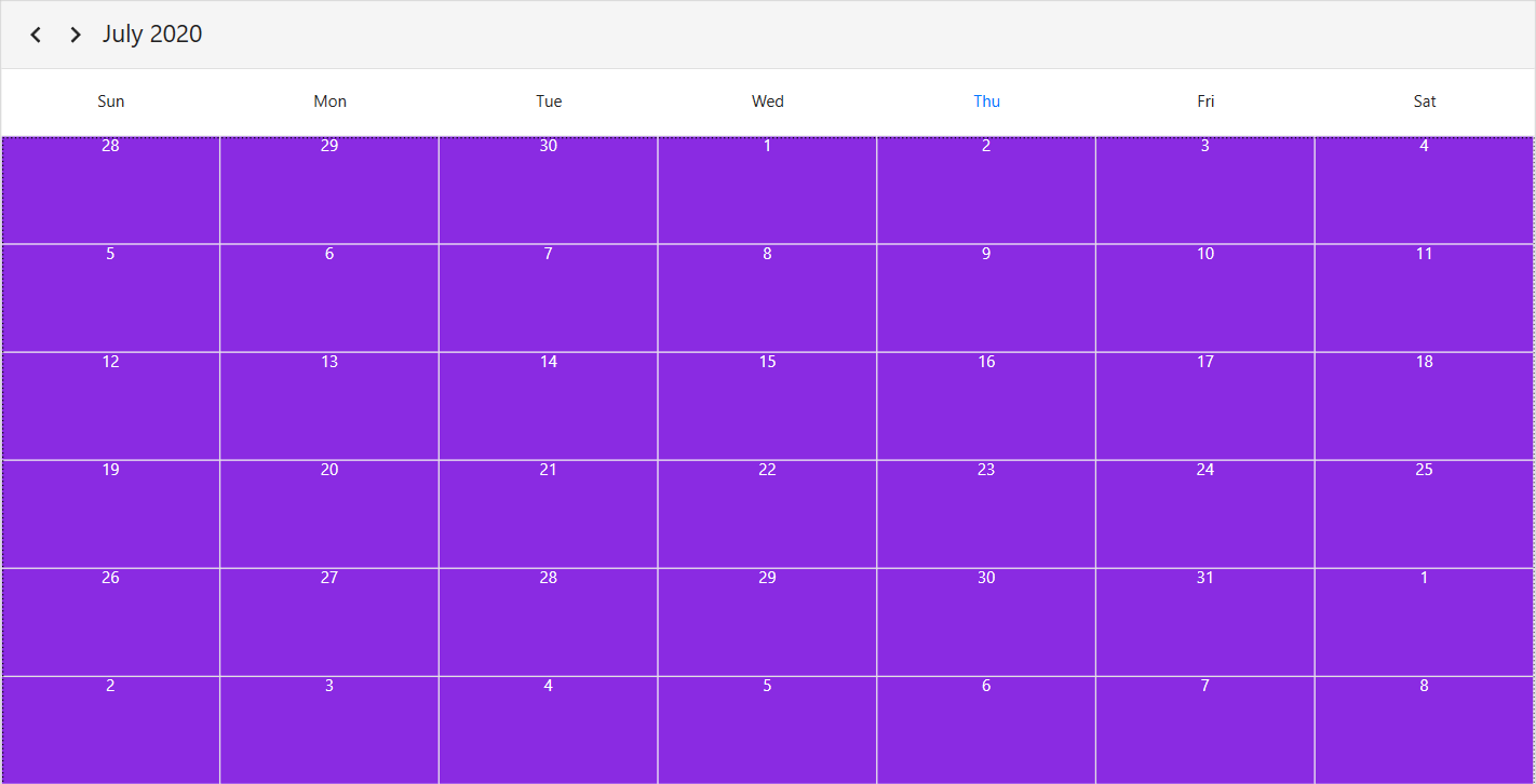
Customize the default appearance of the month cell by using the [MonthCellTemplate](https://help.syncfusion.com/cr/wpf/Syncfusion.UI.Xaml.Scheduler.MonthViewSettings.html#Syncfusion_UI_Xaml_Scheduler_MonthViewSettings_MonthCellTemplate) property of `MonthViewSettings`.

{% tabs %}
{% highlight xaml %}
<Window 
    . . .
    xmlns:syncfusion="http://schemas.syncfusion.com/wpf">
    <Grid>
        <syncfusion:SfScheduler x:Name="Schedule"
                            ViewType="Month">
            <syncfusion:SfScheduler.MonthViewSettings>
                <syncfusion:MonthViewSettings>
                     <syncfusion:MonthViewSettings.MonthCellTemplate>
                        <DataTemplate>
                            <Border Background="BlueViolet">
                                <TextBlock HorizontalAlignment="Center" Foreground="White" Text="{Binding DateTime.Day}"/>
                            </Border>
                        </DataTemplate>
                     </syncfusion:MonthViewSettings.MonthCellTemplate>
                </syncfusion:MonthViewSettings>
            </syncfusion:SfScheduler.MonthViewSettings>
        </syncfusion:SfScheduler>
    </Grid>
</Window>
{% endhighlight %}
{% endtabs %}

![WPF Scheduler month view MonthCellTemplate](Month-View_Images/wpf-scheduler-monthcell-template.png)

#### Using the DataTemplateSelector 
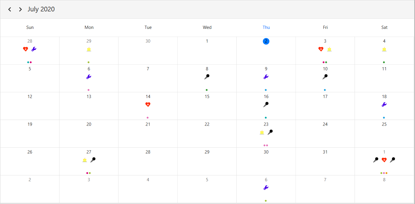
Customize the default appearance of the month cell by using the [MonthCellTemplateSelector](https://help.syncfusion.com/cr/wpf/Syncfusion.UI.Xaml.Scheduler.MonthViewSettings.html#Syncfusion_UI_Xaml_Scheduler_MonthViewSettings_MonthCellTemplateSelector) property of `MonthViewSettings`.
The `DataTemplateSelector` can choose a DataTemplate at runtime based on the value of a data-bound to Scheduler month cell using the MonthCellTemplate. It allows to choose a different data template for each month's cell, customizing the appearance of a particular month cell based on certain conditions.

{% tabs %}
{% highlight xaml %}
<Window 
    . . .
    xmlns:syncfusion="http://schemas.syncfusion.com/wpf">
    <Window.Resources>
            <local:MonthCellTemplateSelector x:Key="monthCellTemplateSelector"/>
    </Window.Resources>   
    <Grid>
        <syncfusion:SfScheduler x:Name="Schedule" 
                            ViewType="Month"
                            ItemsSource="{Binding Appointments}">          
            <syncfusion:SfScheduler.MonthViewSettings>
                <syncfusion:MonthViewSettings AppointmentDisplayMode="Indicator" 
                                              MonthCellTemplateSelector="{StaticResource monthCellTemplateSelector}">
                </syncfusion:MonthViewSettings>
            </syncfusion:SfScheduler.MonthViewSettings>
        </syncfusion:SfScheduler>     
    </Grid>
</Window>
{% endhighlight %}
{% highlight c#%}
using Syncfusion.UI.Xaml.Scheduler;

 public class MonthCellTemplateSelector : DataTemplateSelector
    {
        public MonthCellTemplateSelector()
        {
            var mainWindow = App.Current.MainWindow as Window;
            this.MonthAppointmentTemplate = mainWindow.Resources["monthAppointmentTemplate"] as DataTemplate;
            this.MonthCellDatesTemplate = mainWindow.Resources["monthCellTemplate"] as DataTemplate;
        }

        public DataTemplate MonthAppointmentTemplate { get; set; }
        public DataTemplate MonthCellDatesTemplate { get; set; }
        public override DataTemplate SelectTemplate(object item, DependencyObject container)
        {
            var appointments = item as List<ScheduleAppointment>;
            var cell = container as MonthCell;
            if (cell.DateTime.Date == DateTime.Now.Date)
                cell.Foreground = Brushes.Black;

            if (appointments == null || appointments.Count == 0)
            {
                cell.DataContext = cell;
                return MonthCellDatesTemplate;
            }
            else
            {
                MonthCellViewModel monthCellViewModel = new MonthCellViewModel();
                monthCellViewModel.Foreground = cell.Foreground;
                monthCellViewModel.DateText = cell.DateText;
                monthCellViewModel.MonthCellAppointments = appointments;
                cell.DataContext = monthCellViewModel;
                return MonthAppointmentTemplate;
            }
        }
    }
{% endhighlight %}
{% endtabs %}

![WPF Scheduler month view MonthCellTemplateSelector](Month-View_Images/wpf-scheduler-monthcell-template-selector.png)

## Customize month view appointments

#### Using the DataTemplate
Customize the default appearance of the month cell appointment by using the [AppointmentTemplate](https://help.syncfusion.com/cr/wpf/Syncfusion.UI.Xaml.Scheduler.ViewSettingsBase.html#Syncfusion_UI_Xaml_Scheduler_ViewSettingsBase_AppointmentTemplate) property of `MonthViewSettings`.

 {% tabs %}
{% highlight xaml %}
<Window 
    . . .
    xmlns:syncfusion="http://schemas.syncfusion.com/wpf">
    <Grid>
        <syncfusion:SfScheduler x:Name="Schedule" ViewType="Month" ItemsSource="{Binding Appointments}">
                    <syncfusion:SfScheduler.MonthViewSettings>
                        <syncfusion:MonthViewSettings>
                            <syncfusion:MonthViewSettings.AppointmentTemplate>
                                <DataTemplate>
                                <TextBlock 
                                Background="{Binding Data.BackgroundColor}"
                                Text="{Binding Data.EventName}" 
                                HorizontalAlignment="Stretch"
                                TextTrimming="CharacterEllipsis"
                                Foreground="{Binding Data.ForegroundColor}"        
                                TextWrapping="Wrap"
                                FontStyle="Italic" />
                                </DataTemplate>
                            </syncfusion:MonthViewSettings.AppointmentTemplate>
                        </syncfusion:MonthViewSettings>
                    </syncfusion:SfScheduler.MonthViewSettings>
        </syncfusion:SfScheduler>
    </Grid>
</Window>
{% endhighlight %}
{% endtabs %}

![WPF Scheduler month view AppointmentTemplate](Month-View_Images/wpf-scheduler-appointment-template.png)

#### Using the DataTemplateSelector
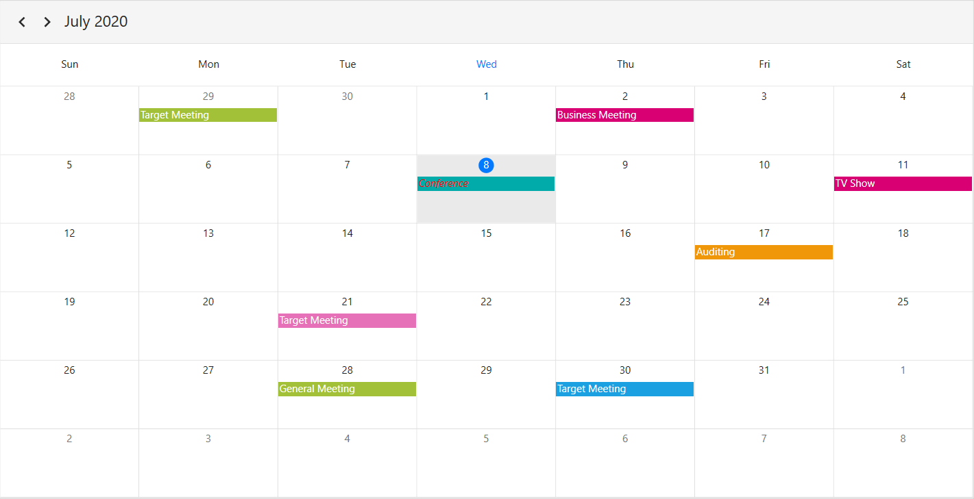
Customize the default appearance of the month view appointments by using the [AppointmentTemplateSelector](https://help.syncfusion.com/cr/wpf/Syncfusion.UI.Xaml.Scheduler.ViewSettingsBase.html#Syncfusion_UI_Xaml_Scheduler_ViewSettingsBase_AppointmentTemplateSelector) property of `MonthViewSettings`.
The `DataTemplateSelector` can choose a DataTemplate at runtime based on the value of a data-bound to Scheduler month appointments using the `AppointmentTemplate`. It allows to choose a different data template for each month's cell, customizing the appearance of a particular appointment based on certain conditions.


{% tabs %}
{% highlight xaml %}
<Window 
    . . .
    xmlns:syncfusion="http://schemas.syncfusion.com/wpf">
    <Window.Resources>
        <local:MonthViewAppointmentTemplateSelector x:Key="appointmentTemplateSelector">
            <local:MonthViewAppointmentTemplateSelector.CurrentDayAppointmentTemplate>
                 <DataTemplate>
                    <Border>
                        <TextBlock Text="{Binding Subject}" 
                                    FontStyle="Italic" 
                                    Foreground="Red" 
                                    TextWrapping="Wrap" 
                                    TextTrimming="WordEllipsis"/>
                    </Border>
                </DataTemplate>
            </local:MonthViewAppointmentTemplateSelector.CurrentDayAppointmentTemplate>
            <local:MonthViewAppointmentTemplateSelector.DefaultAppointmentTemplate>
                <DataTemplate>
                    <TextBlock Text="{Binding Subject}"
                                TextWrapping="Wrap" 
                                TextTrimming="WordEllipsis"/>
                </DataTemplate>
            </local:MonthViewAppointmentTemplateSelector.DefaultAppointmentTemplate>
        </local:MonthViewAppointmentTemplateSelector>
    </Window.Resources>
    <Grid>
        <syncfusion:SfScheduler x:Name="Schedule"
                            ViewType="Month" >
            <syncfusion:SfScheduler.MonthViewSettings>
                <syncfusion:MonthViewSettings AppointmentTemplateSelector="{StaticResource appointmentTemplateSelector}"/>
            </syncfusion:SfScheduler.MonthViewSettings>
        </syncfusion:SfScheduler>
    </Grid>
</Window>

{% endhighlight %}
{% highlight c#%}
using Syncfusion.UI.Xaml.Scheduler;

public class MonthViewAppointmentTemplateSelector : DataTemplateSelector
{
    public DataTemplate CurrentDayAppointmentTemplate { get; set; }
    public DataTemplate DefaultAppointmentTemplate { get; set; }

    public override DataTemplate SelectTemplate(object item, DependencyObject container)
    {
            var app = item as ScheduleAppointment;
            if (app.StartTime.Date == DateTime.Today.Date)
                return this.CurrentDayAppointmentTemplate;
            else
                return this.DefaultAppointmentTemplate;
    }
}
{% endhighlight %}
{% endtabs %}

![WPF Scheduler month view AppointmentTemplateSelector](Month-View_Images/wpf-scheduler-appointment-template-selector.png)

## Customize more appointments indicator in month cell
You can customize the default appearance of more appointments indicator in a month cell by using the [MoreAppointmentsIndicatorTemplate](https://help.syncfusion.com/cr/wpf/Syncfusion.UI.Xaml.Scheduler.MonthViewSettings.html#Syncfusion_UI_Xaml_Scheduler_MonthViewSettings_MoreAppointmentsIndicatorTemplate) property of the `MonthViewSettings.`

{% tabs %}
{% highlight xaml %}
<Window 
    . . .
    xmlns:syncfusion="http://schemas.syncfusion.com/wpf">
    <Grid>
        <syncfusion:SfScheduler x:Name="Schedule" ViewType="Month">
            <syncfusion:SfScheduler.MonthViewSettings>
                <syncfusion:MonthViewSettings>
                    <syncfusion:MonthViewSettings.MoreAppointmentsIndicatorTemplate>
                        <DataTemplate>
                            <TextBlock Text = "{Binding StringFormat=+{0}}" Background = "#EAEAEA" Foreground = "Black" Padding="0,5,0,0">
                            </TextBlock>
                        </DataTemplate>
                    </syncfusion:MonthViewSettings.MoreAppointmentsIndicatorTemplate>
                 </syncfusion:MonthViewSettings>
            </syncfusion:SfScheduler.MonthViewSettings>
        </syncfusion:SfScheduler>
    </Grid>
</Window>
{% endhighlight %}
{% endtabs %}

![appointment-display-count-appearance-customization-in-WPF-scheduler-month-view](Month-View_Images/appointment-display-count-appearance-customization-in-WPF-scheduler-month-view.png)

## Cell right padding

To enhance interaction with a scheduler's appointments, you can customize the spacing between appointments and the right border of their cells using the [CellRightPadding](https://help.syncfusion.com/cr/wpf/Syncfusion.UI.Xaml.Scheduler.MonthViewSettings.html#Syncfusion_UI_Xaml_Scheduler_MonthViewSettings_CellRightPadding) property of [MonthViewSettings](https://help.syncfusion.com/cr/wpf/Syncfusion.UI.Xaml.Scheduler.MonthViewSettings.html) in the [SfScheduler](https://help.syncfusion.com/cr/wpf/Syncfusion.UI.Xaml.Scheduler.SfScheduler.html).

{% tabs %}
{% highlight xaml hl_lines="8" %}
<Window 
    . . .
    xmlns:syncfusion="http://schemas.syncfusion.com/wpf">
    <Grid>
        <syncfusion:SfScheduler x:Name="Schedule" 
                            ViewType="Month">
         <syncfusion:SfScheduler.MonthViewSettings>
             <syncfusion:MonthViewSettings CellRightPadding="30" />
         </syncfusion:SfScheduler.MonthViewSettings>
        </syncfusion:SfScheduler>
    </Grid>
</Window>
{% endhighlight %}
{% highlight c# hl_lines="4" %}
using Syncfusion.UI.Xaml.Scheduler;

this.Schedule.ViewType = SchedulerViewType.Month;
this.Schedule.MonthViewSettings.CellRightPadding = 30;
{% endhighlight %}
{% endtabs %}
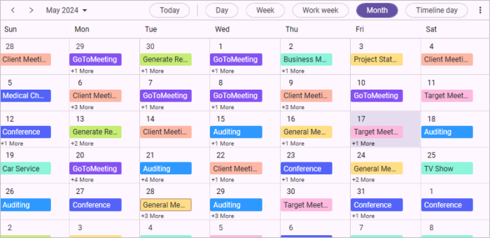

![cell-right-padding-support-in-WPF-scheduler](Month-View_Images/cell-right-padding-support-in-WPF-scheduler.png)

N>
* This customization will apply only when the scheduler has an appointment.

N> You can refer to our [WPF Scheduler](https://www.syncfusion.com/scheduler-sdk/wpf-scheduler) feature tour page for its groundbreaking feature representations. You can also explore our [WPF Scheduler example](https://github.com/syncfusion/wpf-demos) to knows how to schedule and manage appointments through an intuitive user interface, similar to the Outlook calendar.