Grid Report Item
The grid data region report item displays report data in cells that are organized into rows and columns. Report data can be a data which is retrieved from the data source.
To add a grid to a report
-
Create a report and define a dataset. For more information refer Create Dataset.
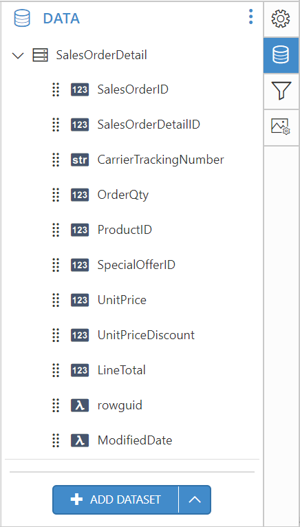
Note: AdventureWorks database is used for demonstration.
-
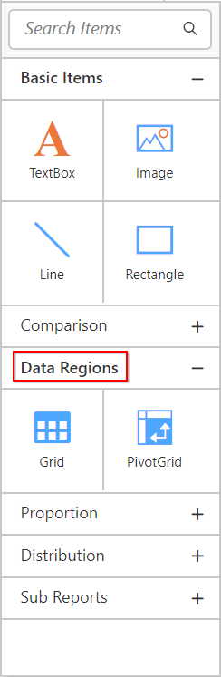
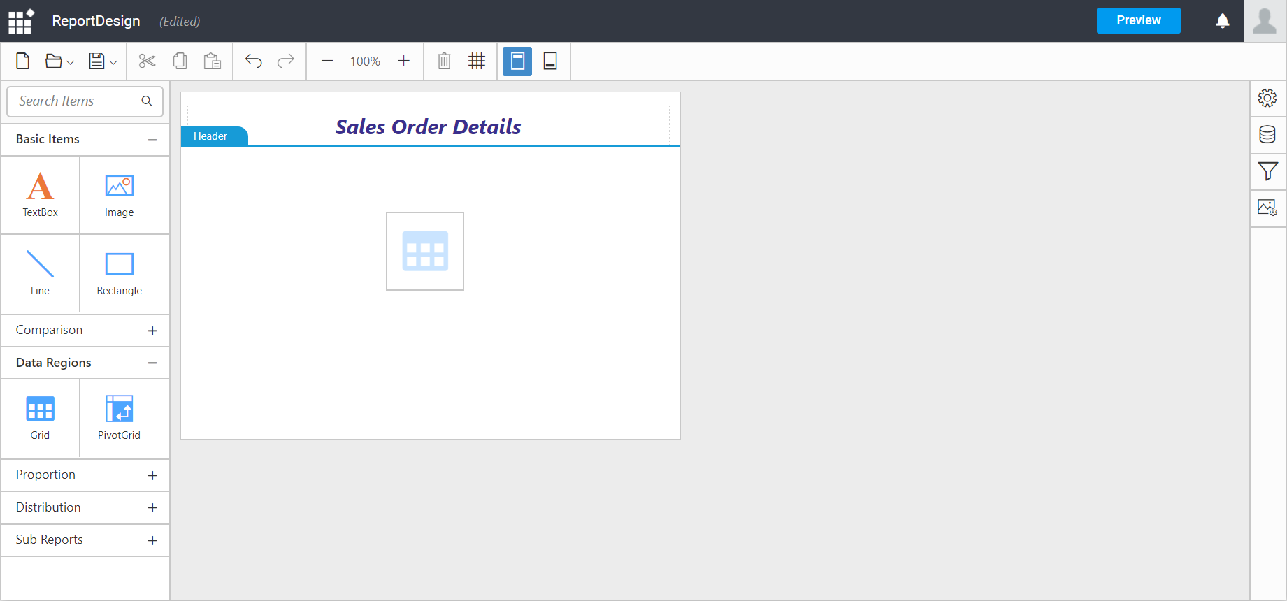
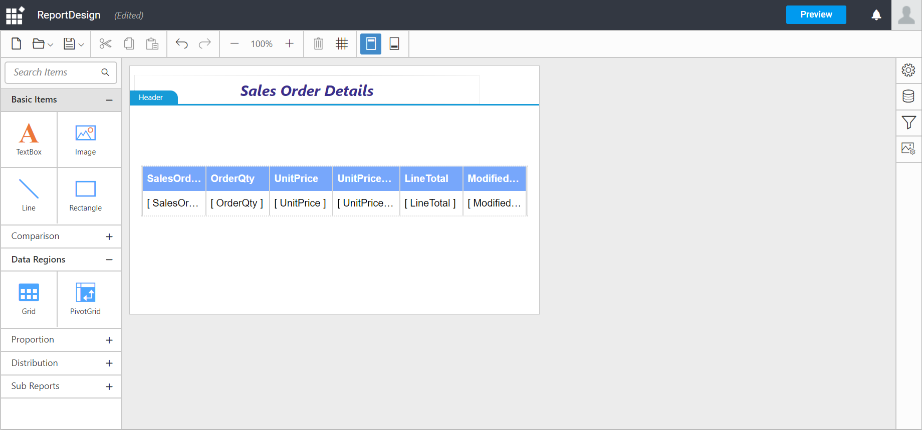
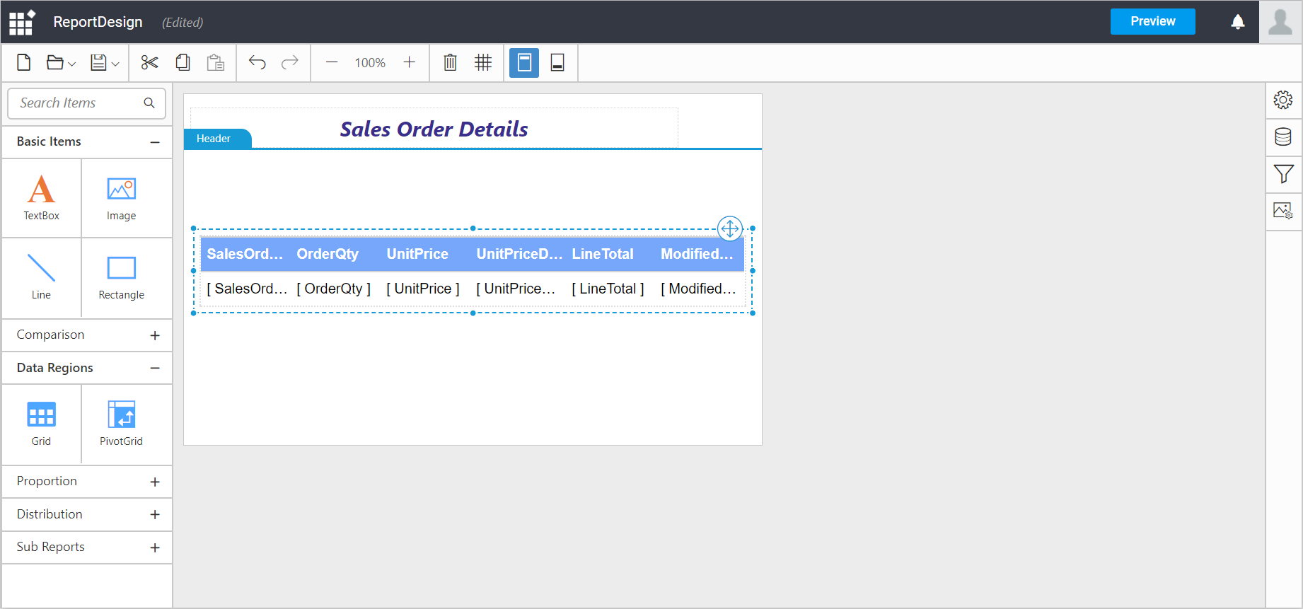
To add a Grid data region to the report, drag and drop the grid from the item panel.
After adding a grid data region to the design surface, click the properties icon in the configuration panel to display the grid properties panel. In the grid Properties pane, click the Data Assign tab.
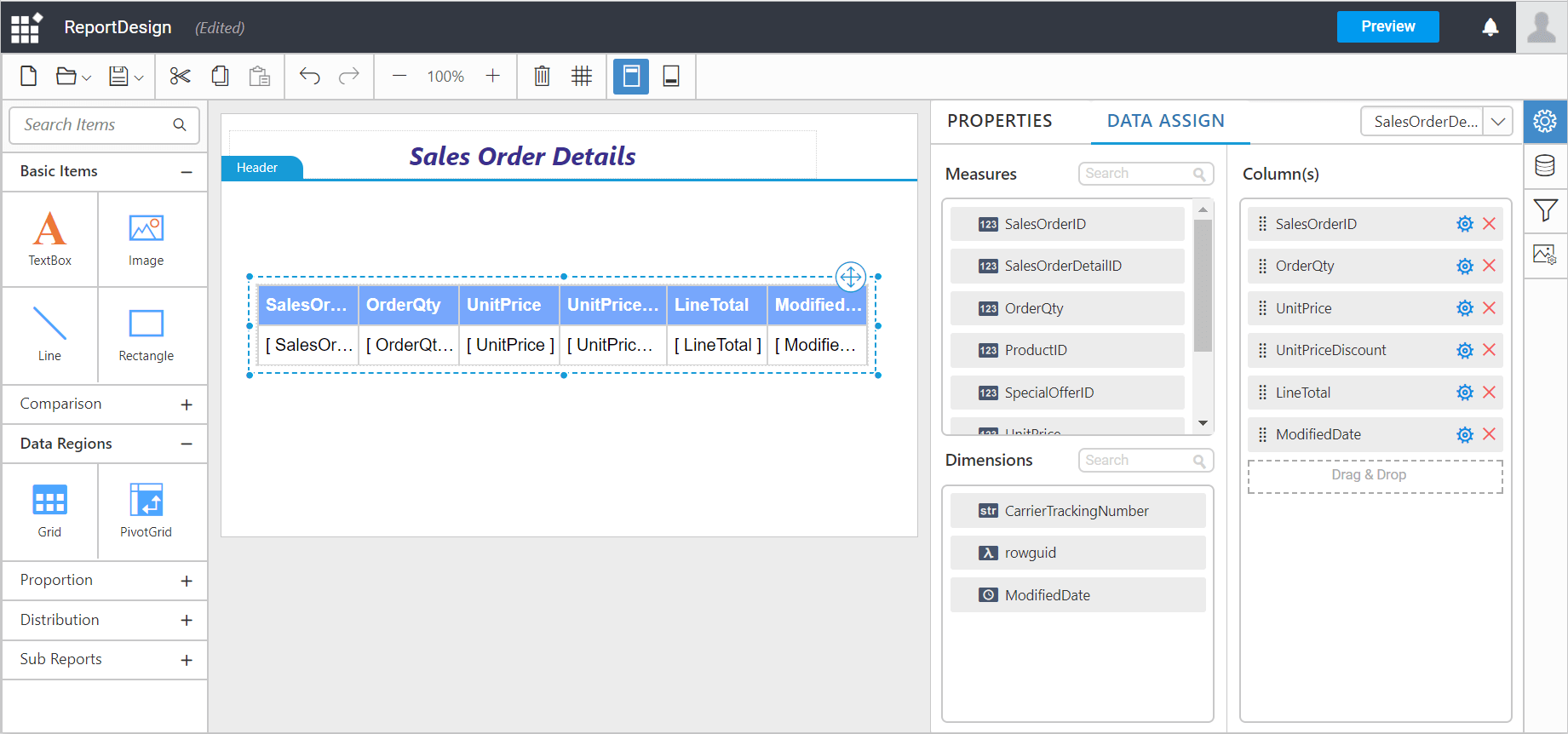
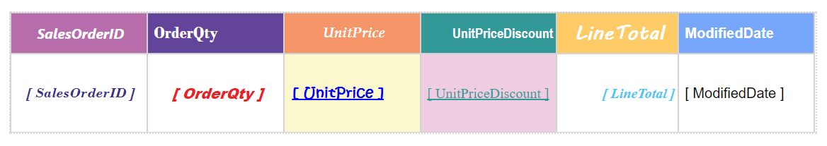
Bind column through drag and drop element from Measures section to Column(s) section.
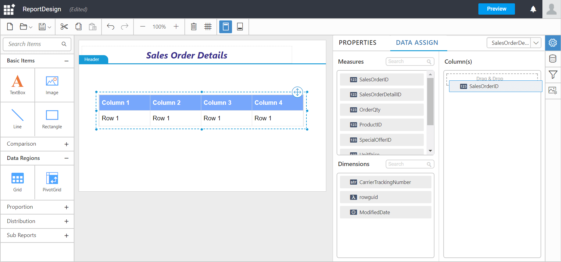
Multiple columns can be binded to the columns section.
Designing a grid
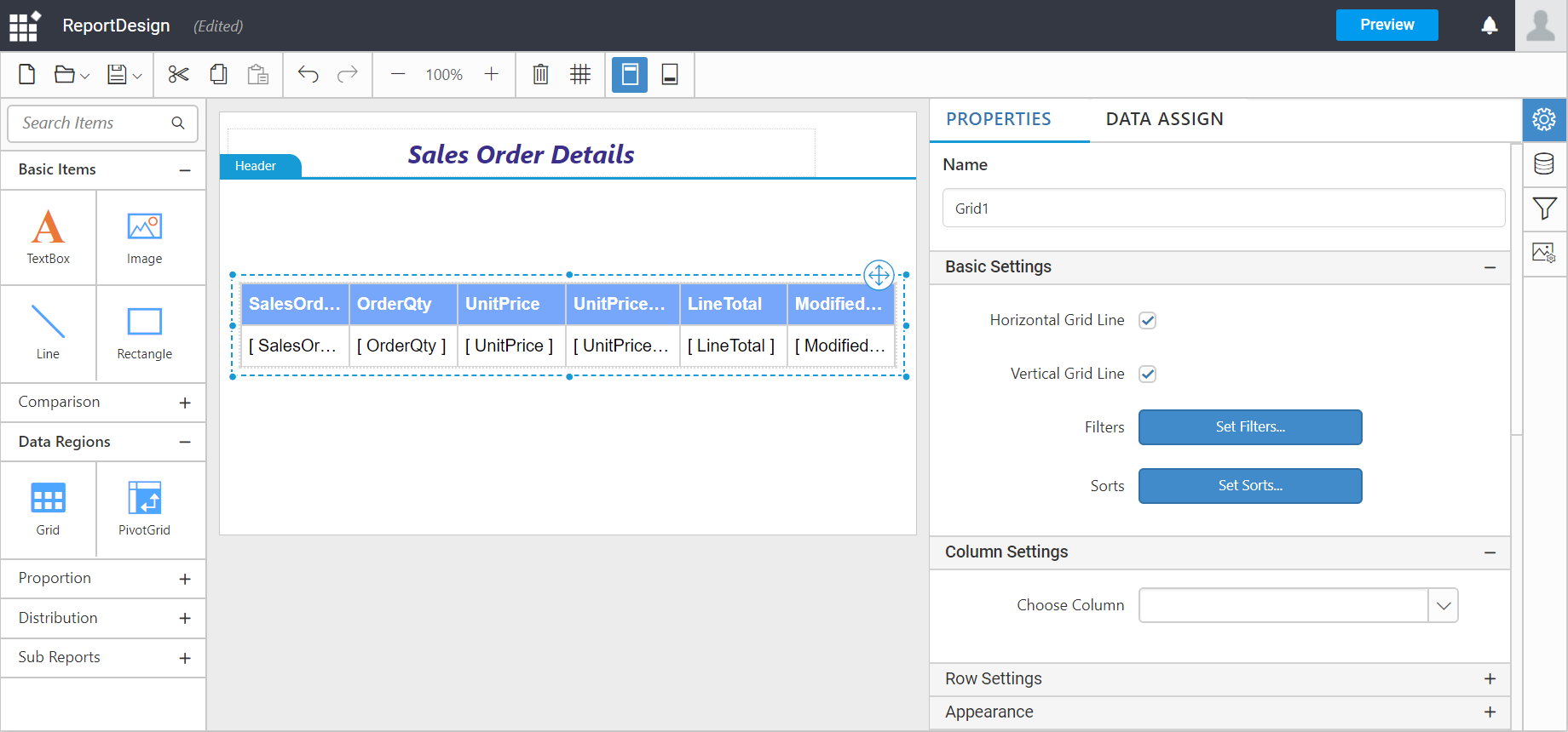
In the grid Properties pane, the visual effects of the grid can be designed using the Properties tab.
In the Properties pane, to add Expression or to open Advanced options, click the icon in the right corner of each property.
Note: RDL standard windows fonts are not supported in cross platforms. So, you need to load the unsupported fonts in application level for cross platforms.
Name: Title for the grid report item can be set using this property.
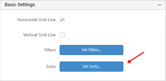
Basic settings
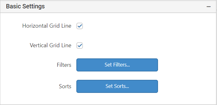
Horizontal grid line: Horizontal grid lines are used to differentiate the rows in the grid. By default the grid appears with horizontal grid lines.

-
To hide the grid lines, clear the Horizontal Grid Line check box.
Vertical grid line: Vertical grid lines are used to differentiate the columns in the grid. By default the grid appears with vertical grid lines.
-
To hide the grid lines, clear the Vertical Grid Line check box.
Filters: Filters are used to limit the data in a report after the data is retrieved from a data source. When a filter is added to the grid data, the report will retrieve data that matches the filter conditions.
To add the filter, specify one or more conditions; the conditions are filter equations. A filter equation has an expression that identifies the data has to be filtered, and also identifies the value has to be compared.
Add filters
-
Click
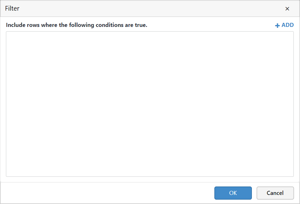
Set Filters...in the filters property. It will launch theFilter Dialog, by default the list is empty.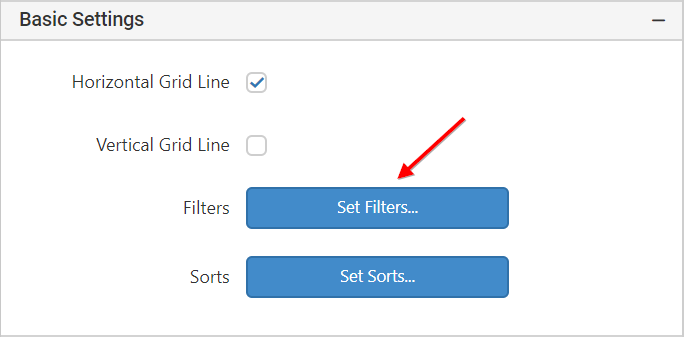
-
Click Add. A new blank filter equation appears.
-
The first field in the filter is an Expression field, type or select an expression for the field to filter.
-
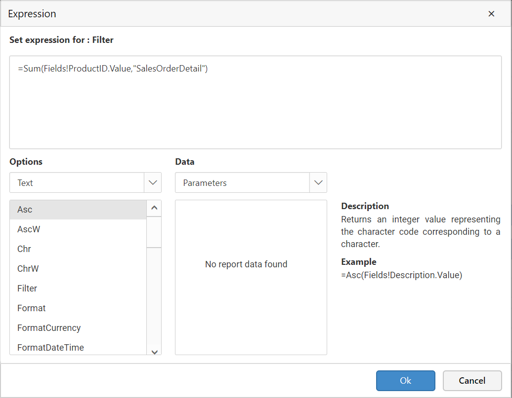
To edit an expression, click on the icon next to the expression field and select
Expression.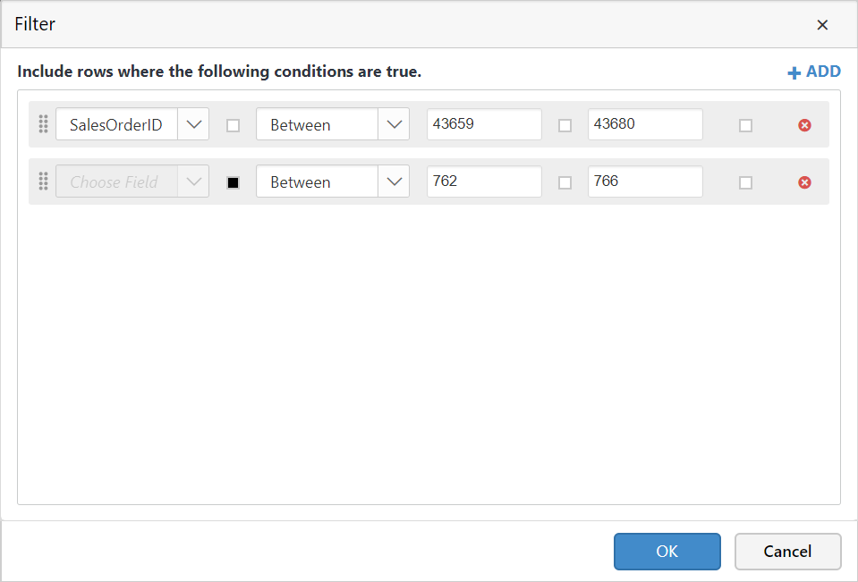
The expression can be set like below.
-
The icon will be indicated in
Black color, if the expression is applied.
-
-
In the Operator box, select the operator by which the filter can compare the values in the Expression box and the Value box.
-
In the Value box, type the expression or value against which you want the filter to evaluate the value in Expression.
-
Click OK.
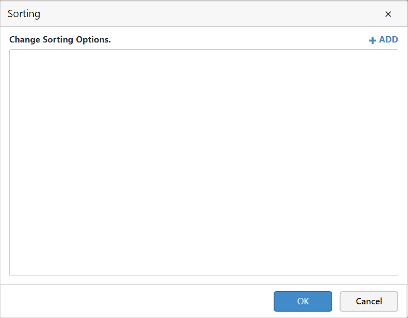
Sort data in a grid data region
Sorts: A sort expression controls the order in which data appears in a data region.
-
In the properties panel, click the Set Sorts.
-
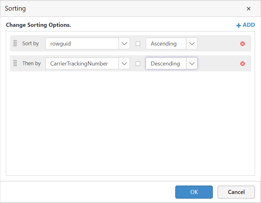
For each sort expression, follow these steps:
-
Click Add.
-
Type or select an expression by which the data will be sorted.
-
From the drop-down list, choose the sort direction for each expression. Ascending sorts an expression in A-Z order. Descending sorts an expression in Z-A order.
-
-
Click OK.
Note: For effective sorting experience, apply sorting to the column with string data.
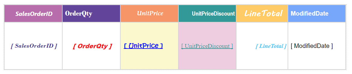
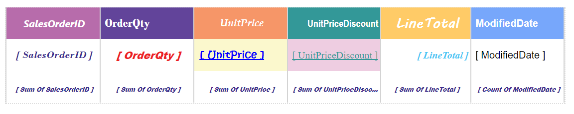
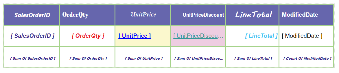
Column and Row settings :
Row and column group headers are created automatically when data assigned to the grid.
To differentiate each fields from another the visual effects to the column can be added using Column and Row settings in the properties pane.
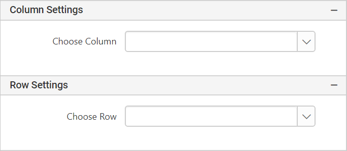
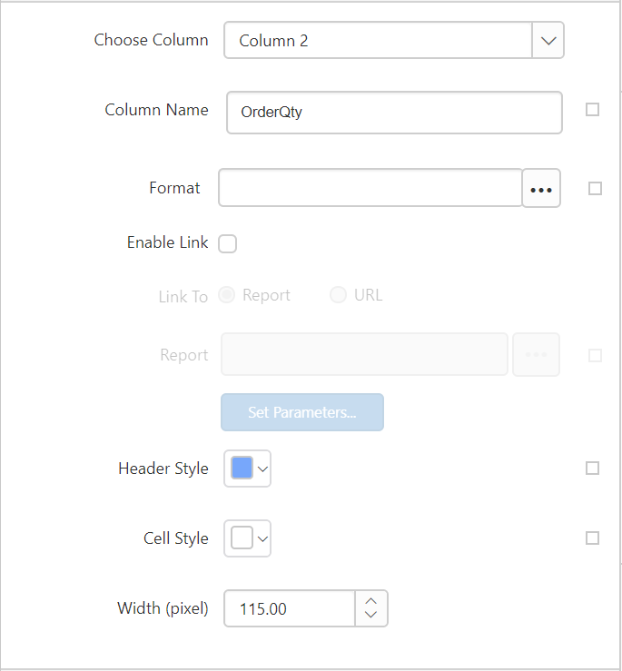
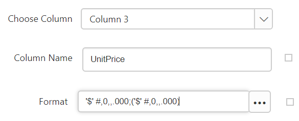
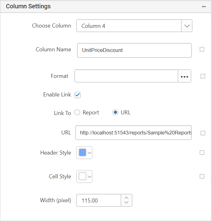
To set column properties: Select the column number from the Choose Column drop-down list in which the properties can be edited . Now, the column properties fields will be displayed under column settings.
-
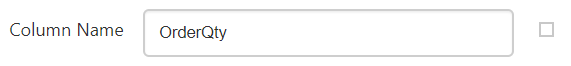
Column name: By default the field is set with the selected column name. You can set the column name of your choice by editing the default name. You can also set expression for the column name field by clicking the expression icon in the right corner of the field.
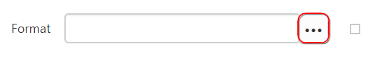
Format: The numbers and dates in grid data regions can be formatted by selecting a format from the Format dialog.
-
Click the highlighted button in the above image to open
Formatdialog.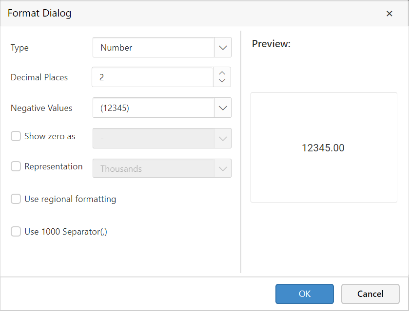
-
To set custom format, enter the format in the text field.
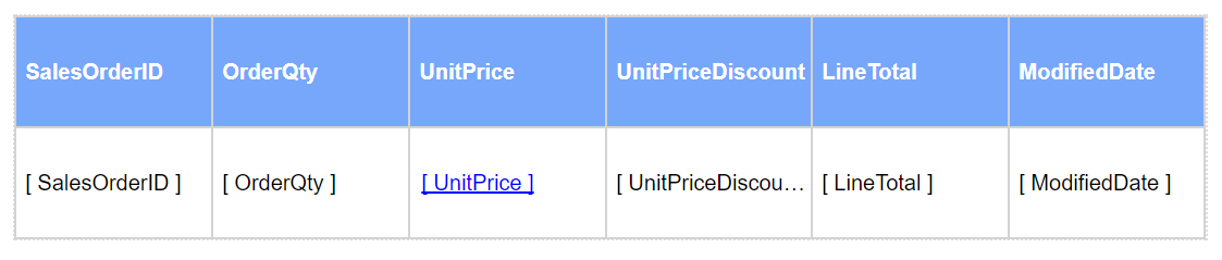
To demonstrate an example, here Currency format is applied to the
Unit Pricecolumn.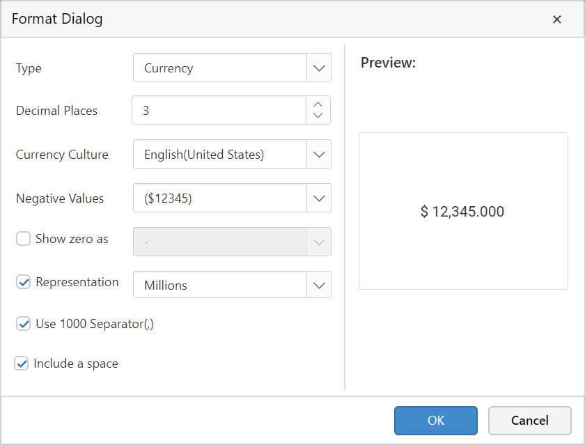
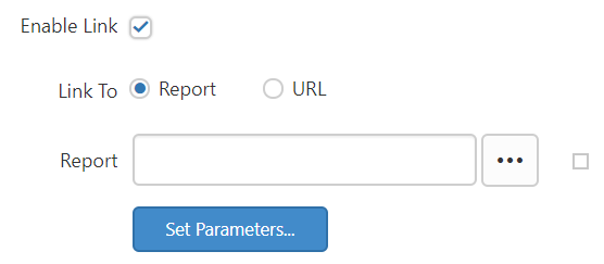
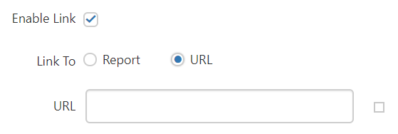
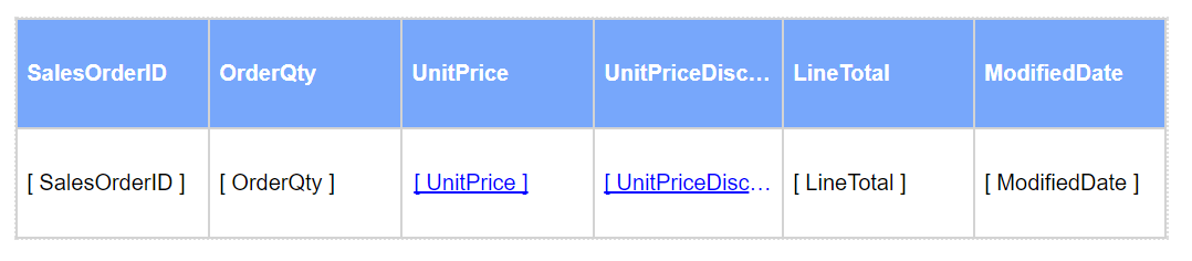
Enable Link: To enable Action fields, enable the Enable Link checkbox.
-
Action - Defines a hyperlink, a bookmark link, or a drill through action.
The action property must contain only one of the following elements: Hyperlink, Drill through, or BookmarkLink.
To add a drill through action
-
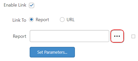
Select Report.
-
Click the
Browsein the report fields and select the report from the list.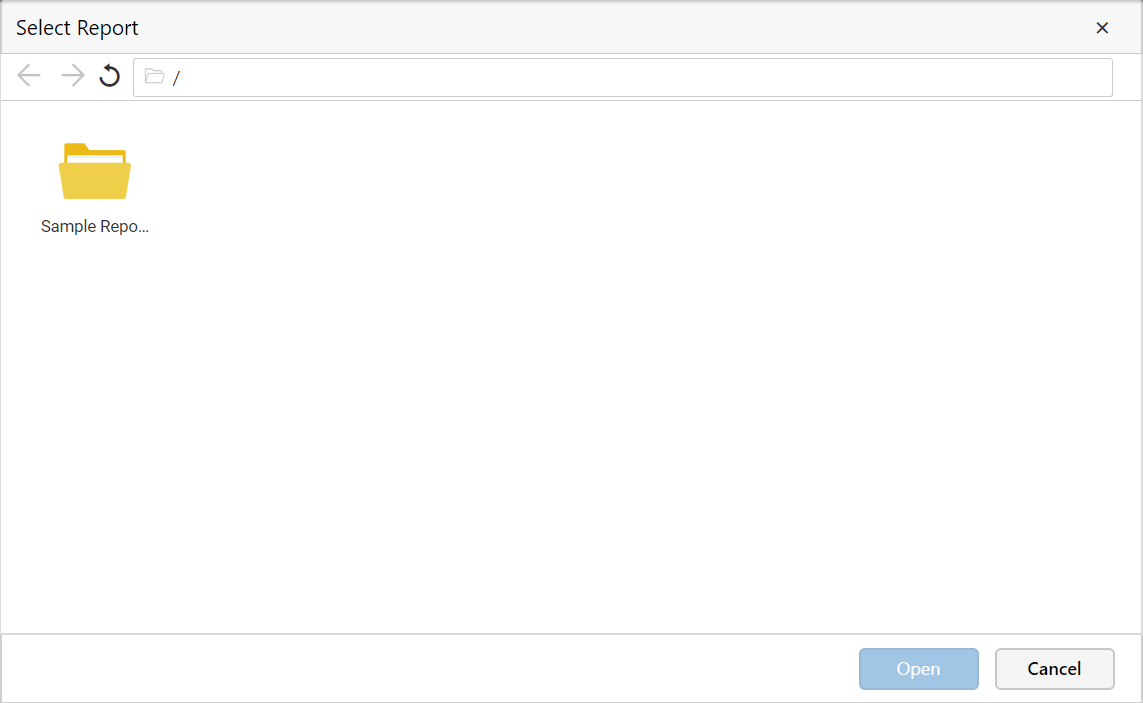
To specify parameters for the drill through report, follow the next step.
-
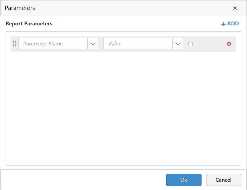
Click the
Set Parametersin the report fields, it will launch theParametersdialog.
-
Click Add. A new row is added to the parameter grid.
-
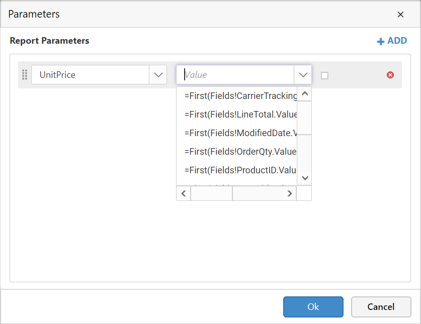
In the Name text box, type the name of the report parameter in the drill through report. If the drill through report is in the server, the parameter names are available in the drop-down list.
-
In Value, type or select the value to pass to the parameter in the drill through report.
-
Values contain an expression that evaluates to a value to pass to the report parameter. The expressions in the value list include the field list for the current report.
-
-
-
Click
OK. -
To test the link, run the report and click the report item to which the link is assigned.
Add a hyperlink to a URL
Hyperlink can be added to the report item, so that users can able to click the link in the report and open a browser to the URL that you specify.
-
Select URL.
-
In URL field, type or select a URL or an expression that evaluates to the URL.
-
To test the link, click Preview to preview the report, and then click the report item that you set on this link.
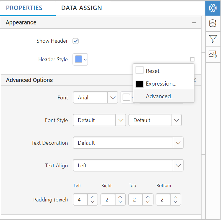
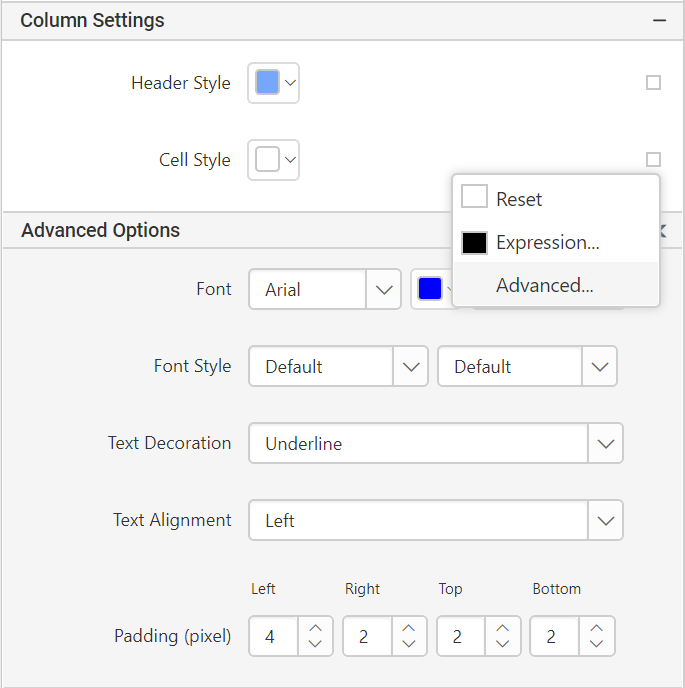
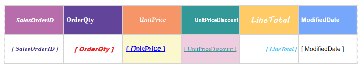
Header Style: Using the header style property, the font style, font size,font color, text decoration, text alignment, and padding of the each column header can be changed.
To apply the above mentioned properties click the icon in the right corner and select Advanced.
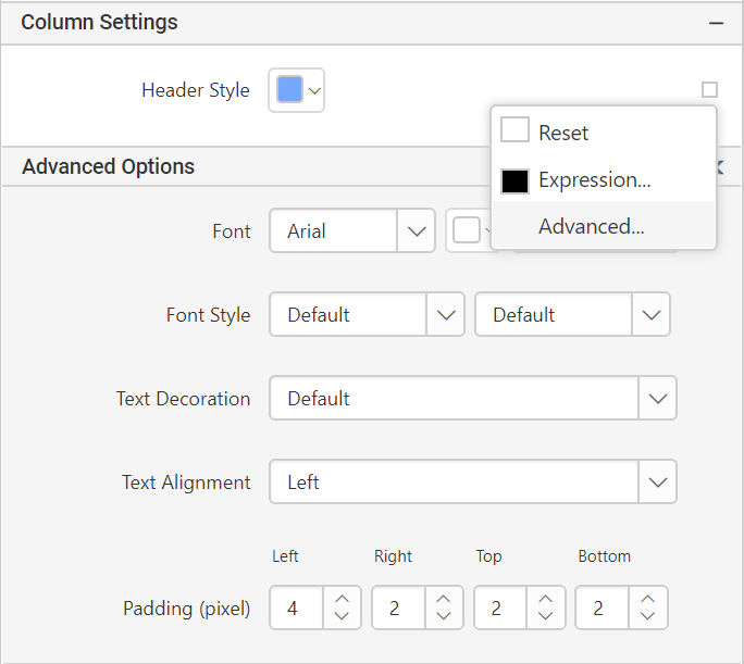
Note: RDL standard windows fonts are not supported in cross platforms. So, you need to load the unsupported fonts in application level for cross platforms.
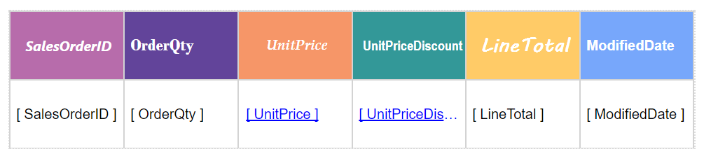
Cell Style: Using the cell style property, the font style, font size,font color, text decoration, text alignment, and padding of the each column cell can be changed.
Width: Present more data readable by adjusting the width of the each column using this property.
To set row properties: Select the row type from the Choose Row drop-down list to which you want to set the properties.
-
Header row: Using this property, the
Heightproperty of the gridHeader Rowcan be customized.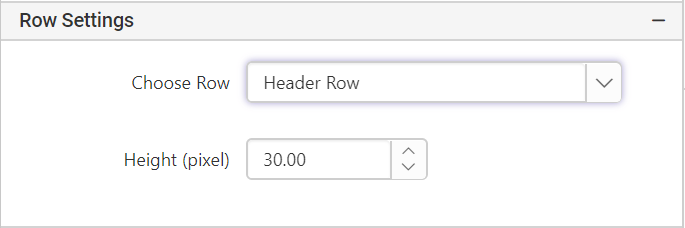
-
Data row: Using this property, the
Heightproperty of the gridData Rowcan be customized.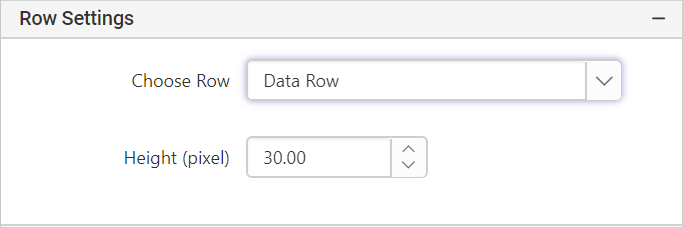
-
Summary row: To provide the summary details of each cell summary row option can be used.
-
Summary style: Using the summary style property, the font style, font size,font color, text decoration, text alignment, and padding of the each cell’s summary text can be changed.
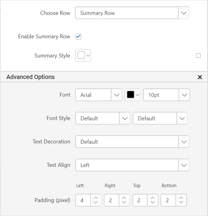
Note: RDL standard windows fonts are not supported in cross platforms. So, you need to load the unsupported fonts in application level for cross platforms.
-
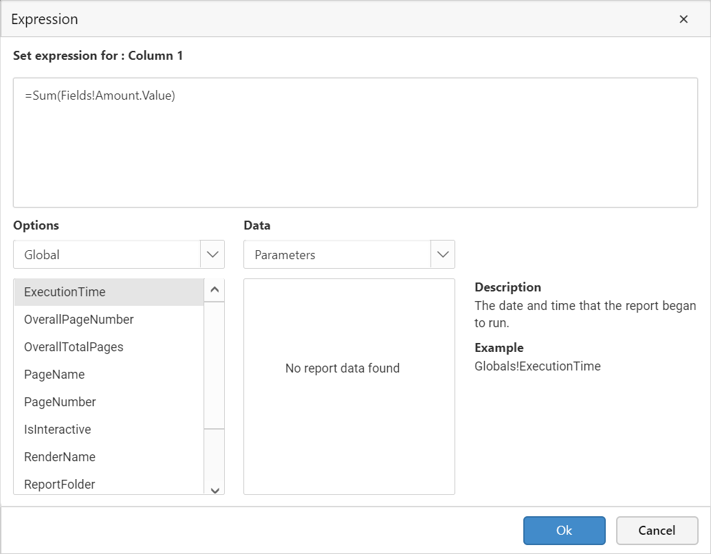
Summary Column: Enable the Enable Summary Row checkbox, will expand the menu with Summary Column option, where the summary of each cell can be edited by clicking the
fxicon.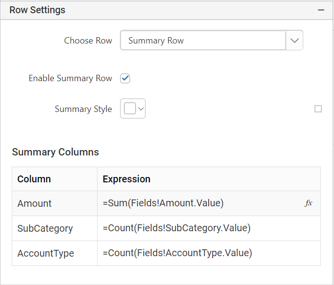
Note: Hover the cursor on each row to enable the
Expressionicon.-
Height: Using this property, the
Heightproperty of the gridSummary Rowcan be adjusted.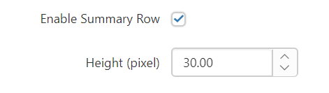
-
Appearance
In the appearance category, the border style, border width, border color, and background color of the overall grid (Column and Row) can be set to enhance the grid effects.
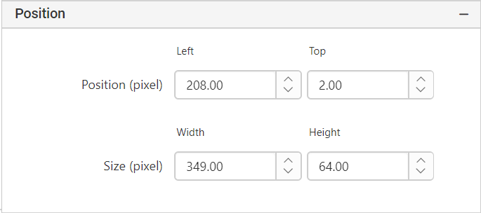
Position: The position and size of the grid can be changed using position and size property. The position and size can also be changed using Resizer.
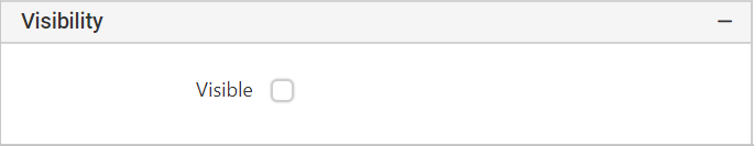
Visibility - Select this option to indicate how the report item is initially displayed in the report.
-
Enable the checkbox to show the report item.

-
Disable the checkbox to hide the report item.